Brand colour beyond default blue
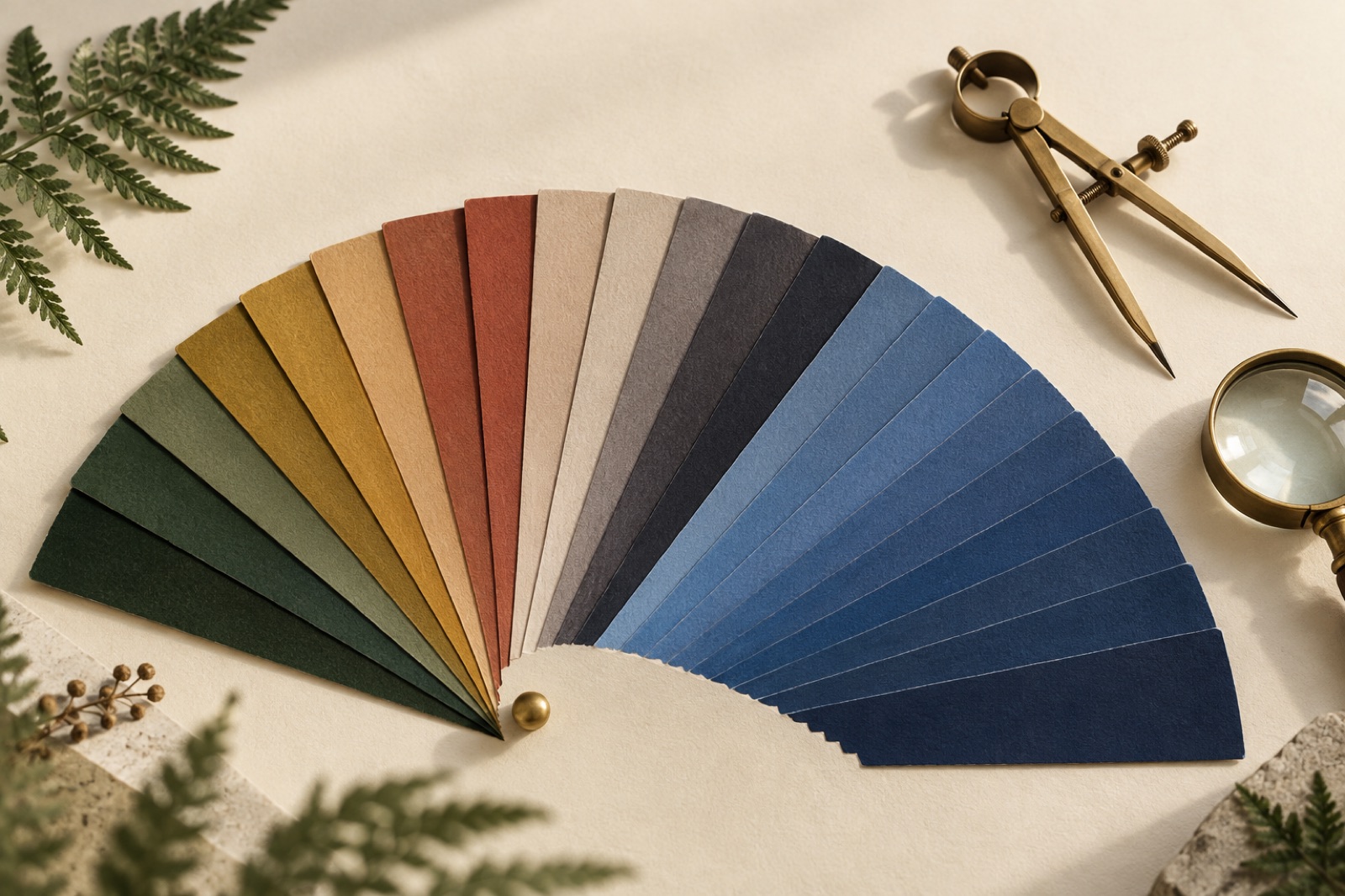
Open the websites of any fifty seed-funded startups and you will find forty-one blues. Not forty-one different blues, understood as a considered choice — the same blue, reached for the way you reach for the nearest pen. Blue says trust, says the brief. Blue says enterprise-ready, says the deck. Blue says nothing, says us.
Colour is the single highest-throughput signal a brand owns. It arrives before the logo is parsed, before the headline is read, before the layout registers. Treating it as an afterthought — or as a category convention to copy — is leaving your cheapest asset on the table. Here is how we actually choose colour for clients, as part of a wider brand identity engagement, and the traps that turn a palette into paint.
Start with a colour map, not a moodboard
Before anyone opens a swatch library, we map the category. Take the twenty competitors, prospects and comparators your audience will genuinely encounter in the same week, screenshot their sites and packaging, and extract the dominant hues onto a simple wheel. What you get is a picture of where the category's visual gravity sits.
For a fintech client the wheel is a wall of navy with a periwinkle fringe. For wellness it's sage and oat milk. For developer tools it's near-black with an acid accent. This exercise takes half a day and changes every conversation after it, because it converts an aesthetic argument ("I like purple") into a positional one ("purple sits in empty territory our audience scans past a hundred times a day").
The wheel also tells you how much distinctiveness is available. Some categories are chromatically crowded — hospitality palettes cluster so tightly that a shift from terracotta to brick reads as bold. Others are so uniform that a modest deviation is loud. When we worked with Copperline Mutual on a community bank that sounds human, the category map was a solid wall of conservative blue, and the genuinely distinctive move — a warm, earthen system — required less hue risk than the board feared. You can't know the size of the leap until you've seen the crowd.
Convention versus distinctiveness: the honest trade-off
Brand writing loves to valorise distinctiveness, but convention isn't cowardice. Category colour conventions exist because they carry meaning cheaply: navy whispers your money is safe here to a nervous first-time customer in a fraction of a second. Abandoning that signal has a cost, and the honest version of the exercise weighs both sides.
Our working rule: be conventional where trust is scarce and distinctive where attention is scarce.
A deposit-taking product's onboarding screens lean conventional; its packaging, events and merch can shout. A consumer app fighting for a thumb-stop in a feed does the reverse. The mistake is picking one register for everything — either the entire brand hides in category camouflage, or every surface screams and nothing can be dialled up when it matters. Distinctiveness is a budget you spend per surface, not a personality trait.
And distinctiveness is relative, not absolute. You don't need a hue nobody has used (they're all used). You need a hue your direct comparison set isn't using, applied with enough conviction that it becomes yours. Fern green is just a green until it owns every touchpoint; then it's a brand.
Accessibility is a creative brief, not a linter
The conventional sequence — fall in love with a palette, discover it fails contrast checks, mangle it into compliance at the eleventh hour — is how you get brand teams who resent accessibility and accessibility leads who resent brand teams. Flip it. Run the checks on day one and treat them as the most concrete part of the brief.
WCAG 2.2 asks for 4.5:1 contrast on body text, 3:1 on large text and meaningful non-text elements. In practice that rules out most light-on-mid and mid-on-mid combinations, which is exactly where tasteful palettes like to live. Knowing this early reshapes the exploration for the better: you search for colours with enough intrinsic "depth range" to produce both a light tint that passes on dark and a dark shade that passes on light. Some beautiful hues simply can't do it, and finding that out in week one is a gift.
Two tactical notes from the trenches:
- **Set text colour and background colour as a pair in tokens**, never text alone. A brand colour that passes on your cream but fails on a user's high-contrast or dark-mode background is a bug you'll ship on channels you don't control.
- Test the accent against both anchors. Call-to-action colours get chosen against white, then deployed on tinted wells, photography and dark footers. Check every combination your design system permits — and prune the system so the impossible pairs can't be composed.
Build a tint system, not three swatches
"Primary, secondary, accent" is not a palette; it's a shopping list. Real identities need a scale per hue — the brand colour rendered across roughly eight to twelve steps from near-white to near-black — because reality demands hover states, tinted backgrounds, disabled states, data visualisation series, charts against dark panels, and print.
This is where craft separates from taste. A good scale is not a linear fade to white: naïve ramps collapse in the middle, producing muddy steps that look identical on cheap laptop panels. We build perceptually spaced ramps and then — this part matters — we temper them by eye, pushing saturation into the middle steps so the brand hue still reads as itself at 30% strength, and desaturating the extremes so tints don't fluoresce. Automated tools get you 80% there; the last 20% is someone with good eyes and a cheap monitor arguing about step 400.
Deliver the scale as tokens, not swatches. Once colour is code — versioned, named, consumed by product and marketing alike — "off-brand" stops being an opinion. We documented the downstream plumbing in testing design tokens in CI, and the governance case in living brand guidelines. The colour decision and the colour infrastructure are the same decision.
Colour is a system, so photograph the system
A palette chosen on a 27-inch calibrated display against a white Figma canvas has passed almost no tests. Our final gate before sign-off is a gauntlet of real conditions:
- Cheap screens. The mid-range Android and the five-year-old ThinkPad are where your audience lives. Muddy mid-steps and lost contrast show up here first.
- Print. If the brand will ever put ink on paper — and it will, at an event if nowhere else — check which hues survive CMYK. Saturated screen-greens notoriously die in print; better to know now and spec a print-adjusted spot than to discover it on a run of two thousand tote bags.
- Photography. Drop the palette into candid photography, because that is where it will actually live: does the primary hue hold next to real skin tones, real food, real weather? Some colours flatter images; some fight them.
- The app store and the feed. Shrink the icon to 48 pixels and put the launch screens next to the actual competitors your audience scrolls past. Distinctiveness is judged in situ, not in a portfolio deck.
We ran exactly this gauntlet on Hearthbrew's subscription brand, where a copper-forward system had to survive kraft-mailbox print, dim café lighting and a checkout flow, and three candidate hues died on the cheap-screen test before the final one went to print. Losing candidates late feels expensive; losing them in production is worse.
Own fewer colours, harder
The last discipline is subtraction. Brands that own one hue look confident; brands that own five look like a design tool's onboarding. When a client asks for a broader palette "for flexibility," what they usually need is a broader scale — more steps and tints of a hue with conviction, plus genuinely neutral companions — not more hues competing for the same job.
Count the colours on the strongest brand you can think of. It's two, maybe three, and one of them is doing all the work. That's the standard: a colour system small enough that your audience could draw it from memory, and consistent enough that they eventually can.
Key takeaways
- Map your category's colour gravity before choosing anything; distinctiveness is measured against the comparison set your audience actually sees.
- Spend convention where trust is scarce and distinctiveness where attention is scarce — per surface, not as a blanket personality.
- Treat accessibility as day-one brief criteria: it eliminates impossible hues early, which saves the palette from eleventh-hour butchering.
- Ship tints as perceptual token scales, not three swatches; colour infrastructure is half the brand decision.
- Test on cheap screens, in print, against real photography and at icon size before anyone falls in love.
Frequently asked questions
How many colours should a brand palette have? Fewer than you think: one hero hue with a full tint scale, one or two supporting hues, and genuine neutrals cover nearly every real-world need. Five "core colours" is a flag that nobody decided what the brand is.
Is it a mistake to use the same colour as a competitor? It's a mistake to use it the same way. Shared hues can be owned through scale, proportion and application — but if your two closest competitors both live in the hue, the distinctiveness budget is better spent elsewhere.
How do we handle dark mode with brand colour? Dark mode needs its own tuned steps of the scale, not an inversion: brand hues usually need lightening and desaturating to hold their character on near-black. Spec it in tokens at the same time as light mode, never as a retrofit.
Should colour preference research (surveys, focus groups) drive the decision? Use it as one input, not the verdict. People report liking what they recognise, which biases research toward the incumbent convention and away from anything distinctive. Decide on strategy, then use testing to de-risk execution, not to elect a favourite swatch.
When is rebranding the colour justified on its own? When the category has moved and your colour now codes you as the thing you no longer are — or when an acquisition or repositioning makes the old association actively wrong. Otherwise, refresh the system around the hue rather than burning its accumulated recognition.
Kill the brand PDF: living guidelines that get used
Guideline PDFs rot in shared drives while brands drift. What actually replaces them: living guideline sites with tokens, patterns, versioning and honest governance.
Sonic branding for studios without a jingle budget
Lightweight sonic identity without the six-figure jingle: the three-moment rule, UI sound principles, accessibility defaults, and one commissioned motif.
Will your logo survive your product?
Identity work gets judged at 16 pixels. Favicons, avatar crops, dark surfaces, motion restraint, and the logo-usage contract that keeps engineers on side.