Larklight: a SaaS marketing site that doubled demo bookings
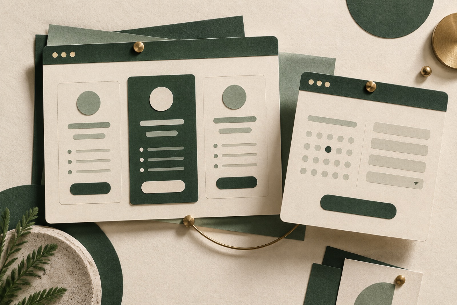
Larklight is a fictional-but-plausible field-service management SaaS: scheduling, dispatch and invoicing for trade businesses of five to fifty people — plumbers, sparkies, HVAC crews. Good product, beloved by its customers, invisible on the web. When their head of revenue called us, the marketing site converted 0.9% of visitors to demo requests and the most common piece of sales-call feedback was "your website didn't really explain what you do."
Eight months later the demo-request rate sat at 2.1% with paid spend flat. This is the story of what we changed, in the order we changed it. The numbers are illustrative, but the shape is real. And the moral is older than the web: nobody buys what they cannot understand.
The challenge
Larklight's site had been assembled in the classic sequence: a founder-written page from 2019, a redesign by committee in 2021, and three years of campaign landing pages duct-taped on top. The symptoms:
- The positioning was a word salad with croutons. "The all-in-one operational backbone for the modern field workforce." We interviewed twelve customers and asked what they'd tell a mate at the pub. Not one used the words "all-in-one", "backbone" or "workforce". They said: "It stops jobs falling through the cracks." There was the headline, gift-wrapped.
- Pricing was a hostage negotiation. Three tiers, a "contact us" enterprise wall, and so many footnotes the table needed its own table. Our research on what thirty pricing pages taught us says confusion is the number-one demo-killer, ahead of price itself.
- The demo form was eleven fields long, including "How did you hear about us?" — a question for the CRM, not the customer — and it asked for a phone number before it asked for a name.
- Measurement was vibes. The team could not tell us which page a closed-won deal had first touched. There was no tracking plan, just a tag manager that had become a junk drawer.
The approach
Positioning first, pixels second. Before any design, we ran a two-week messaging sprint: customer interviews, win/loss calls, a review-mining pass across 400+ app-store and G2-style reviews for Larklight and its four competitors. The output was a single page of positioning: one headline, three jobs the product is hired for, and the five objections every sales call hits. Every page on the new site hangs off that document. Conversion copy is clarity, not cleverness — a hill we will die on, as we've written in our conversion copywriting piece.
A pricing page that treats visitors like adults. We rebuilt pricing around the question buyers actually ask: "What will this cost a business like mine?" The new page opens with a crew-size slider that prices the whole thing in real dollars, in the open — including the enterprise tier, which turned out to be a normal price embarrassed by a "contact us" badge. Every feature footnote was rewritten in trade English ("SMS reminders to customers" not "event-driven comms triggers"). The comparison table survives; the ambiguity does not.
A demo flow with the friction sanded off. The eleven-field form became three fields — name, work email, company size — plus a calendar. Everything else sales wanted moved to a post-booking enrichment step. We also added the thing no competitor had: a recorded four-minute demo, chaptered by job ("see scheduling", "see invoicing"), for the 60% of visitors who arrive at 9pm and will not book a call with a stranger. It is, politely, a funnel piece — as our principal engineer likes to say, the best landing page test is respecting the visitor's timezone.
A CRO program, not a CRO mood. After launch we ran a standing experiment cadence: one test at a time, pre-registered hypotheses, pre-registered kill criteria, minimum two-week runs. The methodology is the whole game — see our field guide to honest testing. Early wins: relocating proof logos beside the pricing table (+14% tier-page progression), and replacing the hero's product screenshot collage with one annotated screen (+9% demo starts). Early losses we honourably buried: an exit-intent offer (killed at day six for annoying precisely the people we liked most).
Instrumentation before celebration. A written tracking plan, server-side where possible, and a weekly revenue-attributed report the leadership team actually reads. No vanity metrics; we report movement, not moments.
The outcome
Measured across the two quarters after relaunch, against the two quarters prior:
- Demo request rate: 0.9% → 2.1% of sessions. Paid spend unchanged. The lift decomposed roughly into: positioning/IA rebuild (about half), pricing page honesty (about a third), demo-flow friction cuts (the rest).
- The recorded demo is watched, to some chapter, by 22% of demo page visitors, and viewers who later book convert to opportunities at 1.6× the rate of non-viewers. The midnight researcher is a real persona; serve them.
- Sales cycle shortened by nine days on web-sourced deals, because prospects arrived already able to describe the product. The website started doing discovery-call work.
- Organic demo requests rose 38% as the new copy gave the site something worth ranking for; the content program that followed is a story for our growth journal.
- Pricing page rage-clicks: zero in the last six months, down from "many". Small metric, enormous morale.
Stack and team
React and TypeScript on Vite, Sanity as the editorial backbone so marketing owns every word post-handover, Cloudflare at the edge. Squad: one strategist, one designer, one engineer, one growth lead — me, in the interests of disclosure — with Larklight's head of revenue in every Friday demo. The engagement model is the one described in how we work.
What we'd tell another SaaS team
Your customers have already written your headlines; go get them. Publish your enterprise price or have a reason, not a reflex. And treat CRO as a program with kill criteria, not a slot machine. If that sounds like your next quarter, look at our SaaS work, browse more case studies, or start a brief.

Copperplate: a design system people actually read
How we rebuilt a dev-tooling company's design system docs around live tokens, do/don't blocks and honest guidance — and doubled adoption in a quarter.
Ledgerline: an accounting firm with opinions, finally visible
A sharp accounting practice had a beige website. We rebuilt the identity and turned forty accountants into a publishing engine with forty-minute weeks.
Marlowe Hotels: winning back the direct booking
A boutique coastal hotel group was paying OTAs a quiet tax on three-quarters of its bookings. We rebuilt the site and booking flow — and the share flipped.