PDP galleries: the eight-image sequence that answers every doubt
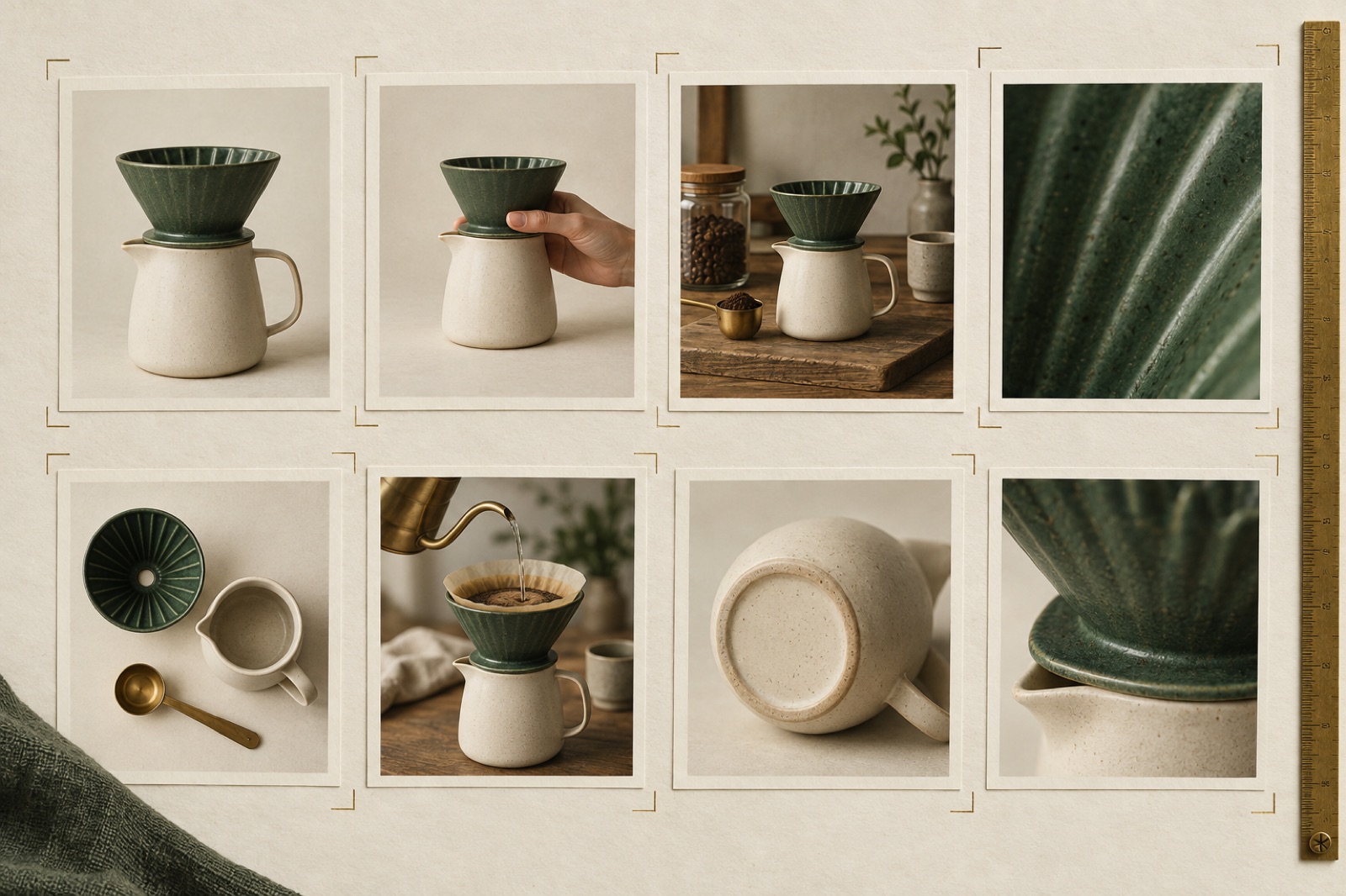
Open any product page and watch where the session recording cursor goes first. Not the title, not the price — the gallery. Shoppers swipe, pinch and scrub their way through your imagery before they read a word of copy, and the verdict they reach in those twelve seconds decides whether the rest of the page gets read at all. The gallery is the busiest, most consequential component on your store. It is also, on most stores, a lazy one: images in whatever order the photographer delivered them, a zoom that fights the customer, thumbnails sized for ants.
We wrote about briefing product photography separately — this is the companion piece about the machine those photographs live in. The component, the sequence, the interactions. What follows is the spec we build from when a gallery has to earn its place on the PDP.
Sequence by doubt, not by camera roll
A gallery is an argument made in a fixed order, and the order should follow the customer's doubts, not the folder structure. For most considered goods, the doubt order is remarkably stable: What is it? How big is it? What does it look like in a life like mine? What's it made of? What exactly arrives?
That maps to an eight-image sequence we've converged on across builds — adjust per category, but the logic holds:
- Hero. Isolated product, honest colour, consistent angle across the catalogue. This image is also your category-page thumbnail, so it must survive being 400 pixels wide.
- Scale. Against a hand, a body, a doorframe, a familiar object. "How big is it really" is the number-one unanswerable question online, and a scale shot answers it silently.
- Context. The product in the life it's bought for — styled, but believably so. This is the aspiration slot.
- Macro detail. Texture, stitching, grain, glaze. The anti-return shot: it answers "is this cheap?" before the doubt fully forms.
- Second context, different setting or user. Broadens the imagined owner; quietly doubles the audience.
- Contents. Everything that arrives in the box, laid out flat. Kills "what's included?" tickets and sets bundle expectations.
- Proof in use. Worn in, poured from, mid-task. Motion implied, not faked.
- The honest shot. The back, the sole, the underside, the care label. The shot that says we have nothing to hide — and the one customers screenshot and send to the group chat.
Notice what's absent: near-duplicates. Two nearly identical angles don't read as thoroughness; they read as padding, and each redundant frame spends the customer's patience before you reach the shots that matter. Eight distinct answers beat fourteen variations of the same answer.
Zoom: magnification is a promise
Every zoom interaction is a promise that closer inspection will be rewarded. Break it and you've told the customer, at the moment of highest scrutiny, that there's less here than meets the eye.
Source resolution is the floor. Serve zoom images at a minimum of 2000px on the long edge, ideally 2800px for textured goods. A zoom that hits a wall of soft pixels at 1.4× is worse than no zoom — it announces that the detail shot was decorative.
Pan, don't magnify-follow, on desktop. The cursor-follow magnifier (the image shifts opposite the mouse) feels clever in demos and disorients in practice: the customer's hand-eye model has to invert. A click-to-zoom that opens a large pan-first view — click to step in, drag to move, click or escape to leave — matches the mental model everyone already has from maps. On touch, pinch is the only acceptable gesture, and freeform: let people settle at 2.3×, don't snap them between preset levels.
Zoom must work on every image, not just the macro shot. Customers zoom the scale shot to read a label. They zoom the contents shot to count items. If images six through eight are served smaller than image one, the promise is selectively broken.
Never trap the page scroll. Scroll-hijacking zooms — the ones that interrupt wheel to magnify — produce rage, not inspection. Zoom on intent: a click, a tap, a keystroke.
The furniture around the image
The frame around your imagery does quiet, constant work:
- Thumbnails on desktop, dots on mobile — and pick one. A horizontal thumbnail rail at 64–88px with a clear selected state (outline, not just opacity) lets customers scan the argument before committing. On mobile, full-width swipe with a position indicator wins; hybrid patterns that show four slivers of the next image mostly show four slivers of confusion.
- Swipe physics should feel like paper. The swipe needs resistance at the ends, no rubber-band trap between slides, and a commit threshold around a quarter of the viewport width so half-hearted drags snap back instead of advancing. Janky swipe physics is the single most common way a premium store reveals it isn't one.
- The keyboard path is the audit trail. Arrow keys advance, escape exits zoom, focus is visible on the thumbnail rail, and the lightbox traps and returns focus correctly. If your gallery fails this, it fails the audit — see accessibility as an engineering practice.
- Alt text is per-image copy, not one string repeated. "Ceramic pour-over set — scale shot with hand" is data for screen readers and for image search; "product image 4" is neither. Write gallery alt text as a sequence, the way you'd caption an exhibition.
Video: one, short, and after the stills
Video in a PDP gallery works under tight discipline. A 15–30 second clip — no sound required, captions or none needed, showing the product in motion — lifts conversion in apparel, footwear, cookware and anything where drape, pour or mechanism is the selling point. What fails: autoplay with audio (open hostility), two-minute brand films in position one (the customer hasn't bought yet — don't show them the victory lap), and video replacing stills, which removes the scrub-fast, compare-fast rhythm that's the entire point of a gallery.
Placement matters: video in slot two or three, never slot one (the hero still is your LCP element and your category thumbnail), and never last, where it never gets seen. Load it lazily, poster-frame it properly, and let it inherit the gallery's swipe order rather than bolting a player underneath.
Performance is part of the design
The gallery is usually the heaviest thing on the PDP, which means it's where your image pipeline either earns its keep or starts leaking revenue — site speed is a merchandising decision, and this is the aisle where it bites.
The rules we hold to: the hero still is the LCP candidate — preload it, prioritize it, and keep it under roughly 150KB at serving size. Everything else lazy-loads with correct srcset per breakpoint. Zoom masters load on zoom intent, never up front — shipping eight 2800px images before interaction is how a PDP ends up heavier than a video game. And reserve space with accurate aspect ratios; a gallery that shifts the buy button twice while loading has measurably fewer buys.
We put all of this to work on GLADE's skincare storefront, where the macro texture shot had to carry the entire "nothing to hide" positioning — the gallery wasn't supporting the brand claim, it was the brand claim. When the imagery is the argument, the component that sequences and serves it is brand infrastructure, sprayed with the same care as the logotype. That standard is what our e-commerce practice builds by default.
Key takeaways
- Sequence the gallery by the customer's doubt order: hero, scale, context, macro, contents, proof, honesty. Cut near-duplicates ruthlessly.
- Zoom is a promise of detail. Serve real resolution, use pan-on-zoom for desktop and freeform pinch on touch, and never hijack the page scroll.
- Thumbnails on desktop, swipe with dots on mobile, keyboard nav everywhere, per-image alt text.
- One short silent video, in slot two or three — never first, never in place of stills.
- Preload the hero, lazy-load the rest, load zoom masters on intent, and reserve layout space so the buy button never moves.
FAQ
How many images is too many? Past about ten, engagement per image falls off a cliff and the gallery starts reading as noise. We'd rather see eight images that each answer a distinct question than fourteen that answer six. If you genuinely have more to show — colourways, configurability — that's a variant swatch problem, not a longer gallery.
Should the gallery show 360° spins? Rarely. Spins feel impressive in the boardroom and behave badly on phones: heavy payloads, awkward touch conflicts with swipe, and a dwell time cost most shoppers won't pay. A good macro shot plus a short video answers the same question cheaper. The exception is genuinely dimensional products — furniture, luggage, equipment — where the back is as important as the front.
Do customers actually use zoom? On textured and sized goods, yes — session data consistently shows zoom engagement correlating with purchase, which is the point: inspection behaviour is buying behaviour. Customers who zoom are trying to own the product in their head. Make that easy.
What about user-generated photos in the gallery? Excellent as a complement, dangerous as a substitute. A "from our customers" section below the fold, or a tagged slot at the end of the sequence, adds social proof with genuine texture. Interleaving UGC through the core sequence muddies the argument and the colour consistency that makes a catalogue feel trustworthy.
The cart is a negotiation, not a spreadsheet
Cart UX that closes: drawer vs page economics, threshold cues done honestly, gift and quantity design, save-for-later rituals, and mobile-first cart anatomy.
Cart drawer or cart page? Stop guessing
The drawer-vs-page argument is a measurement problem, not a taste debate. The decision framework, drawer anatomy, cross-sell discipline and what to track.
Designing for the gift buyer, not just the fan
Gift buyers are a different user with different anxieties. Gift finders, delivery-date honesty, card messages and the Q4 checklist done right.