The ninety-minute heuristic review
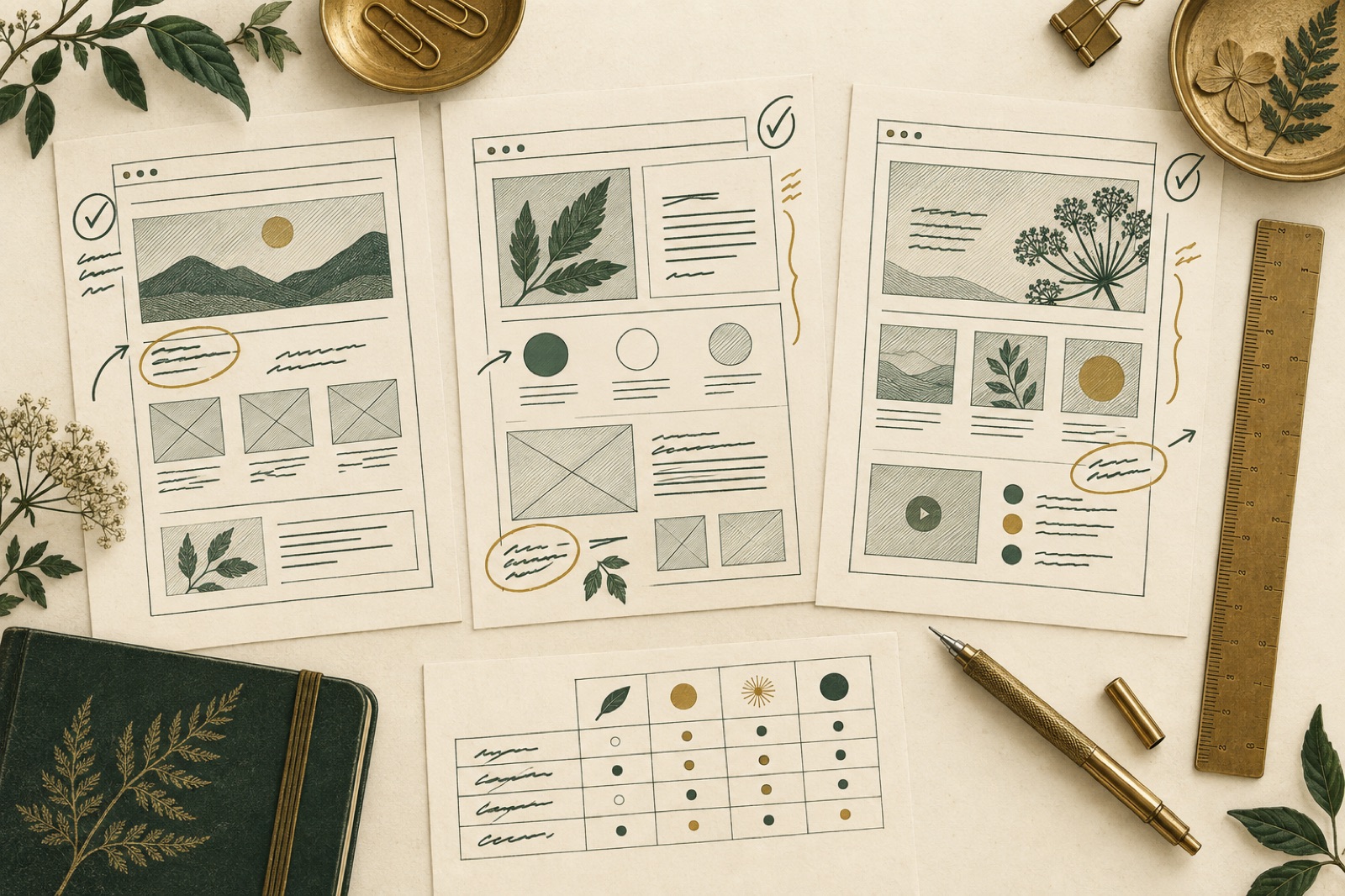
Most marketing sites have never had a conversion review. They've had redesigns — expensive, opinion-driven redesigns — but nobody has ever sat down and systematically asked whether the homepage explains what the company does, whether the pricing page answers the questions buyers actually ask, or whether the contact form demands three fields of commitment before a stranger is ready to give one. The usual excuse is traffic: "we can't A/B test anything, we don't have the numbers." Which is true, and irrelevant. You don't need statistics to find what a structured expert review finds in an afternoon.
This is the review we run at the start of most growth engagements: a ninety-minute heuristic evaluation of a marketing site against a fixed rubric. It's not the same as our heuristic CRO audit, which walks whole funnels on mature products. This is the faster, sharper instrument for sites that aren't ready for an experimentation programme — the five-to-ten-page marketing site of a company whose next funding round, hire or sales quarter depends on the website doing its job.
Why marketing pages need their own rubric
Generic usability heuristics — Nielsen's ten, various shards of ISO standards — were built for applications. They ask about error prevention and user control, which matter enormously in a dashboard and almost not at all on an about page. A marketing page has a different job: it must convince a skeptical stranger, in seconds, that continuing is worth their time. So its failure modes are different. Marketing pages rarely fail because a control is unlabelled. They fail because:
- The headline says "Reimagining tomorrow's workflows" instead of what the product does.
- The only proof on the page is a wall of logos the visitor has never heard of.
- The call to action asks for a demo before the page has earned one.
- Nothing on the page could not be said by every competitor.
Our rubric has four lenses, each with five statements a reviewer scores. Twenty scores per page, and the whole thing fits on one sheet.
The rubric: four lenses, twenty statements
Clarity — does a cold visitor get it?
- A first-time visitor can state what the company does, in one sentence, within five seconds of the hero loading.
- The page names who it is for — explicitly or through unmistakable examples.
- Every section heading survives being read alone, in sequence, as a table of contents.
- The next action is visible and unambiguous at every scroll depth.
- Zero jargon that the target customer wouldn't use about themselves.
Proof — why should anyone believe it?
- Every claim of fact ("2.3× faster onboarding") carries evidence or a source on the page.
- Social proof is specific: named companies, attributable quotes, real numbers — not "trusted by teams everywhere".
- The page shows the thing — screenshots, video, live demo — rather than describing it in adjectives. (The craft of presenting that proof without tipping into cringe is its own discipline; see social proof design without the cringe.)
- Proof appears near the claim it supports, not quarantined on a testimonials page.
- The most skeptical question a buyer would ask is answered on the page, not in a sales call.
Friction — how hard is it to say yes?
- The primary call to action matches the visitor's likely commitment level (a "read the docs" link converts more cold traffic than "book a demo" at this stage).
- Every form field earns its place; nothing is asked that wouldn't change the follow-up.
- Pricing, or an honest reason pricing is withheld, is findable within two clicks of anywhere.
- The page works — fully — on a 375px phone over hotel wifi.
- There is exactly one thing being asked of the visitor per section.
Trust — does this feel like a real company?
- Real humans are visible: names, faces, a physical address, a point of view.
- Trust marks are genuine and specific, not clipart shields.
- The site's dates are alive — a changelog, journal or careers page that proves someone is home.
- Legal, privacy and security pages exist, load, and are written in the same voice.
- Nothing on the page is contradicted elsewhere on the site (the oldest lie detector in the business).
The ninety minutes, minute by minute
The format matters as much as the rubric. Longer, and it becomes a consulting engagement. Shorter, and reviewers start skimming. We run it with three people: one who knows the business, one who has never seen the site, one scribe.
Minutes 0–10 — Set the stranger loose. The fresh-eyes reviewer explores the site cold, narrating aloud, starting from a Google-style entry (search the brand name plus the category — that's how real visitors arrive). The scribe records verbatim quotes. "Wait, is this for me or for IT departments?" is worth more than any score.
Minutes 10–50 — Score the pages. Pick the four pages that carry the commercial weight — usually homepage, pricing, one service or product page, and the conversion page (contact, signup, demo). Each reviewer scores every statement 0, 1 or 2: 0 for "fails outright", 1 for "present but weak", 2 for "genuinely strong". No half points, no discussion during scoring — disagreement is data, and you'll resolve it in the debrief. That's twenty scores per page per reviewer; brisk but doable.
Minutes 50–70 — Debrief the disagreement. Sort by score variance first, not by average. A statement scored 0 by one reviewer and 2 by another is a finding — it means the page works only for people who already understand it. Agree on a reconciled score; note who was surprised.
Minutes 70–90 — Turn scores into a fix list. Every statement scoring below 1.5 generates a candidate fix. Each candidate gets two ratings from the group, one to five: expected impact and effort. Plot them, take the high-impact low-effort quadrant, and that's your next sprint.
What the scores tell you (and what they don't)
Aggregate numbers are for communication, not precision. A page scoring 18 out of 40 is not "45% good". But patterns across the four lenses are diagnostic. In our experience across dozens of B2B and service sites:
- Clarity high, Proof low — the classic agency-built site. Beautiful, articulate, evidence-free. The fixes are content work: customer stories, real numbers, showing the product.
- Proof high, Friction high — the enterprise legacy site. Great case studies buried behind a form that asks for your revenue band and phone number before you can read a whitepaper. The fixes are subtraction.
- Everything mediocre — usually a governance problem, not a design one. The site was built by committee and no single person has owned it since. A rubric score gives that person a mandate.
What the scores can't do is tell you how much a fix is worth in revenue, or predict the winner between two genuinely different directions. That's what experiments are for — and when the site graduates to real traffic, the fix list from this review becomes the seed of a proper testing programme, with the low-scoring statements as its first hypotheses.
The failure modes to avoid
Three ways teams ruin a good instrument. First, scoring alone. Single-reviewer rubrics produce one person's taste dressed as data. The disagreement in the debrief is the product. Second, fixing everything. A rubric that yields forty fixes yields none; the impact/effort triage exists because attention is the scarce resource. Third, running it once. The review takes ninety minutes. Put it in the calendar quarterly, keep the old score sheets, and the trend line becomes the most honest measure of whether the site is actually improving — far more honest than a redesign anniversary.
Key takeaways
- You don't need test-level traffic to improve a marketing site. A structured expert review finds what duplication of effort and committee design leave behind.
- Use a rubric built for marketing pages: clarity, proof, friction, trust — five scored statements each, 0–2, no half measures.
- Three reviewers, ninety minutes: ten of cold narration, forty of independent scoring, twenty of debrief, twenty of triage.
- Sort the debrief by disagreement, not average. Variance is where the real findings live.
- Scores diagnose patterns (evidence-free, friction-heavy, committee-flat) — they don't price fixes. Ship the quick wins; graduate the contested questions to experiments when traffic allows.
FAQ
How is this different from a heuristic CRO audit? Depth and stage. The CRO audit walks complete funnels with severity scoring and confidence tags, and it's aimed at products that can experiment. This review is a fast rubric for marketing pages of companies that can't — yet. Run this first; it often creates the conditions (a higher baseline, a sharper backlog) that make the full audit worthwhile.
Who should the three reviewers be? One insider, one genuine stranger, one disciplined scribe. The stranger matters most — recruit someone from a neighbouring team, a friendly customer, or a peer at another company. The worst panel is three people who built the site.
Should we use it on our own site, or hire someone external? Self-review works surprisingly well with the rubric because the scores force structure. What you lose is the cold-narration pass — you cannot un-know your own product. Our compromise: self-score, but borrow an outsider for the first ten minutes.
How often should we re-run it? Quarterly is the sweet spot, and always before briefing a redesign. More often than quarterly and you're measuring noise; less often and the rubric becomes a design opinion rather than a trend.
What score should we aim for? In our reviews, pages below 24 out of 40 have obvious commercial leaks; most good-but-unglamorous B2B sites sit at 28–34; we have never scored anything above 36, because perfection is not what the 2s are for. Aim to raise your lowest lens by two points per quarter, not to max the sheet.
Need a harder look at your site than your calendar allows? This review is the first thing we run in most growth engagements — ninety minutes, one rubric, a fix list you'll actually ship. Tell us about your site.
Audit first, test second: heuristic CRO that finds the free wins
Before your next A/B test, walk the funnel as a stranger. Our heuristic CRO audit method: the friction walkthrough, severity scoring, and fixes that don't need stats.
Landing page testing: velocity over genius
A landing page experiment programme that compounds: message-match first, structural swings second, a backlog scoring model that survives meetings, and kill criteria.
A/B testing statistics for people who ship
Reading A/B tests honestly: minimum detectable effects, the peeking problem, novelty effects, segment traps, and the decision log that ends the arguments.