Colour systems that survive dark mode and rebrands
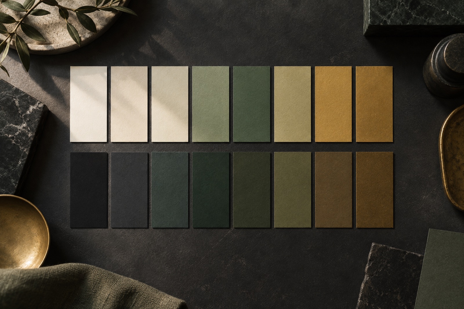
Every designer has shipped a colour palette they were proud of, then watched it shatter. The trigger is usually one of two events: marketing asks for dark mode, or the brand team announces a refresh. In the best case you spend three sprints find-and-replacing hex values. In the worst case — and I have audited this worst case at two different clients — the rebrand stalls for a quarter because nobody knows which of 340 hard-coded #2e6b47 values mean "primary action" and which mean "the intern liked this green."
A colour system that survives is not a bigger palette. It is a smaller set of decisions, expressed in the right order. This is the architecture we now install by default at Brassfern — the same one underpinning the token pipeline we described in design tokens that survive contact with engineering. It has lived through a full rebrand at Copperline Mutual and a dark-mode launch at Meridian Climate without a single line of component code changing.
Literal palettes are a loan against the future
The instinctive way to build colour is the way Figma invites you to: swatches named green/500, green/600, blue/500. This is a literal palette — colours named after what they look like. It feels organised because it mirrors how paint is sold. It is also a trap, for three reasons.
The names carry no intent. When a new designer needs a background for an empty state, green/100 tells them nothing. They guess. Multiply the guessing by forty people and eighteen months and you have a product where five different tints of the same hue each mean something slightly different, and no one can delete any of them safely.
Dark mode becomes a second palette. The lazy dark mode is a hand-built inversion: someone duplicates the file, dims the whites, and now every future design decision must be made twice, in two files that drift apart within weeks. We have inherited codebases where dark mode was 900 lines of overrides. That is not a theme; that is a parallel product.
A rebrand invalidates everything. If your brand green moves from forest to fern — as happens when a company grows up — every token named after green is now a lie. You either rename 400 tokens (a breaking change everywhere) or live with green/500 that renders a colour that is not green, which is how #brandGreen: #c94f2e ends up in production, and I wish I were joking.
The three-layer architecture
The fix is to refuse to let components touch raw colour at all. We build colour in three layers, and each layer can only reference the one beneath it.
Layer 1: Primitives. The raw paint. fern-400, brass-600, ink-900. These exist so a human can see the full gamut and so the layers above have something to resolve to. Nothing in the product ever references a primitive. Treat them like private class members.
Layer 2: Semantic tokens. Colours named for their role: surface/base, surface/raised, text/primary, text/muted, action/primary, action/primary-hover, feedback/danger. This is the entire vocabulary a UI is allowed to speak. The list is short — our typical system has 35 to 50 semantic tokens — because adding a semantic token is a design decision, not a palette decision. When a designer asks for a new tint, the question isn't "which hex?" it's "is this a new role, or an existing role you haven't noticed?"
Layer 3: Theme mappings. A theme is just a table that says what each semantic token resolves to. Light theme: surface/base → paper-50. Dark theme: surface/base → ink-950. A rebrand: swap the mappings to the new primitives. The components — which only ever speak semantic — do not know anything happened.
/* Themes resolve semantics to primitives. Components never see this file. */
[data-theme='light'] {
  --surface-base: var(--paper-50);
  --text-primary: var(--ink-900);
  --action-primary: var(--fern-500);
}
[data-theme='dark'] {
  --surface-base: var(--ink-950);
  --text-primary: var(--paper-100);
  --action-primary: var(--fern-300);
}

/* The only colour rules in the whole component library. */
.card { background: var(--surface-raised); color: var(--text-primary); }
.button { background: var(--action-primary); }
That is the whole trick, and it is embarrassingly simple. The discipline is in the governance: a lint rule that fails CI on any raw hex in a component file. Without the lint rule you are running on trust, and trust loses to deadlines every time.
Build ramps on perception, not arithmetic
The primitive ramps underneath are where most systems quietly go wrong. Designers (and most token generators) build ramps by stepping lightness evenly: 10% lighter, 10% lighter. The result looks mechanical because human vision is not linear — a 10-point lightness step at the pale end of a ramp is barely visible, while the same step in the murky middle is a chasm.
We build ramps in OKLCH, which models perceived lightness, and we tune by eye at three checkpoints: where the ramp meets white, where it meets black, and where the primary brand value sits. Then — and this is the part people skip — we define contrast pairs as part of the token itself: action/primary always ships with action/on-primary, and the pair is contractually guaranteed to hit WCAG AA. When the brand ramp changes in a refresh, we re-check the pairs, not the pages.
Two practical rules we hold to:
- Ramp steps should hold their spacing when converted to greyscale. Squint-test friendly. If two adjacent swatches merge when the hue drains away, they were never two steps.
- Never use more than four steps of a hue in one screen. If a designer needs a fifth step, the information hierarchy has a problem that colour will not fix.
Dark mode is a design problem, not an inversion
With semantic layers in place, dark mode is no longer a technical threat — but it remains a craft problem, because "the same roles, darker" is not legible design. The failure we see most often: a dark theme where everything is flat, because the light theme expressed elevation with shadows, and shadows go invisible on near-black backgrounds.
Our dark-mode checklist, from the Meridian Climate work, where researchers read emissions dashboards in unlit field offices:
- Elevation moves to lightness, not shadow. In dark mode, raised surfaces get lighter, layered like paper under a lamp.
surface/raisedsits 4–6 points abovesurface/basein OKLCH lightness. Borders do the work shadows used to do. - Desaturate the big fields. A fully saturated brand colour that glows pleasantly on a small button will vibrate horribly as a full-bleed hero background in a dark room. Dark theme primitives drop chroma by 15–25% on large surfaces.
- True black is for OLED marketing pages, not products.
#000000backgrounds smear on scroll and make light text bloom. We floor dark surfaces aroundink-950— near-black with the warmth of the brand still in it. - Re-check every chart, map and diagram. Data visualisation palettes built for paper-white die on charcoal. This is why Meridian's chart tokens live in their own semantic group (
chart/series-1…chart/series-8) with per-theme mappings, so the dark theme could shift the series hues rather than just dimming them. - Ship
prefers-color-schemesupport, but always offer the manual toggle. People working at 2am next to a sleeping partner have Opinions, and they are right to.
Surviving the rebrand
The Copperline Mutual rebrand was the real trial: a community bank moving from a dated maroon to a warm copper-and-eucalyptus identity, across a marketing site, an internet banking app and forty email templates. Because the whole stack spoke semantic tokens, the rebrand was a primitive-swap and a contrast re-audit — design work, not archaeology. The banking app's component code changed zero lines. Not as a stunt; we checked the diff.
What made it survivable was boring governance: one source of truth for tokens, exported mechanically and reviewed as a pull request — the exact pipeline in our tokens article. Colour systems don't die from bad taste. They die from drift, and drift is an infrastructure problem wearing a design costume.
If you're starting a brand identity engagement this year, ask whoever is doing it one question: "Show me the semantic layer." If the answer is a wall of green/500, you are buying a rebrand that cannot be rebranded.
Key takeaways
- Literal palettes (
green/500everywhere) fail at dark mode and at rebrand time because the names encode appearance, not intent. - Use three layers: primitives (raw paint), semantic tokens (roles), theme mappings (the resolution table). Components only speak semantic.
- Keep the semantic set short — 35 to 50 tokens. Every addition is a design decision.
- Build ramps in OKLCH, eyeball-tuned, and ship text/background pairs with a contractual AA guarantee.
- Dark mode is not an inversion: elevation becomes lightness, big fields desaturate, and charts get their own per-theme tokens.
- Enforce it with a lint rule. Trust loses to deadlines.
FAQ
How many colours should a brand system have? Fewer than you think. Our median system ships with 6 hue ramps of 8–10 steps each, resolving to under 50 semantic tokens. If you have 200 semantic tokens, you don't have a system — you have a thesaurus.
Should dark mode be automatic or manual? Both. Default to prefers-color-scheme, expose a toggle, and store the choice. Respect prefers-reduced-motion for the theme transition itself while you're at it — an unanimated colour swap is correct behaviour, not a missing feature.
Do we need OKLCH, or is HSL fine? HSL is workable if you hand-tune every step, but its "lightness" lies: hsl(60, 100%, 50%) yellow and hsl(240, 100%, 50%) blue are worlds apart perceptually. OKLCH makes spacing honest by default, and browser support is no longer an argument against it.
What about brand colour in third-party embeds? Embed them inside a surface/raised container with your own border and padding, and let the embed keep its own colours. Wrestling a third-party widget into your palette produces the uncanny valley of branding — close enough to look wrong.
Focus states are a design system feature, not a browser default
Stop inheriting the browser's focus ring. Design it: tokens, 3:1 contrast on every surface, dark-theme variants, and the overrides that silently break keyboards.
Dark mode is a second design system
Treating dark mode as a CSS inversion is how you ship a grey smear. Design dark themes as a second, deliberate system — tokens, elevation, contrast, CI tests.
Focus-visible: designing the ring, not removing it
Keyboard focus styles are a design problem most teams delete instead of solve. How to design focus rings that are visible, beautiful and part of the identity system.