Skeleton screens that don't flash and lie
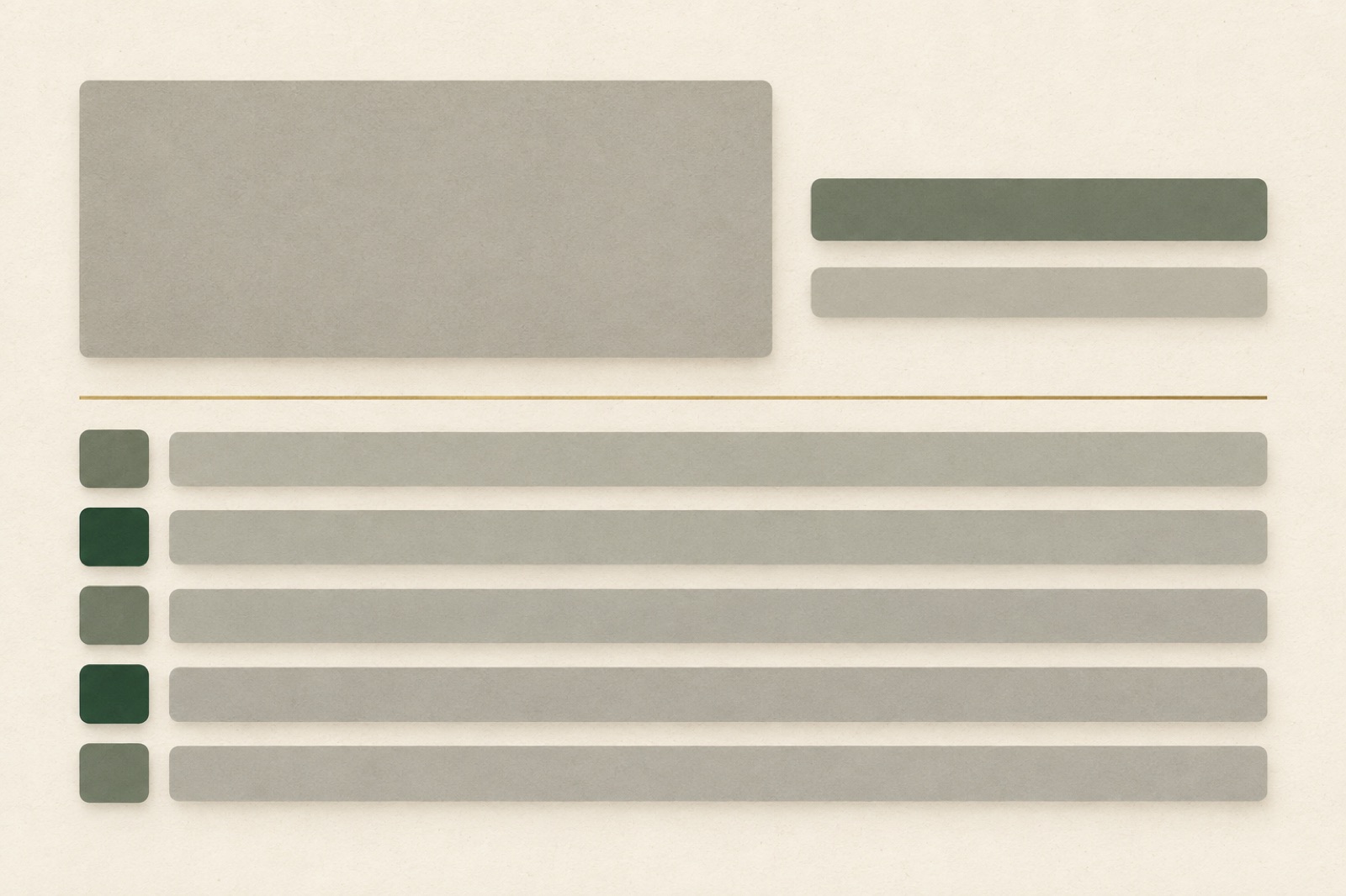
The skeleton screen has a PR problem of its own making. Ten years ago it was the civilised alternative to the spinner: show the shape of what's coming and waiting stops feeling like waiting. Then somewhere along the way "skeleton" became a generic shimmer rectangle slapped over any region that fetches data, and the device quietly turned into a spinner with a design team's signature on it. The gap between those two outcomes is entirely a matter of craft, and craft is checkable.
We've written before that perceived performance is a design material — this is the deep cut on one material, with the rules we actually hold in reviews.
A skeleton is a promise of structure
Everything follows from one definition: a skeleton is a promise about the shape of the content that's coming. Users read it subconsciously — five rows of blocks mean five list items; a tall rectangle beside two short lines means a card with title and meta. When the promise is kept, the brain treats the load as "already half-arrived" and subjective wait time drops measurably. When the promise is broken — a card grid replaced by one giant shimmering slab, three rows that resolve into seventeen — the device backfires: users now wait and recalibrate. Broken promises feel slower than honest spinners.
So the first audit questions are shape questions:
- Count. How many items will actually arrive? If the answer is "between zero and forty," don't guess three rows — show a count you control ("Loading 12 invoices…") or fall back to a spinner.
- Proportion. Skeleton blocks should sit at the real aspect ratios. A 16:9 hero placeholder that resolves into a 4:5 image is layout shift wearing a costume.
- Position. Same grid, same columns, same spacing. The entire value of a skeleton is that eyes and cursor can already rest where the content will be.
The flash: skeletons for things that weren't slow
The most common failure isn't a bad skeleton — it's a skeleton at all. If content reliably arrives within ~200–300ms (a cached route, a prefetched page, an optimistic local write), rendering a skeleton produces a strobe of grey that subjectively lengthens the load. Users read the flash as "something big just churned."
The fix is a display gate: render nothing for the first 200–300ms, then the skeleton only if the fetch is still outstanding. Under the threshold, humans don't perceive a gap — the brain forgives a blink far more readily than a flicker. Network-complete-in-180ms renders feel instant; network-complete-in-180ms-after-a-120ms-skeleton-flash feel janky. Same milliseconds, opposite verdicts.
Implement it as a hook-level concern, not sprinkled per component: useDelayedLoading(promise, 250) that only reports isLoading: true after the gate. One place, testable, and it becomes impossible for a fast path to accidentally flash.
Pair the gate with a minimum dwell: once a skeleton has appeared, hold it at least 400ms so it reads as a state rather than a rendering artifact. Gate on the way in, dwell on the way out.
Shimmer: restraint or nothing
The shimmer sweep is decorative motion, and decorative motion has to earn its keep — the house rule from motion that earns its keep applies double here, because the shimmer plays while the user is already impatient. Our defaults:
- Pulse, don't pan. A subtle opacity pulse (100% → 55% → 100%, ~1200ms, ease-in-out) communicates "alive, working" without implying progress that doesn't exist. A panning highlight implies left-to-right advancement — a lie, unless you actually have progress data (in which case use a progress bar).
- One animator per region. Twenty skeleton blocks each running their own shimmer with random phases looks like a disco. Synchronise, or stagger by a fixed small offset.
- Static is respectable. A correctly-shaped, perfectly still skeleton beats a shimmering one in most contexts. Motion is an emphasised claim; don't emphasise "please wait."
And the non-negotiable: prefers-reduced-motion receives the static skeleton. Full stop. This is the easiest accessibility win in the entire pattern and the one most often skipped.
Layout shift is the skeleton's way to lie
A skeleton that reserves the wrong space is a CLS generator with good intentions. Two rules close the hole. First: the skeleton and the content share the same box. Render the skeleton inside the container that will hold the content, sized by the same grid and aspect-ratio declarations — not as an absolutely-positioned overlay that happens to look right at one viewport. Second: skeletons must never push. If the skeleton occupies 400px and content needs 640px, you built a layout shift, not a loading state. When final height is unknowable, reserve for the minimum and let content grow downward — never upward, never into already-rendered content. The Core Web Vitals field guide has the engineering side; the design side is simply: measure the skeleton, don't eyeball it.
When to choose something else entirely
Skeletons are not the only loading state, and reach for them only when all three hold: the layout is known in advance, the wait is usually 300ms–3s, and the content loads as one batch. Otherwise:
- Spinner for short algebra-free waits in compact spaces (buttons, inline validation), where drawing a skeleton would itself be the flash.
- Determinate progress for genuinely long, staged work — uploads, imports, report generation. If you have real progress, show real progress. A skeleton held for 12 seconds is a hostage situation.
- Optimistic UI for interactions that don't deserve a wait at all — tick the task, like the post, apply instantly, reconcile behind the scenes. The integrity contract lives in optimistic UI, with integrity: optimism only where failure is rare, reversible and visibly recovered.
- Stale content with a freshness indicator beats every loading state when you have last-visit data. Showing yesterday's dashboard with a quiet "updated 9:41" chip is faster than any placeholder ever rendered.
The decision tree is short enough to print on a card, and it belongs in your design system next to the component itself — our broader treatment of why these states carry your product's reputation is in empty, loading, error.
Measuring whether it worked
Loading-state design is testable like anything else. Three numbers tell the story: CLS per route (skeletons should contribute zero), a time-to-first-useful-reading you define per template, and the qualitative check — screen-record real loads on throttled connections and watch for flashes, jumps and double takes. On a recent website engagement for a media client, gating the skeleton flash below 250ms and switching pan to pulse moved the "site feels fast" score in moderated testing from 61% to 84% with zero change to actual load times. The server did nothing. The waiting got designed.
Key takeaways
- A skeleton is a promise of structure: match count, proportion and position to the real content, or don't use one.
- Gate skeletons ~250ms on the way in to prevent flash; hold ~400ms minimum once shown.
- Pulse beats pan; synchronise animators;
prefers-reduced-motiongets a static skeleton. - Share one box between skeleton and content, reserve minimum height, grow only downward — zero CLS contribution is the success metric.
- Choose the right state for the wait: spinner under it, progress bar over it, optimistic UI instead of it, stale content before it.
FAQ
How long is too long for a skeleton? Past roughly 3–5 seconds users stop reading a skeleton as "loading" and start reading it as "broken." If p50 load exceeds that, fix the load or switch to staged/progressive rendering where the top of the page is real content, not placeholder.
Should skeletons include text like "Loading…"? Only where ambiguity hurts. Assistive tech needs an aria-busy region and a polite announcement, but visually the shape usually speaks for itself. The exception is unknown-item-count lists, where a count ("Loading 12 invoices") beats a row-count guess.
Do we skeleton images? Images want aspect-ratio boxes and progressive loading (dominant-colour placeholder → full), not shimmer blocks with image icons. The placeholder should resemble the image, not announce it.
Isn't this over-engineering a loading spinner? The loading state is the UI your users see exactly when trust is most fragile. Teams that treat it as an edge case ship interfaces that feel slower than they are — and "feels slow" costs the same as "is slow," only harder to fix later.
Want loading states that feel as fast as they are? That's the sort of thing we sweat on every product and website build — tell us what you're shipping.
Perceived performance is a design material
Perceived performance is designed, not just engineered: skeletons, optimistic UI, progressive images, zero layout shift and the choreography of waiting states.
Scrollytelling with restraint: narrative pages that respect the scrollbar
The production playbook for scrollytelling that earns its keep: a one-pin budget, chapter navigation, a designed reduced-motion variant, and a print-test honesty check.
Reading progress indicators: craft or clutter?
The reading progress bar is the most faked detail on the web. The honest version: when long-form needs one, how to build it without jank or lies, when to skip it.