Aiko Tanaka
Prototype first, argue later. Keeps a museum of deleted features she is quietly proud of.
- Role
- Senior Product Designer
- Based
- Wellington
- In the journal
- 49 articles · 9 case studies

The Corrowong Trust: an archive people actually browse
How we rebuilt a regional museum group's 180,000-item digital archive around wandering instead of database forms — and made it funding-proof.
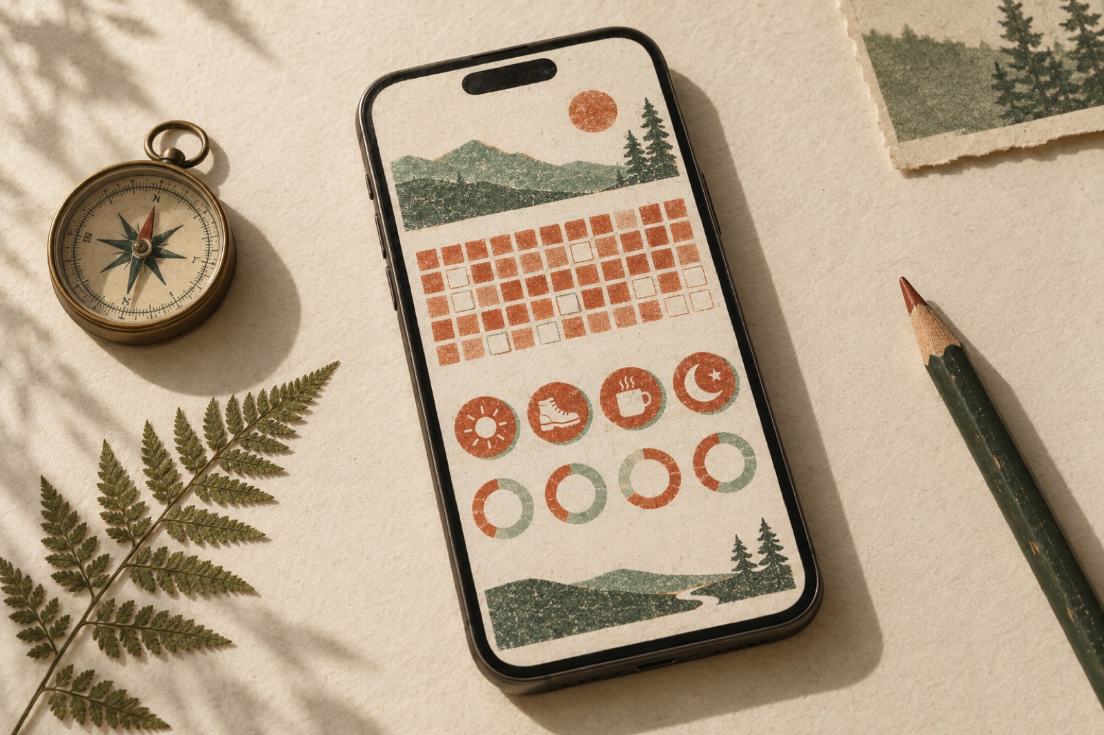
Trailswell: habit tracking without the guilt trip
Habit apps run on guilt. Trailswell wanted the opposite: a tracker that celebrates calmly, treats lapses honestly, and survives week three.

Harvest Loop: logistics dashboards for a food-rescue charity
A driver app and donor dashboard for a food-rescue charity — built for cracked Android phones, volunteer patience and funders who reply with 'prove it'.

Kowa Health — unifying nine clinics onto one patient platform
Nine NZ primary-care clinics, five booking systems and a phone-heavy queue, unified into one patient portal co-designed with the receptionists who run it.
Prairie Mutual: claims that take six minutes, not six phone calls
A regional insurer replaced a fourteen-page claims PDF with a six-minute guided flow — and 'where is my claim?' calls fell by more than a third.
Quill Legal: a document platform lawyers actually enjoy
A legal-tech SaaS had a brilliant document-automation engine trapped in a 2016 UI. We redesigned the product end-to-end and shipped its design system, Precedent.

Keepsake: pressing letters into pixels
A letterpress stationery configurator built from layered SVG: live paper, ink and edge-paint previews, transparent pricing per option, and a shareable design link.

Arlo & Sons: a tradies marketplace that earned trust slowly
How we rebuilt a two-sided trades marketplace around verified work: comparable quotes, review integrity, trade-side dashboards and onboarding that favours patience.

Pylon Health: telehealth that treats anxiety as a UX problem
How Brassfern rebuilt Pylon Health's telehealth booking flow around patient anxiety — plain-language triage, an honest waiting room, and dropouts that heal.
How long should the answer be? Right-sizing LLM output
Answer length is a product decision, not a model default. Per-surface budgets, summary-detail layering, and evals that treat 'too long' as a failure.
Hover states with purpose
Hover is the most abused state in interface design — decoration where it should teach. A taxonomy of hover states that do a job, plus the focus-parity rules.
Prototyping with AI: where it speeds design and where it rots it
Field notes on AI-assisted prototyping: real speed in code exploration, hallucinated-component traps, prompt libraries for layout, and a provenance rule for files.
Bottom sheets that don't fight the user
When a bottom sheet beats a modal on mobile web: drag affordances, scrim honesty, snap-point logic, keyboard and screen-reader behaviour, and anti-patterns.
Personalisation vs privacy: drawing the line deliberately
Draw the personalisation privacy line before legal does: on-device and anonymous patterns, explainable personalisation, and consent UX that actually means something.
Multimodal inputs: the upload box is a trust surface
File, image and audio uploads are where AI features win or lose trust. Design limits, preprocessing transparency, privacy prompts and honest errors for multimodal UX.
Command palettes: patterns for the Cmd-K era
When a Cmd-K palette earns its complexity: ranking that beats fuzzy match, mixing actions with navigation, keyboard ergonomics, discovery and mobile equivalents.
AI triage for support: routing, not deflecting
AI support triage should route customers, not wall them off. Intent detection that errs toward humans, handoff packages, and the deflection metric trap.
Keep your pages findable by Ctrl-F
Virtualisation silently breaks in-page search. The hidden=until-found and content-visibility toolkit, chunk-rendered long lists, and when a custom find box earns its keep.
Focus-visible: designing the ring, not removing it
Keyboard focus styles are a design problem most teams delete instead of solve. How to design focus rings that are visible, beautiful and part of the identity system.
The prompt box is your whole interface — design it like one
An empty prompt box teaches nothing. Placeholder pedagogy, suggestion chips, command discovery and attachment UX that make AI assistants learnable.
Skeleton screens that don't flash and lie
Skeleton UI done honestly: match the shape of the answer, gate the flash, respect reduced motion, and know when a spinner or optimistic UI beats a skeleton entirely.
When the AI says no: moderation UX
Every generative AI feature eventually refuses a user, and most refusals are dead ends. Designing blocked, revised and appeal states that preserve dignity.
Onboarding users to an AI assistant
First-run design for copilots: capability discovery without homework, starter prompts that teach, mental-model calibration, and measuring adoption honestly.
When the model is wrong: designing failure states for AI features
AI failure is a design state, not an exception. Wrong-answer UX, graceful degradation tiers, feedback that improves the system, and copy that keeps trust intact.
Showing the swarm: status UX for multi-agent systems
Multi-agent features bury users in log firehoses or leave them staring at a spinner. Designing step summaries, cost displays, interruption and failure narration.
Settings IA: where features go to be findable
Settings screens are where growing products quietly drown. Grouping by user intent, search-within-settings, destructive zoning and how to migrate categories safely.
Comparison tables: the marketing page's hardest-working table
Feature matrices carry your pricing argument. Honest checkmarks, mobile collapse patterns, the competitor-row dilemma, and the semantics most teams skip.
The highest-traffic UI nobody designs: forms
Forms are the most-used, least-designed UI on the web. A practitioner's guide to labels, validation timing, error copy, autofill and mobile keyboards.
Drag handles, sliders and the affordance problem
Draggable UI fails quietly: nobody drags, keyboards can't, layouts forget themselves. How to build handles and sliders that people actually find, use and keep.
Fluid type scales in practice: from ratio to tokens
How we build fluid type scales that behave from 375px to 1440px: ratios, clamp() mechanics, optical correction, and type tokens that stay readable a year later.
Print stylesheets: the forgotten design surface
Most web teams ship print CSS by accident. Here's @media print done properly: receipts, itineraries, tickets, page breaks, link URLs, and testing without a printer.
Size and fit UX: the returns you can design away
Fit is apparel's most expensive doubt. Comparison sizing, fit feedback loops, measurement photography, and the metrics that prove a size tool actually reduces returns.
Sticky elements that don't annoy anyone
Sticky headers, bars and CTAs must pay rent for the viewport they occupy. Height budgets, scroll-directional chrome, and the focus traps behind sticky UI.
When the model fails: fallback UX for LLM features
LLMs fail — slowly, confidently and at the worst times. How to design degradation tiers, honest error states and timeouts that keep users' trust intact.
Maps on the web: restraint and alternatives
A map is the most expensive component on most sites — in kilobytes, attention and accessibility. When a map earns it, how to design one that doesn't, and when a list wins.
Cancellation flows that leave the door open
Offboarding is a trust surface: retention offers without traps, exit surveys that yield signal, data-export dignity, and win-back timing that works.
Command palettes: the 200-millisecond product tour
A command palette done well is a 200-millisecond product tour. Ranking heuristics, forgiving fuzzy match, keyboard ergonomics, and when a palette is a crutch.
Accessibility starts in the design file
Most accessibility rework is a design-file problem found too late. The annotations, contrast workflows and focus specs that stop retrofits before they start.
Agent UX: designing for delegation, not magic
Agentic features fail when they promise magic. The interface patterns we use instead: scope setting, visible progress, checkpoints, undo and earned autonomy.
Search on storefronts: the shopper's shortcut
Storefront search is where high-intent shoppers confess what they want. Instant results, synonym curation, zero-results recovery and honest measurement.
Cart drawer or cart page? Stop guessing
The drawer-vs-page argument is a measurement problem, not a taste debate. The decision framework, drawer anatomy, cross-sell discipline and what to track.
Workspaces and orgs: the UX of switching context
Where the workspace switcher lives, URL strategy per tenant, cross-space notifications, and preventing wrong-org mistakes without nannying confirm dialogs.
Gift cards are products. Treat them like it.
Gift cards sit in a footer link and a plugin default. They deserve product thinking: delivery scheduling, balance checks without login walls, honest expiry, calm recovery.
A research repository that gets read after the study ends
Most research dies in a read-once PDF. Build a repository people actually use: atomic notes, a lasting taxonomy, insight half-lives, traceable decisions.
Honest inventory: stock states without the fake-scarcity slime
Stock states designed honestly: real low-stock signals, backorders with dates, preorders without traps, and inventory messaging that builds trust.
Empty states are onboarding: designing the blank dashboard
The blank dashboard is the highest-leverage screen in a SaaS product: three empty-state archetypes, sample-data patterns that teach, and measuring the lift.
Streaming UX: making latency feel like thought
Token streaming is a design material, not a loading state. Skeleton-to-stream choreography, citation timing, honest cancellation, and perceived-performance numbers.
Timeouts, autosave and recovery: designing for interruption
Autosave contracts, session timeouts that warn without punishing, crash recovery and 'unsaved changes' guards that don't cry wolf: interruption-proof UX, end to end.
Sandboxes that convert: demo data done right
A sandbox full of believable data outsells a drip-feed of tooltips. How to design demo data, sandbox vs trial taxonomy, resets, and the swap-to-real moment.
Naming products and features inside a masterbrand
Not every feature deserves a name. The descriptive–invented spectrum, a naming budget against sprawl, and renaming features mid-life without confusing everyone.
Wizards that don't feel like tax forms
Multi-step flows get a bad name from bad implementations. Step economics, honest progress, save-and-resume, and the test for when one long page beats five short ones.
Designing forms people actually finish
Forms are where products lose users and revenue quietly. The field-economics, label copy, error writing and autofill respect we use to keep completion high.
Feature parity: deciding what mobile doesn't get
A decision framework for mobile/web feature parity: the task-context matrix, honest de-scoping documents, 'desktop-only' messaging with dignity, and cross-device handoff.
Onboarding checklists without the nag
Checklists can activate users or train them to ignore your UI. Sequencing by value, dismissible design and honest progress — lessons from shipped onboarding work.
Jobs-to-be-done interviews: our exact script
Most customer interviews collect feature requests in research costumes. Our JTBD format: the timeline technique, hiring-and-firing language, and red flags.
Engineering keyboard-first interfaces
Roving tabindex, focus management without traps, shortcut systems users can actually discover, and the test setup that treats the keyboard as a primary input.
Empty, loading, error: the states that carry your trust
A field guide to the 20% of screens that carry 80% of trust: zero-data dashboards, skeletons vs spinners, and error copy that admits fault without over-apologising.
Empty states are product marketing
First-run, cleared, error and no-results states teach or lose people. Copy frameworks, illustration restraint, and measuring empty states as funnel steps.