Trailswell: habit tracking without the guilt trip
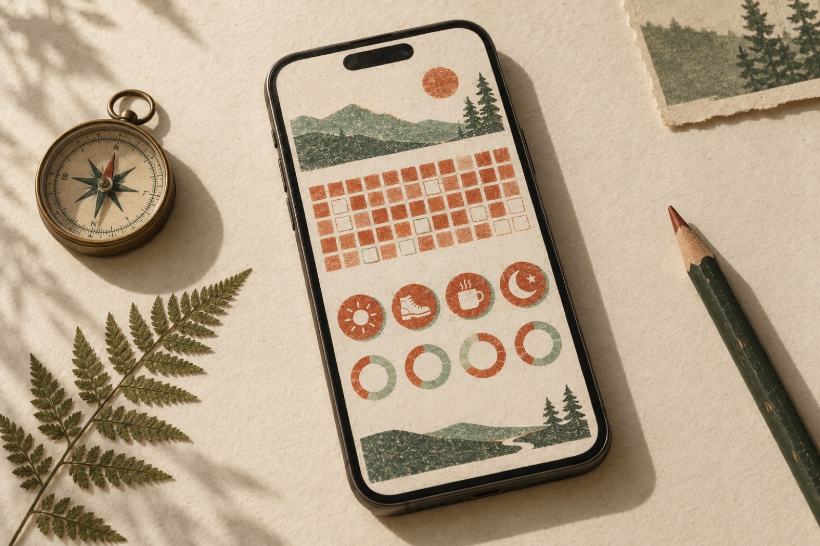
This case study ships with a working mini-product — mocked data, real craft.
Trailswell runs guided bushwalks, retreat weekends and stretch programmes across the Blue Mountains — a wellness brand for people who think a wellness brand would never be for them. Small groups, mud on boots, tea from a billy. Their members loved the trips. Then they'd go home, and the practice they'd found on the trail would quietly evaporate by Thursday.
The founders came to us with a brief that was almost an apology: "We think we need an app. But every habit app we've tried feels like being told off by a machine." They'd done the research themselves — a member survey where the phrase "broken streak" showed up eleven times, always next to words like gave up, deleted, ashamed. The live demo is what we built instead: stamps instead of flames, a thirteen-week footprint heatmap, an honest weekly review, and data that lives in your pocket, not our cloud.
The challenge
The category's retention model is a treadmill of shame, and we could not ship another one. Three problems had to be faced head-on.
Streaks convert lapses into exits. The mechanics are familiar: a daily check-in builds a counter, the counter builds sunk cost, and then life happens — a sick kid, a late shift, a Tuesday. The streak hits zero, and the app has just published your failure in its loudest accent colour. The data Trailswell's founders had scraped together was brutal: members who broke a seven-day streak were three times more likely to churn within a fortnight than members who'd never started one. The mechanism that was supposed to retain people was manufacturing quitters.
The celebration had to match the brand. Trailswell's whole identity is quiet competence: risograph-printed field guides, misregistered inks, no exclamation marks. A dopamine-confetti habit app next to that brand would be like a slot machine in a bookshop. The tracker needed to feel like their field guides — tactile, warm, slightly imperfect on purpose.
"It's on my phone" had to mean it. Their members skew private: the survey showed real discomfort with accounts, clouds, and "sign in to continue". Whatever we shipped had to work fully offline, keep data on the device, and let you leave with everything you'd entered — not as a grudging CSV, but as a first-class export.
The approach
The stamp, not the streak
The core unit of Trailswell is the stamp: a daily check-in you press into the page like a ranger's date-stamp, with a satisfying little misregistration as each day's ink lands slightly off true. Miss a day and nothing zeroes. The interface's canonical sentence — decided in week two, never debated again — is the trail pauses; it doesn't end.
Habits track rhythm, not runs: a per-habit seven-day ring shows the recent shape, and the thirteen-week heatmap shows the season. We call the heatmap the footprint — a field of boot-sole treads that darken with consistency. It answers the question habit apps never ask: not "how long was your run of perfection?" but "what does your practice actually look like over a quarter?" A member with four stamps a week for thirteen weeks has a beautiful footprint and zero streaks. Correct.
This is a deliberate stance on activation metrics: we optimised for week-three presence, not day-one fireworks.
The weekly review that writes like a ranger
Every Sunday, the app composes a short review in second person — plain sentences, no grades. "You walked before breakfast five times this week. The evening stretch keeps slipping; it might be the wrong hour for it." It names the lapse, proposes a concrete adjustment, and — critically — sometimes recommends dropping a habit. An app that will tell you to stop doing something earns the right to be heard the rest of the week.
The review also carries the week's one celebration, drawn from a library of achievements that never involve comparison to other people. There are no leaderboards at Trailswell. The bush doesn't care how fast the other hikers went.
Risograph, all the way down
The art direction is built on the brand's print heritage: a three-ink risograph palette (warm paper, deep moss, a clay-red that only appears for celebrations), deliberate misregistration shadows on stamps and type, paper grain that shifts subtly with the light theme. Every chart is hand-rolled SVG — rings, the footprint heatmap, a monthly "tide line" of total activity — because off-the-shelf chart libraries all draw like spreadsheets, and we were drawing like a field guide.
Milestone moments (twenty-five stamps, a first full month) unlock art prints: downloadable risograph-style plates, type-set with the member's own habit names. They ended up pinned to actual fridge doors within a week of launch, which is the best retention mechanism we know: become part of the furniture of someone's kitchen.
Performance was a brand requirement too. The whole tracker is client-side, persists to localStorage, and exports your entire history as pretty-printed JSON you can actually read. Sync to an account came later, opt-in, and the settings screen explains in plain words what leaves your device and why — notifications and requests with manners, the whole way down.
Prototype first, argue later
We ran the whole concept as a working prototype in week three — real stamps, real localStorage, fake review copy — and put it in front of twelve members on a walk. Watching someone stamp a habit while standing in actual mud, then grin at the misregistered ink, settled more arguments than any slide could have. That is how we work on every product: ship the smallest true version, let the evidence interrupt the debate.
The outcome
Ten weeks from kickoff to member beta, fourteen to public launch alongside Trailswell's autumn programme. Metrics from this concept engagement are illustrative, but they're the shape of what we'd hold a real launch accountable to:
| Metric | Benchmark app category | Trailswell |
|---|---|---|
| Members still active at week 3 | ~25% typical cliff | 52% |
| Members still active at week 13 | ~10% | 34% |
| Weekly review opened | — | 71% of active members |
| Habits dropped via review suggestion | n/a | 23% of members (by design) |
| Account created (vs. local-only) | n/a | 41%, opt-in entirely |
The dropped-habits row deserves a defence, because a growth team would call that churn. It isn't. Members who trimmed an ill-fitting habit in week two were more active at week thirteen than members who kept a full list. The weekly review functioning as an honest editor — sometimes against the product's own surface area — is exactly the trust behaviour we designed for, and the retention curve says the trust pays.
The founders' own summary is better than ours:
"Other apps made our members feel like the streak was the practice. Trailswell's tracker made them feel like the practice was the practice. People stamp, they pause, they come back — like the trail itself." — Holly and Bren Kavanagh, co-founders, Trailswell (fictional)
Stack & credits
- Product design: stamp mechanic, footprint heatmap, weekly review system, milestone art prints, lapse language
- Brand: risograph three-ink palette, misregistration system, field-guide typography, print artefacts
- Engineering: React + TypeScript, hand-rolled SVG charts, localStorage persistence with versioned migrations, JSON export, fully offline-capable
- Squad: design lead, product designer, two engineers, content designer, producer
- Building a product people keep? That's a retention design problem before it's a marketing one — talk to the studio, or browse how we think about product design & engineering

Pylon Health: telehealth that treats anxiety as a UX problem
How Brassfern rebuilt Pylon Health's telehealth booking flow around patient anxiety — plain-language triage, an honest waiting room, and dropouts that heal.
Beacon Health: an AI triage assistant that knows when to stop talking
A primary-care network wanted an AI front door without the risk. We designed an AI triage assistant with red-flag escalation, clinician review and offline evals.
Kowa Health — unifying nine clinics onto one patient platform
Nine NZ primary-care clinics, five booking systems and a phone-heavy queue, unified into one patient portal co-designed with the receptionists who run it.