Pylon Health: telehealth that treats anxiety as a UX problem

This case study ships with a working mini-product — mocked data, real craft.
Pylon Health runs GP video consults across regional Australia — places where the nearest clinic can be a two-hour drive and the nearest specialist a flight. Their platform worked, technically. The video connected, the prescriptions flowed, the clinicians were excellent. But a third of booked appointments never completed, and the support inbox read like an anxiety journal: "Is the doctor still coming?" "Did I break it?" "I pressed the button and nothing happened."
Their clinical director, Dr. Elena Vasquez-Ford, said something in the kickoff that became the project's spine: "Every patient arrives already worried. Our job is to add zero to that."
The challenge
A telehealth product has two products inside it: the consult, and the thirty minutes before it. Pylon had invested in the first and neglected the second. Our research — intercepts with 24 patients, call-log analysis, a week shadowing the triage nurses — surfaced three failures, all of them emotional before they were technical:
Triage read like an exam. The intake form used clinical shorthand ("acute presentation", "duration of symptoms", "GP management plan") with a 600-word wall of option text. Patients over 65 — almost a third of Pylon's book — copied symptoms from the back of medicine packets rather than trust their own words. Abandonment peaked at a dropdown labelled "presenting complaint category."
The waiting room was a black box. After booking, patients got a spinner: You're in the queue. No position, no estimate, no sense of what happens next. Waiting is bearable; unexplained waiting is not. Support calls spiked at minute nine of an average eleven-minute wait.
The session was fragile on the connections patients actually had. A dropped packet on a congested regional link killed the consult session outright. Rejoining meant re-doing triage from a cold start. For a patient on a farm at the edge of coverage, one dropout often ended the episode of care.
Underneath all three sat the accessibility bar: bookings needed to survive screen readers, motor impairments, low literacy, and a tired parent doing this on a phone at midnight with one hand.
The approach
Triage in the patient's own words
We rebuilt triage around how people actually describe illness: by feeling, not by taxonomy. The first question became "What's bothering you?" — free text, with friendly chips underneath ("sore throat", "can't sleep", "something's not right"). Plain-language copy at roughly year-six reading level, one idea per screen, progressive disclosure so nobody meets question nine until question eight is answered. Every clinical term that survived into the interface came with a translation. The form got longer in clicks and shorter in felt length, which is the length that matters.
We ran comprehension testing with patients aged 62 to 81 through our product research practice, and the rule that emerged is now Brassfern canon for health work: never make a sick person decode the interface before the interface lets them describe feeling sick.
A waiting room that talks
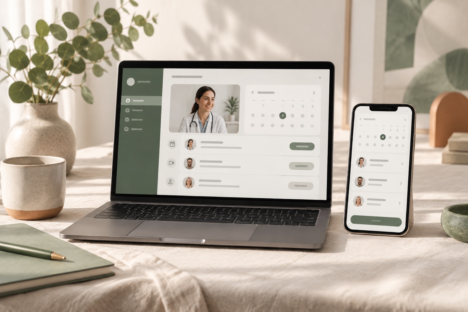
The waiting room redesign was built on one principle: anxiety lives in the silence between actions, so fill the silence with useful truth. The new room tells you your position, your estimated wait, what happens at each stage, and lets you test camera and microphone before the consult with a guided check that actually explains what "allow access" means. A prep checklist ("have your Medicare card handy; jot down your current meds") turns dead minutes into useful ones.
When a clinician runs late, the room says so — with language the clinic's staff author themselves from a small set of honest templates ("Dr. Rahim is with another patient — about 10 more minutes"), not an apology modal from 2009. The tone work drew on the same voice discipline behind our Hearthbrew brand system: warm, specific, no exclamation marks near medical things.
Engineering for the last bar of signal
For regional connectivity, we treated dropouts as a design state, not an error. The consult state machine lives server-side; a patient's session is addressable by a rejoin code delivered by SMS at booking time, so any device — the phone, the kitchen iPad, the neighbour's laptop — can resume mid-episode without re-doing triage. Triage answers cache locally as you write them, so a dead connection costs you nothing but time. When video degrades, the session steps down gracefully: video → audio → "we'll call you on this number instead", with the clinician seeing the same ladder on their side.
We tested on throttled connections in the lab and — more honestly — by driving to places with famously bad coverage and doing consults from a parked car, which is exactly how a real patient does it. Ship-to-learn is central to how we work, but sometimes our favourite lab is a paddock.
Accessible means everyone, on their worst day
The full flow targets WCAG 2.2 AA: 44px touch targets minimum all the way through, visible focus states, captions on consult video, no information carried by colour alone, and the entire booking completable by keyboard or voice. We audited with screen-reader users, not just tools — automated checkers catch the violations, humans catch the humiliations.
The outcome
Sixteen weeks from kickoff to full rollout, co-built with Pylon's clinical team in weekly demos. Metrics from this concept engagement are illustrative, but here's the shape of what we'd hold a real rebuild accountable to:
| Metric | Before | After |
|---|---|---|
| Booked appointments completed | 68% | 89% |
| Triage form abandonment | 41% | 14% |
| Support contacts per 100 consults | 9.2 | 2.7 |
| Sessions recovered after dropout | ~0% (session lost) | 96% rejoined |
| Booking completable by screen reader (audit) | 3 critical blockers | 0 |
The dropout-recovery row is the one we put on our own wall. Before the rebuild, a dropped connection was, clinically speaking, a lost consultation. After it, lost consultations from connectivity were nearly a rounding error — because we'd stopped treating a flickering link as a failure and started treating it as weather.
Dr. Vasquez-Ford's team now runs the content templates themselves; like any good system from our studio's point of view, it was designed to be handed over, not rented forever.
"Patients used to ring us to ask if the doctor was still coming. Now the room tells them. The phone went quiet, the clinicians went calmer, and the completion number followed." — Dr. Elena Vasquez-Ford, Clinical Director, Pylon Health (fictional)
Stack & credits
- Product design: research, triage re-flow, waiting-room system, tone-of-voice templates, accessibility programme
- Engineering: React + TypeScript, WebRTC consult layer with graceful degrade ladder, server-side session state machine, SMS rejoin flow
- Accessibility: WCAG 2.2 AA audit with assistive-tech users, keyboard/voice booking
- Squad: design lead, product designer, two engineers, accessibility specialist, producer
- Healthcare product on your roadmap? Talk to the studio — or see how we structure engagements and pricing
“They said no to three of our favourite ideas and were right every time. That is what you are paying for — judgement, not just hands.”
Trailswell: habit tracking without the guilt trip
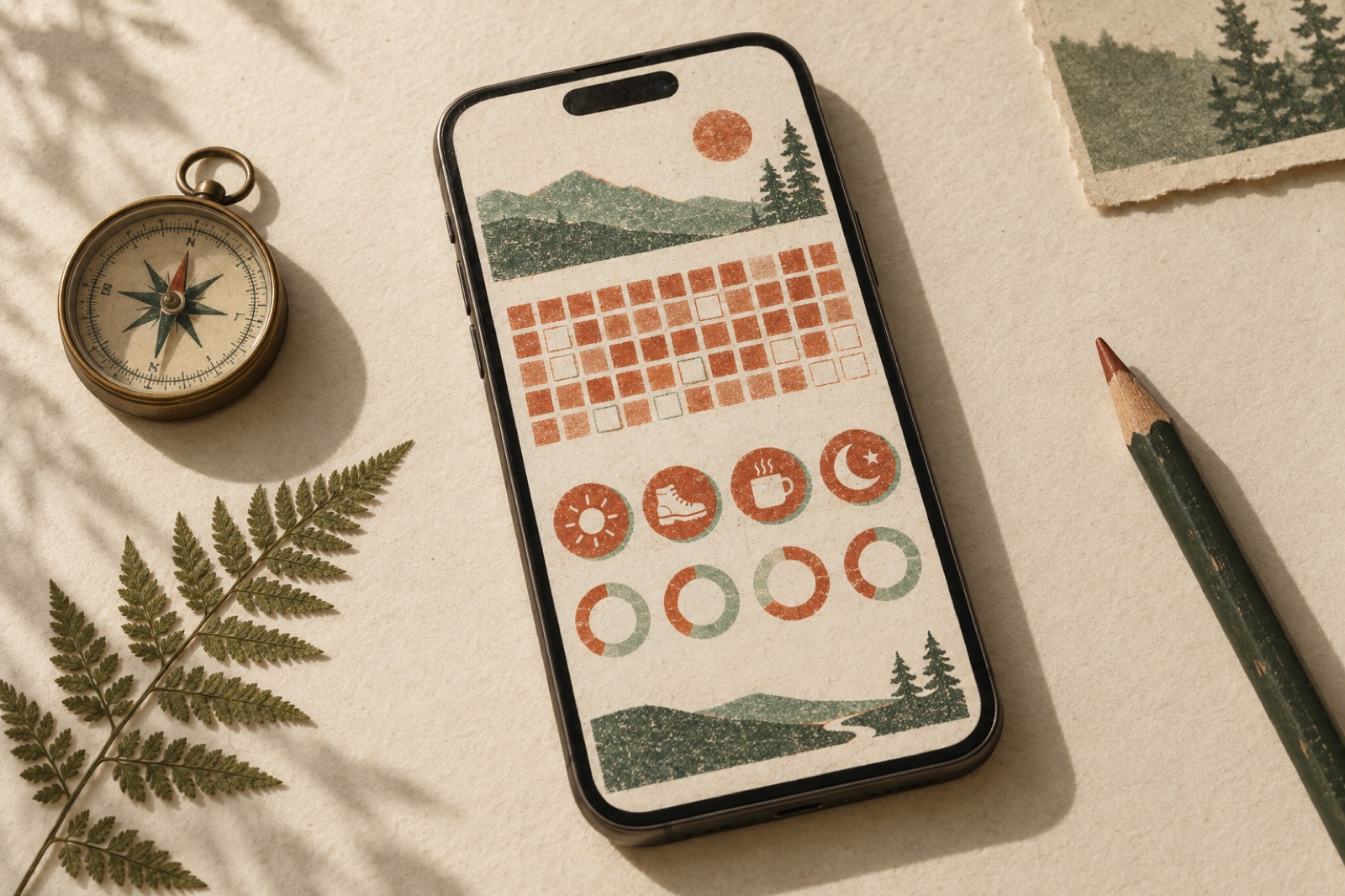
Habit apps run on guilt. Trailswell wanted the opposite: a tracker that celebrates calmly, treats lapses honestly, and survives week three.
Beacon Health: an AI triage assistant that knows when to stop talking
A primary-care network wanted an AI front door without the risk. We designed an AI triage assistant with red-flag escalation, clinician review and offline evals.
Kowa Health — unifying nine clinics onto one patient platform
Nine NZ primary-care clinics, five booking systems and a phone-heavy queue, unified into one patient portal co-designed with the receptionists who run it.