A brand system that grows itself
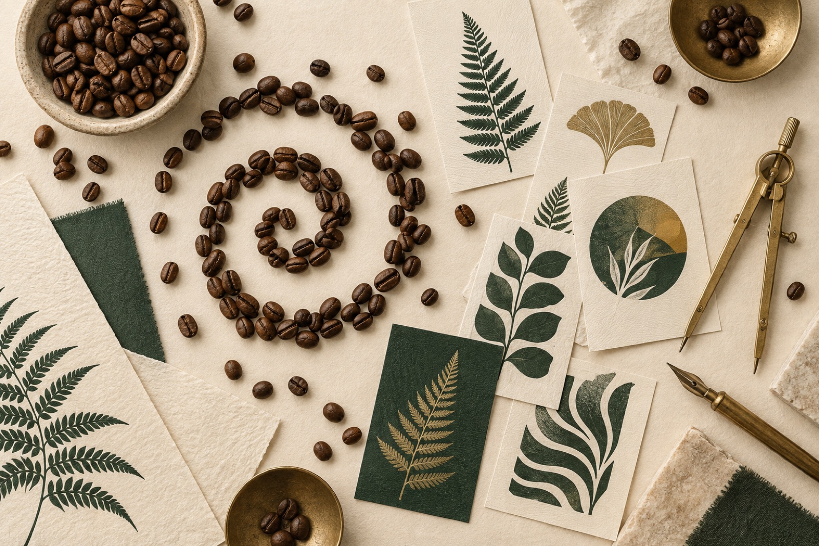
This case study ships with a working mini-product — mocked data, real craft.
Hearthbrew Coffee started as a single roastery in Marrickville and became, over eight years, a small constellation of cafés, a subscription business and a wholesale arm. What never grew with it was the brand. By 2024 the company was running three logos, four typefaces and a palette best described as "whatever the last agency left behind". Their marketing lead, Claire Beaumont, put it plainly in the first workshop: "Every new thing we make looks like it belongs to a different company."
The challenge
Hearthbrew's problem was not taste — everyone on their team had plenty. The problem was throughput. A small internal team shipped packaging, social tiles, café menus, email campaigns and a website across dozens of touchpoints a week, and the brand guidelines (a 74-page PDF, last opened in 2022) answered almost none of their real questions. What pattern goes on a cup sleeve? What does the menu type do at 9pt? Which of the five greens is "ours"?
The constraints were real ones: a rebrand had to land without reprinting every coffee bag on the shelves, the physical refresh rolling across cafés over six months. Any solution had to respect a transition period where old and new would sit side by side. And the team needed to keep producing daily materials without bottlenecking on an agency.
Our brand & identity practice sees this pattern constantly: rebrand projects fail not because the identity is wrong, but because the identity can't be operated. So we framed the engagement differently from the start — not "design a look" but "build a brand machine".
The approach
Strategy: one true thing
Week one was listening. We interviewed baristas, wholesale customers, the founders, and twelve subscribers about why they stayed. The answer kept landing in the same place: Hearthbrew felt grown, not manufactured. Slow roasts, farmer relationships measured in years, a deliberately unhurried café experience. The brand idea became three words — "slowly grown" — and every downstream decision got tested against them.
Identity: botanical, but engineered
The visual system started with the thing Hearthbrew already loved: botanical illustration. Coffee is a plant; subscriptions grow; cafés grow regulars. But hand-drawn botanicals don't scale to a weekly content machine, so we went generative.
Working alongside June's design team, our engineers wrote a small parametric drawing engine — stems, leaves and coffee cherries grown by a seeded algorithm with three honest dials: warmth (how roasty the palette leans), growth (how branched the vine becomes) and density (how much of the field fills). Every output is unique, and every output is on-brand by construction, because the dials only reach inside the brand's territory.
The same token set that drives the generator drives the website and the print spec: five colours, two typefaces, one rule for motion ("if it shouts, it's off-brand"). Because we express identity as data — our usual design tokens pipeline — the café menu template in Figma and the React component on the site are reading the same source of truth.
The handover: a tool, not a PDF
The centrepiece of the delivery is the Identity Lab: an internal web tool where any team member can generate packaging patterns, social backgrounds and campaign art — then export palette values with a click. You can try the public version in our Lab right now; the internal build adds export formats and template presets.
We retired the 74-page PDF and replaced it with a living guideline site: usage rules with do/don't examples, the token JSON for anyone building software, and the generator for anyone making pictures. Per our release-in-public approach, Hearthbrew saw the system working on staging from week three, and the Friday demos became the venue where their team made decisions with us — twenty minutes, real artifacts, no decks.
The outcome
Eleven weeks from kickoff to launch, inside the fixed sprint scope agreed in week zero. The metrics below are illustrative figures from this fictional concept project:
| Metric | Before | After |
|---|---|---|
| Time to produce a campaign asset | ~3 days | ~40 minutes |
| Brand consistency score (internal audit) | 54/100 | 92/100 |
| Subscription site conversion | baseline | +18% (illustrative) |
| Guideline site monthly active users (internal) | 0 (PDF unopened) | 14 of 16 staff |
Six months on, the transition period finished without a single customer noticing a "rebrand moment" — old bags phased out, new bags phased in, and the generative artwork tied the two eras together. Claire's verdict: "The rebrand shipped, and then it kept shipping itself. The system survived us, which is the whole point."
The subscription storefront followed as a second engagement — a headless rebuild with the kind of conversion-obsessed craft we bring to e-commerce — and the identity held its shape across a channel it was never originally designed for. That, more than any launch-day screenshot, is what a brand system is for.
"Our rebrand could have been a committee tragedy. Instead it shipped in eleven weeks and the team still uses the system daily. It held." — Claire Beaumont, Head of Brand, Hearthbrew Coffee (fictional)
Stack & credits
- Strategy & identity: positioning, naming audit, voice guidelines, logo refinement
- Design system: tokens (colour, type, spacing, motion), Figma libraries, print spec
- Engineering: generative canvas engine (TypeScript), guideline site (React, Sanity), exports pipeline
- Squad: design lead, brand designer, two engineers, producer — how our squads work
- Try it: Hearthbrew Identity Lab · Thinking about a rebrand? Start a project
“Our rebrand could have been a committee tragedy. Instead it shipped in eleven weeks and the team still uses the system daily. It held.”
Marlowe Hotels: winning back the direct booking
A boutique coastal hotel group was paying OTAs a quiet tax on three-quarters of its bookings. We rebuilt the site and booking flow — and the share flipped.
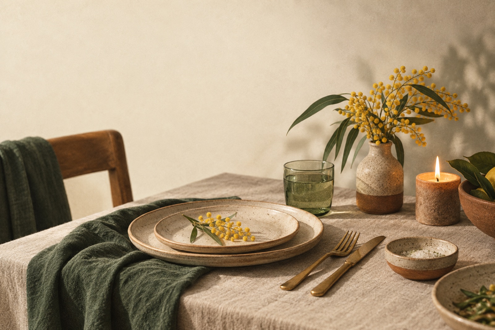
Wattle & Daub: a dining room website that fills tables
How we rebuilt a Surry Hills restaurant's website around reservations that actually convert — cutting no-shows 38% and doubling midweek covers.
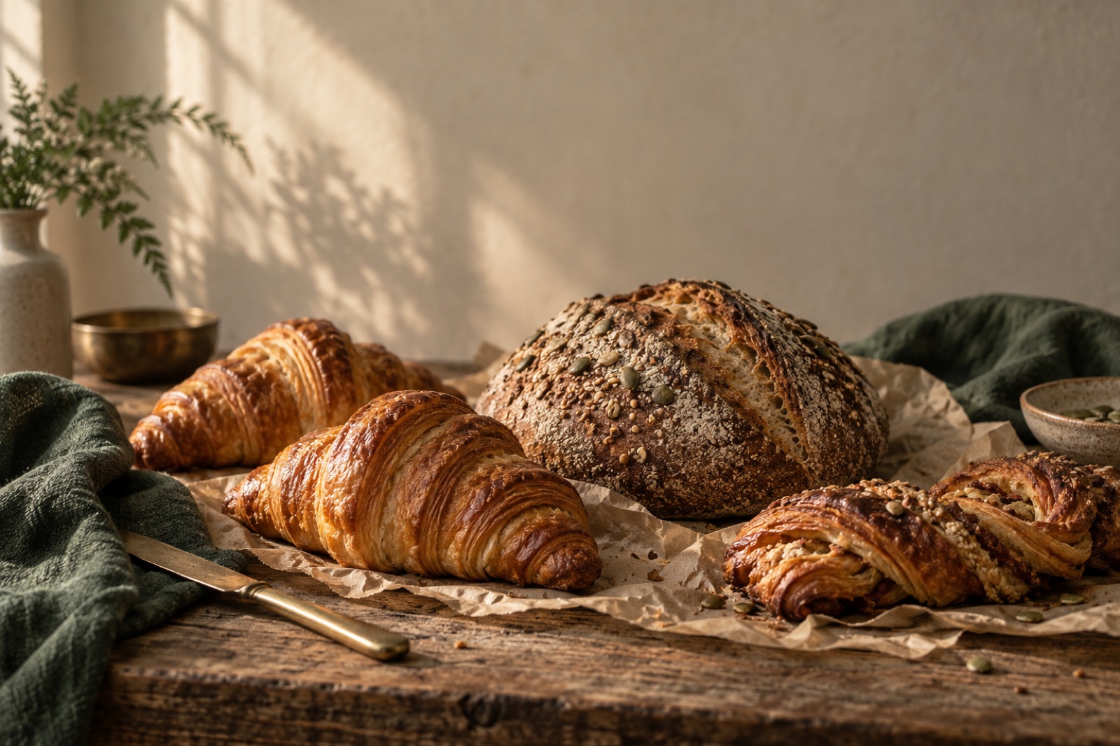
Pinch & Sprig — a bakery group that sells out by 10am, online first
Three Sydney bakeries, one-tap pre-orders with honest cut-offs, a wholesale portal that kills the 5am phone call — and menus that are pages, not PDFs.