Keepsake: pressing letters into pixels
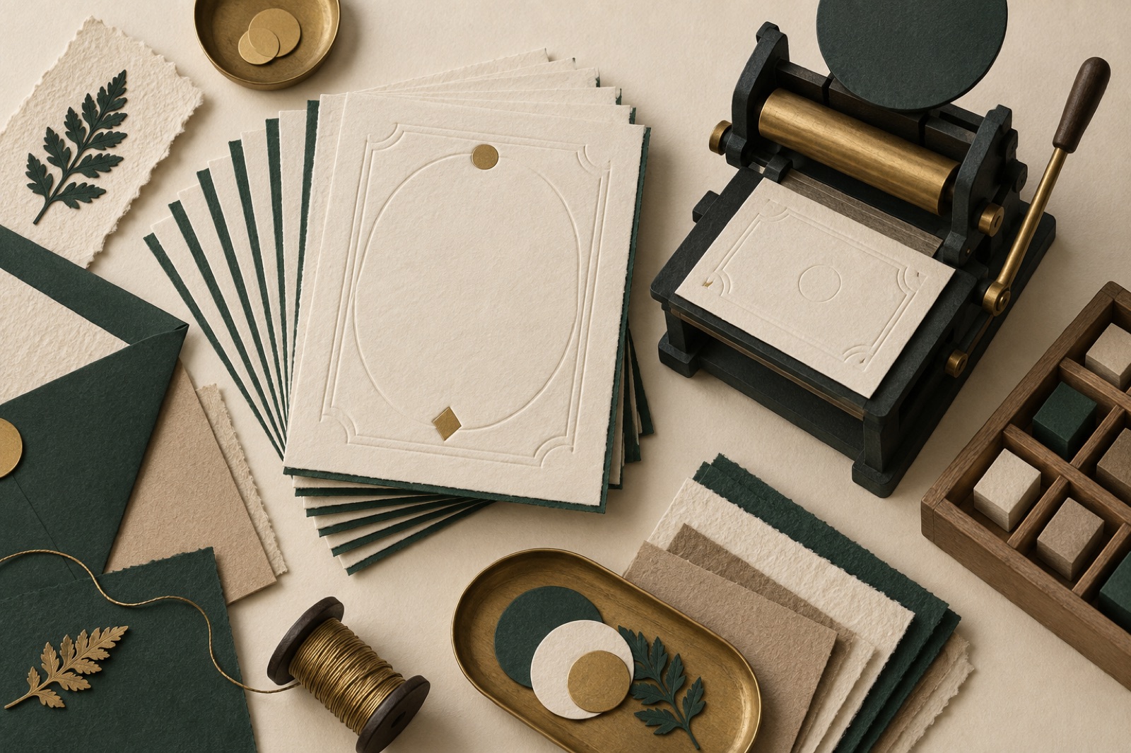
Keepsake (a fictional client in our concept portfolio) is a letterpress studio in Fitzroy — two vintage Heidelberg presses, a wall of polymer plates, and wedding invitations so beautiful that Australian Vogue once called them "the paper equivalent of a held breath." Their ordering process was the opposite of the product: a nine-page PDF form, filled out over email, followed by an average of four rounds of correction, because nobody ordering "sage ink on cotton with a terracotta edge" has ever actually seen sage ink on cotton with a terracotta edge.
The studio's founder, Beatrix Nguyen, opened our first meeting with the number that hurt most: around 40% of jobs involved rework caused not by craft errors but by imagination errors — the customer pictured something the form couldn't show. "We sell how it looks," she said, "through a form that only captures how it reads."
The challenge
Custom stationery sits in a strange corner of e-commerce: high prices, high emotion, irreversible production, and a product that exists exactly once. The failures compound.
The preview problem was the business problem. Paper stock, ink colour, edge paint, foil, envelope liners — each combination changes the object entirely, and the PDF captured choices as words. "Racing green" to a customer means a forest; to a press operator it means a Pantone. Every expectation gap became a reprint conversation, and reprints on cotton paper are expensive in money and in mood.
Pricing was a quote request. Because options stacked non-linearly, Keepsake couldn't list prices — customers submitted a form and waited days for a number. In PDP terms, the product page's most important fact was missing. Hesitation compounds when the purchase is for a wedding with a date attached.
Consultation time didn't scale. Every order began with a human translating the customer's picture into press terms. Lovely work, unscalable, and increasingly crowded out by couples who just wanted to know it would be beautiful without a forty-minute phone call.
The brand hadn't made the leap to screen. Keepsake's printed identity — a Victorian-era specimen-card aesthetic with modern restraint — existed in their type drawer, not their website. The site had to feel like their cards: pressed, layered, deliberate. We'd built our thinking on brand-system translation in projects like the Hearthbrew identity work; Keepsake needed the same care with commerce attached.
The approach
We proposed what we'd eventually call "the proofing press in the browser": a configurator where every choice is visible the moment it's made, priced to the dollar, and shareable as a link. Ten weeks, fixed scope, built on our e-commerce practice with Shopify handling checkout behind a fully custom front end.
SVG, because the product is flat and the fidelity matters
We rejected 3D early. Invitations are nearly planar, and the qualities that make letterpress letterpress — the bite of the impression, ink sitting in the deboss, the deckled edge — are surface phenomena, better simulated in layered SVG than in geometry. The preview stacks six layers: paper texture (three weights, rendered as tileable noise with subtle shadows at deckles), the printed impression (artwork with a multiply blend and an inner shadow that mimics bite depth), a foil pass where applicable, edge paint along the visible border, envelope and liner, and a drop-shadowed scene. Each layer maps one-to-one with a configuration option, so nothing on screen is decorative — it's all state.
The result is honest in a specific way we care about: it looks pressable rather than photoreal, with a note beside it saying exactly that ("a faithful preview, not a photograph — your cotton paper has texture the screen can't"). The configurator lessons we learned in 3D applied directly: the preview's job is confidence, not cinema.
Typography you can feel from the screen
Couples choose typefaces, sight unseen, so we built a type specimen step that behaves like Keepsake's type drawer: seven faces, each set large in a real invitation layout — names, date, the lot — with the couple's actual details live-fillable. Rebecca and Tom see Rebecca and Tom, in eighteen-point Caslon. Personalisation before configuration: it sounds cute, but in testing it moved completion more than any other single decision. Emotion is a conversion metric too.
Price that assembles itself
Every option has its delta printed inline — "+$1.10/invitation," "includes duplexing," ("edge paint shown, add $90") — and the running total is pinned, always visible, quantity-aware. No quote requests, no surprises, and the pricing engine is the same data Shopify charges from, so the number the customer designs against is the number at checkout. Configuration state lives in the URL, following the URL-as-state pattern we rely on across configurators: finish your design at midnight, email the link to your partner, and they open exactly your invitation — same stock, same ink, same price.
That shareable link quietly became the studio's consultation tool too. Couples who'd never pick up the phone now arrive having already designed something, and the forty-minute call became the fifteen-minute confirmation.
Samples as the trust bridge
No preview fully replaces cotton paper in the hand, so we designed the sample pack as a first-class product rather than an afterthought: eight swatch cards across stocks and inks, $25, fully credited against an order. The configurator offers it at exactly the right moment — after design, before quantity — and it's framed as what it is: the sensible step for an irreversible artefact. Roughly a third of orders touched a sample pack, and sample-pack buyers converted to full orders at rates that made Beatrix check our analytics twice.
The outcome
Launched in time for the spring wedding season, followed by a stationery-line expansion on retainer. As with everything in our work portfolio, figures illustrate a real engagement of this shape:
| Metric | Before | After (two seasons) |
|---|---|---|
| Jobs involving expectation-driven rework | ~40% | ~9% |
| Time from first visit to paid order (median) | 6 days | 2 days |
| Design-to-checkout completion | n/a | 61% of configurator starts |
| Consultation calls per 10 orders | ~9 | ~4 |
| Online revenue share | 12% | 55% |
The rework line is the one Beatrix quotes. Four reprint conversations in ten jobs is a business bleeding quietly; fewer than one is a craft studio that happens to sell online.
What we learned
Match the rendering technology to the product's physics. 3D would have been wrong here by exactly the amount it was right for backpacks. Flat craft deserves flat simulation with honest blends.
Show the customer's own words as early as possible. Type selection with "Rebecca & Tom" beat type selection with lorem ipsum by a margin we'll now test on every personalisable product.
Transparent pricing converts hesitation into permission. The inline deltas didn't just remove a step — they turned option-choosing into a game of discernment, which is precisely the emotional register of commissioning stationery in the first place. The configurator didn't replace the studio's taste. It made the taste browsable — and that, Beatrix says, is what the website was always supposed to do.
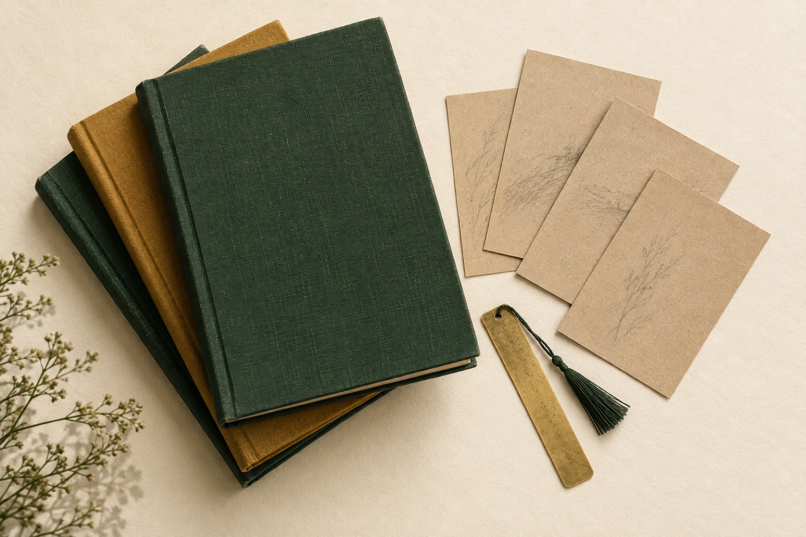
Willow & Wren: the bookshop site that reads like a bookseller
An independent Tasmanian bookshop went online without going generic: shelf-talkers as a content model, honest stock states and a newsletter that outsells the algorithm.
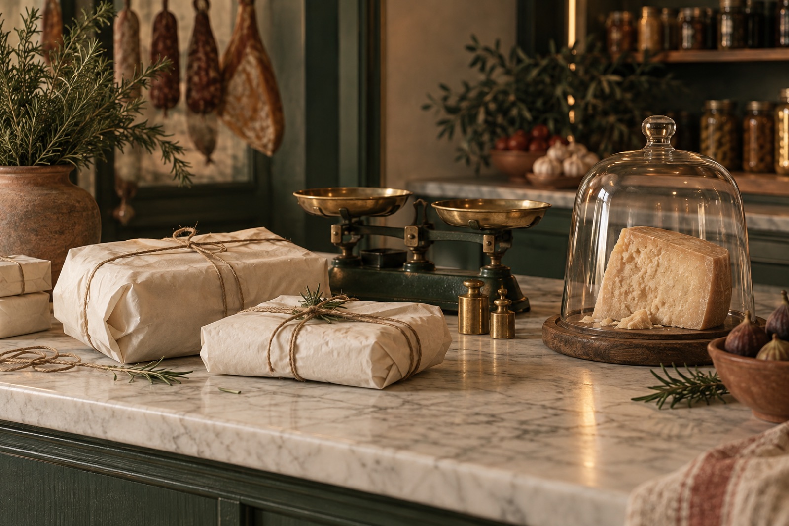
Tallow & Co.: a 1987 butcher becomes a modern providore
A heritage Adelaide butcher went online without losing the counter-chat. How we built pre-order flows, seasonal boxes and a brand refresh the regulars didn't notice.
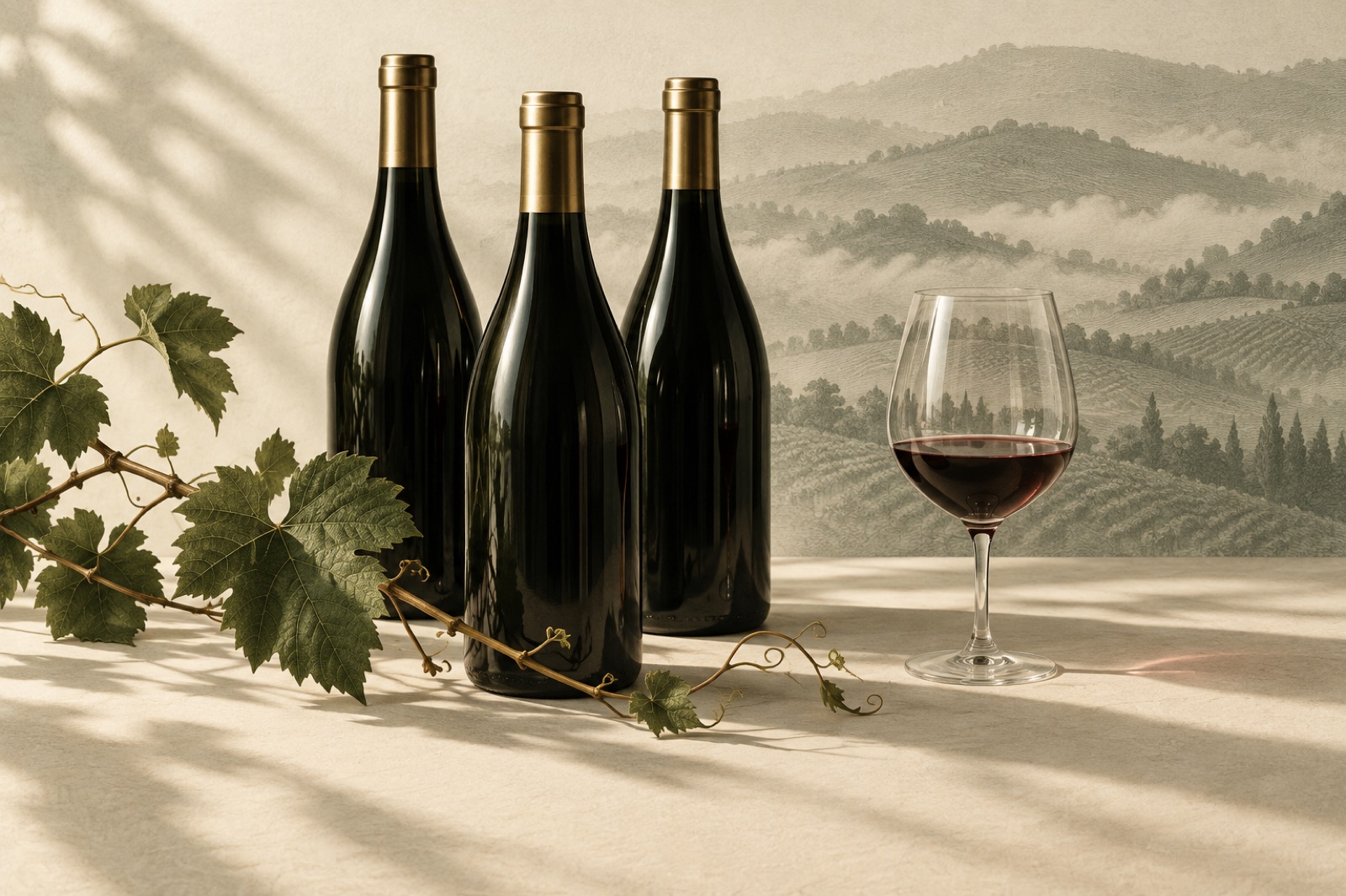
Fernleigh Wines: a cool-climate label learns to sell online
From template storefront to editorial DTC channel: how we rebuilt Fernleigh Wines' online shop around storytelling, flexible subscriptions and cellar-door warmth.