Fernleigh Wines: a cool-climate label learns to sell online
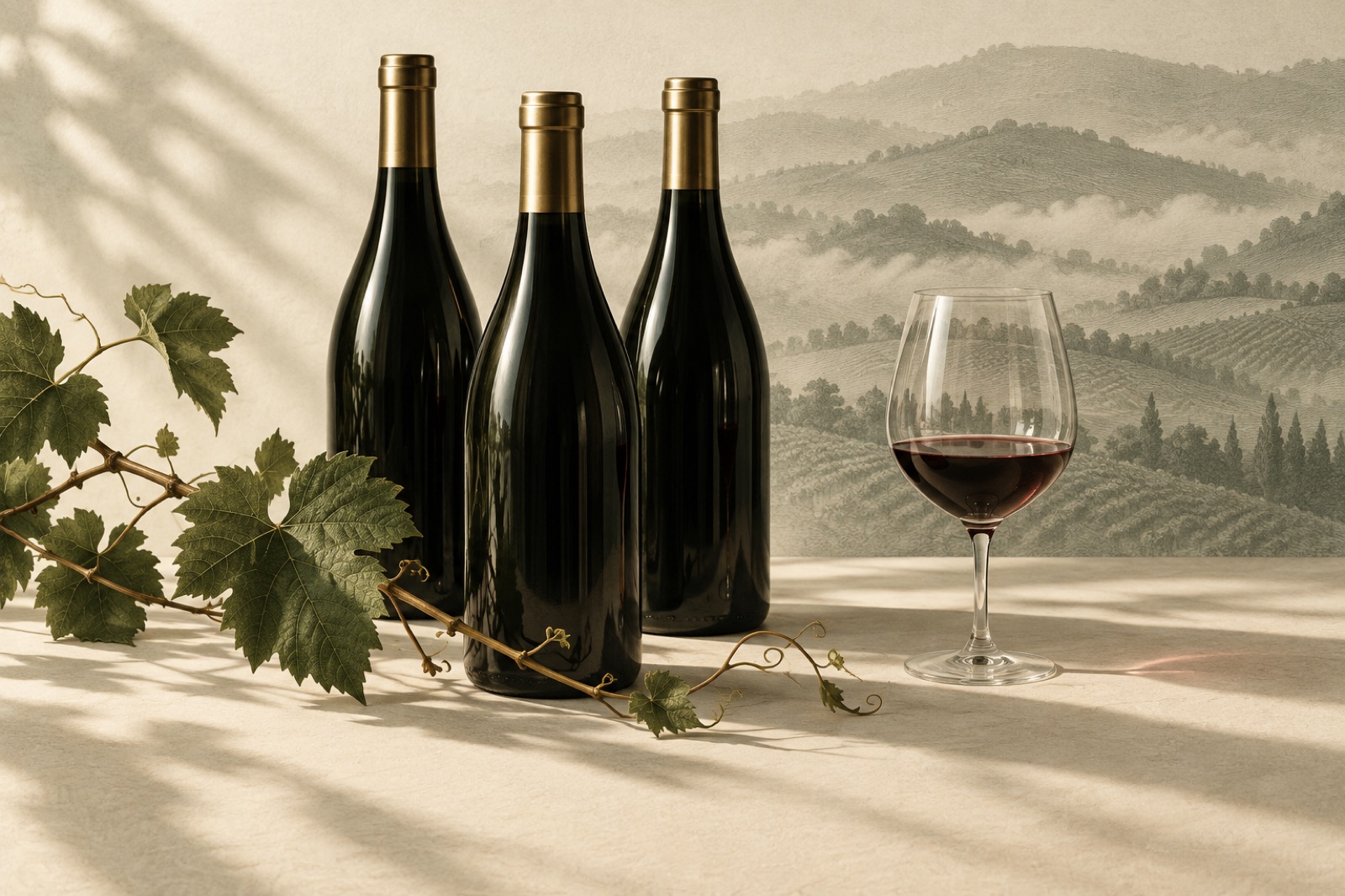
This case study ships with a working mini-product — mocked data, real craft.
Fernleigh Wines is a cool-climate label in the Adelaide Hills — pinot noir, chardonnay, and a nebbiolo the winemaker refuses to enter into shows. Their cellar door is the kind of place people describe to friends: fog over the block, a fire in winter, staff who remember what you drank last time. Their website, by contrast, was a stock theme with the soul of a spreadsheet. It listed wines. It took money. It told no stories, and it was quietly costing them: the cellar door converted browsers at a rate the online store could only dream of.
The brief from co-founder Hadley Fern came with a constraint we liked: "Make the website feel like the door. But don't make it themed. We're a winery, not a film set."
The challenge
Wine e-commerce has three bosses at once, and Fernleigh was serving none of them well.
Story beats SKU, but the store sold SKUs. At the cellar door, wine sells itself through narrative — soil, season, the year the frost took half the crop. Online, Fernleigh's products were grid tiles with a price, a varietal and a description last edited in 2019. The highest-margin channel (direct to consumer) was running the lowest-effort experience.
The wine club was a retention machine held together with email. Club shipments were fixed, skipping meant replying to a human, and swapping a bottle meant a phone call during business hours. Members loved the wine and quietly resented the admin. Churn hid the resentment until it didn't.
Mobile was where the story actually happened, and it was weakest there. Cellar-door visitors scanned a QR code at the tasting bench and landed on a page that took eleven seconds to load over regional reception — the exact moment of maximum intent, spent watching a spinner.
The fix couldn't be a reskin. It had to make storytelling and subscriptions first-class, on a stack Fernleigh's two-person digital team could actually run.
The approach
An editorial storefront, not a catalogue
We rebuilt the storefront as an editorial system where commerce sits inside the story instead of the other way around. Vintage pages lead with the season — what the weather did, what the block gave back — and the buy controls are simply the last paragraph of the story. Collections are organised by occasion, not taxonomy: "Sunday long lunch", "Cellar it: five years of patience", "The pinot people argue about". Regions and varietals still exist as filters for the people who shop that way, but they're the index, not the cover.
Tasting notes got a house rewrite. Wine copy has two failure modes — the lavatory of adjectives ("explosive", "voluptuous") and the chemistry exam. Fernleigh's register sits in between: specific, modest, a little dry. "Green apple, white peach, a lick of slate. Drink the first bottle tonight, hide the second one." A brand voice only survives if it's cheap to write in, so we encoded it as a template with worked examples — the team can produce a new note in minutes without an agency invoice.
Subscriptions people control themselves
The club redesign followed one rule: every action a member wanted to email about became a button. Skip a shipment, swap bottles, change frequency, gift a shipment, pause for a season — all self-serve, all reversible, all confirmed in plain English. Conventional e-commerce wisdom says friction saves churn; our experience says friction saves churn the way a locked door saves a bad relationship. The exit survey replaced the guilt trip: members who paused got asked one honest question, and their answers became the retention roadmap.
Seasonal drops — the small-batch releases that sell out at the door — got a waitlist flow with real scarcity (the number on the page is the number in the shed), giving online members parity with cellar-door regulars for the first time.
Headless, but humble
The stack is a React storefront over a headless commerce backend, with Sanity carrying the editorial layer so merchandising is a CMS decision, not a deploy. Per our e-commerce practice, the budget conversation happened before the fun: pages under 1MB first load, LCP under 2.5 seconds on a 4G connection — because the most valuable page view of Fernleigh's year happens on a phone, standing at a tasting bench, on patchy reception. Art direction gets the budget headline images honestly earned: photography of the actual block in the actual fog, cropped for the story, compressed like we were paying for the bandwidth ourselves. (Our clients' customers are.)
Accessibility rode along as a requirement, not an audit line — the club manages shipments by keyboard as happily as by thumb, and the colourway (deep vine green, chalk, and a red we wrestled away from anything resembling a "sale" colour) holds contrast past AA.
Shipping in the open, weekly
As with every engagement in our approach, Fernleigh saw working builds from week two, and their tiny team made calls in Friday demos with real pages in front of them. The structure came from our standard fixed-scope model: sprints for the rebuild, a light retainer for the seasonal drops that keep the editorial engine fed.
The outcome
Thirteen weeks from kickoff to launch, timed (deliberately) for the week before the autumn release. Figures from this concept project are illustrative, but they're the numbers we'd put on a real scoreboard:
| Metric | Before | After |
|---|---|---|
| Mobile conversion rate | 1.1% | 2.9% |
| Median page load, 4G (product page) | ~11s | ~2.1s |
| Wine-club take rate (orders including a club join) | 4% | 12% |
| Club churn (quarterly) | baseline | down 38% |
| Tasting-bench QR scans converting within 7 days | 6% | 21% |
The QR row is Hadley's favourite, because it closed the loop the brief started on: the cellar door's warmth now has somewhere good to land. The channel that followed people home used to be a spreadsheet; now it's the door, continued.
Twelve months on, the internal team runs drops and vintage pages without us — the editorial system was built for a two-person crew, which is the truest test of a CMS. The pattern rhymes with our Hearthbrew case study: the best thing an agency can ship a small team is a machine that keeps working after the engagement ends.
"The website finally sounds like us and sells like the cellar door. And the club — members can pause themselves now, and somehow fewer of them leave. Go figure." — Hadley Fern, Co-founder, Fernleigh Wines (fictional)
Stack & credits
- Storefront: React + TypeScript over a headless commerce backend; editorial layer in Sanity
- Design: art direction, editorial system, voice templates, club flow redesign, AA+ accessibility
- E-commerce craft: subscription self-service, waitlist drops, performance budgets for regional 4G
- Squad: design lead, e-commerce designer, two engineers, content strategist, producer
- Selling something with a story? Start a project
“We asked for a booking widget. They asked why our Fridays looked the way they did. The answer ended up being the product.”
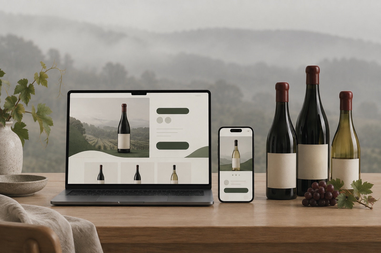

Willow & Wren: the bookshop site that reads like a bookseller
An independent Tasmanian bookshop went online without going generic: shelf-talkers as a content model, honest stock states and a newsletter that outsells the algorithm.
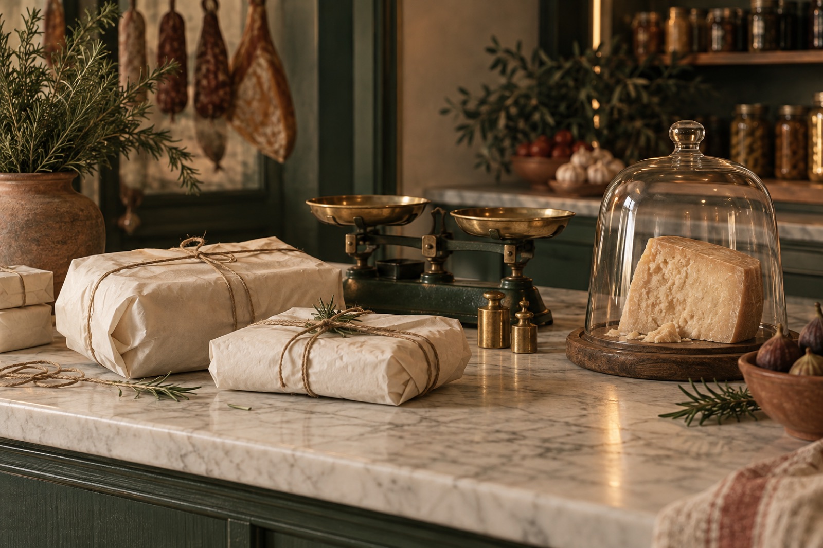
Tallow & Co.: a 1987 butcher becomes a modern providore
A heritage Adelaide butcher went online without losing the counter-chat. How we built pre-order flows, seasonal boxes and a brand refresh the regulars didn't notice.

Tidal Games: a storefront that outlasted launch day
An indie game label needed a store that could survive launch day and still feel hand-made. We built headless commerce and fair, queue-free drops.