Tallow & Co.: a 1987 butcher becomes a modern providore
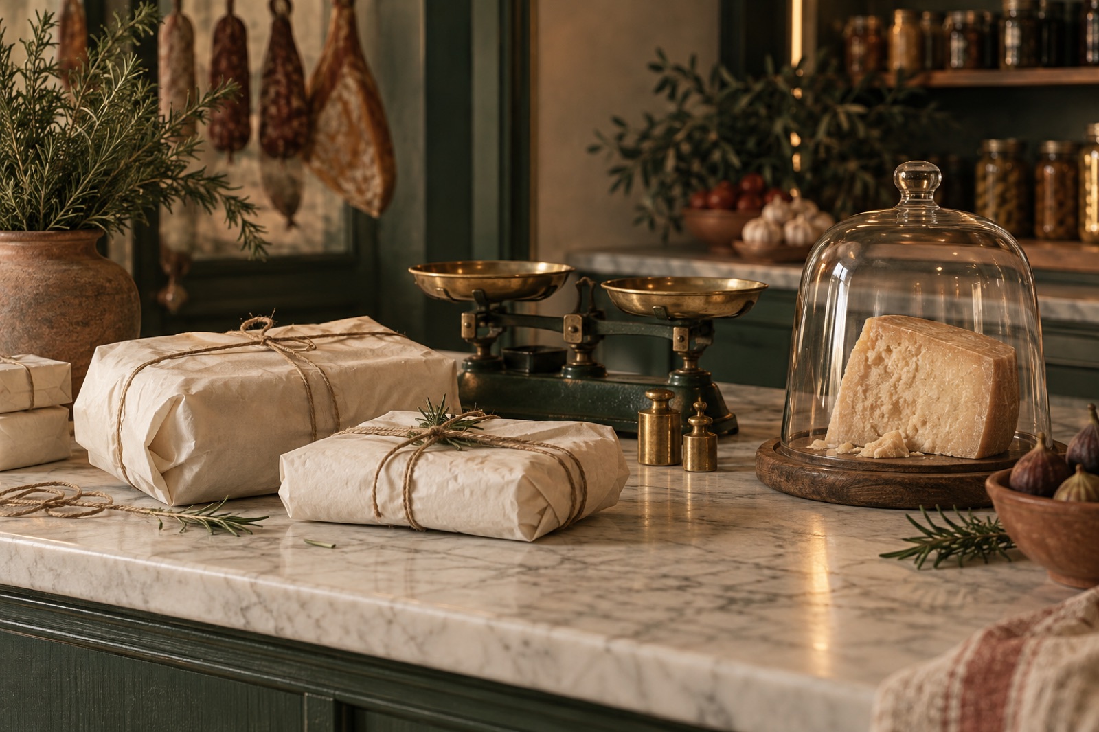
This case study ships with two working mini-products — mocked data, real craft.
Tallow & Co. has occupied the same corner shop in Norwood, Adelaide, since 1987. Third-generation butcher Gus Tallow rebuilt the cold room in 2019 with a bank loan and a handshake. The shop's relationship with its customers is similarly physical: the regulars don't order so much as discuss, and the staff remember whose Sunday roast feeds six and whose feeds sixteen.
In 2024, Gus's daughter Frankie took over operations and found a problem hiding inside a success. The shop's Christmas ham list was managed in a ring binder. Customers queued forty minutes in December because pre-orders lived on paper. Younger households — the suburb was changing — drove past to a flashier providore that at least had click-and-collect. Frankie didn't want to become an e-commerce brand. She wanted the shop's logic to survive online.
The challenge
Heritage retail has a trap. Modernise too loudly and you alienate the people who made the business; modernise too timidly and you get a website that describes a shop's opening hours and little else. Our discovery interviews with thirty regulars produced the sharpest brief of the year: "Don't make it feel like they replaced the butcher."
The operational problems were concrete:
- Pre-orders on paper. Christmas, Easter and the footy finals generated hundreds of paper slips, hand-transscribed pickup times, and a predictable end-of-day argument when two customers had the same surname.
- No way to test the providore idea. Frankie wanted to expand beyond meat into cheeses, smallgoods and pantry goods from the same growers — a "curated box" model — but had no instrument to test demand.
- A brand that lived in Gus's head. The shop's identity was genuine but unsystematised: a hand-painted sign, brown paper, and whatever Frankie wrote on the chalkboard each morning.
The constraint we set with Frankie: every digital touchpoint must behave like the counter. Specific, opinionated, unhurried.
Approach
A refresh you weren't supposed to notice. Our brand work started from the hand-painted fascia. We redrew the lettering as a proper wordmark — same wobble, legible at favicon size — and built a palette from the shop itself: brown paper, butcher's-twine red, cold-room steel. No new logo launch, no rebrand announcement. We photographed the existing shop, the hands, the paper. The regulars' feedback, which we count as success: "Did you guys get the sign repainted? Looks good." This is the rebrand discipline we argue for in our work on brand voice for traditional businesses — the identity was always there; the job was to make it reproducible, not replaceable.
Pre-orders as the core flow. Instead of a generic storefront, we designed around the forty-minute-December-queue problem. A butcher site has natural scarcity: the day's cuts are finite, and pickup is a real event with a real person. The product pages treat a leg of lamb like a booking — choose your size, your pickup window, pay a deposit. The staff get a live manifest instead of a binder; customers get an SMS when the order is cut and wrapped. Deposits were Frankie's bold call, and they behaved exactly like they do at the counter: nobody who puts money down forgets their ham.
Seasonal boxes as a product experiment. Rather than a big providore launch, we shipped one seasonal box per quarter — winter braise, summer barbecue — as a limited drop with a stated run of 250. The subscription variant kept control with the customer: skip a season, swap proteins, no lock-in. (We've written on the journal about why subscription honesty retains like a magazine; the same pattern applies from coffee to braise cuts.)
Content in the chalkboard voice. The site's copy reads like the shop talks. The "notes" section — short write-ups on cuts, growers and the correct spelling of carpaccio — is written by the staff exactly as they would say it across the counter, then lightly edited. The same voice feeds a monthly email with open rates that would embarrass most national retailers.
The outcome
The site launched quietly in autumn 2025, and Christmas 2025 was the first real test. Illustrative results from the first nine months:
- Christmas pre-order chaos: eliminated. 92% of festive orders came through the site, sorted automatically into timed pickup waves of eight. Gus's queue peaked at four people, and he complained about being underemployed.
- Seasonal boxes: the first three drops sold out in under a week each; 31% of box buyers converted to subscribers, with 84% still subscribed after two seasons.
- New-household capture: online orders from postcodes with zero prior shop history grew to 38% of web revenue — evidence the site acquired customers the counter never met.
- Deposit no-shows: under 2%, versus the shop's own estimate of one in ten forgotten paper orders the year before.
"We were scared the website would make us a different shop," Frankie says. "It made us more of the same shop. The binder is the only thing we lost, and nobody misses the binder."
What we'd tell other heritage retailers
Digitise the ritual, not the inventory. The thing your regulars value is almost never "products" in the abstract — it's the rhythm of how they get them. Build the digital layer on that rhythm and it reads as service, not change. And when you refresh a traditional brand, measure success by the absence of drama.
If your business runs on paper and memory and does numbers anyway, that's exactly the starting point we like. Talk to us, or browse more of our retail and e-commerce work.
“Our grandmothers complained about the website. The new one, they use. That is the whole review.”
Willow & Wren: the bookshop site that reads like a bookseller
An independent Tasmanian bookshop went online without going generic: shelf-talkers as a content model, honest stock states and a newsletter that outsells the algorithm.
Fernleigh Wines: a cool-climate label learns to sell online
From template storefront to editorial DTC channel: how we rebuilt Fernleigh Wines' online shop around storytelling, flexible subscriptions and cellar-door warmth.

Tidal Games: a storefront that outlasted launch day
An indie game label needed a store that could survive launch day and still feel hand-made. We built headless commerce and fair, queue-free drops.