Sundial Travel: slow travel, planned properly

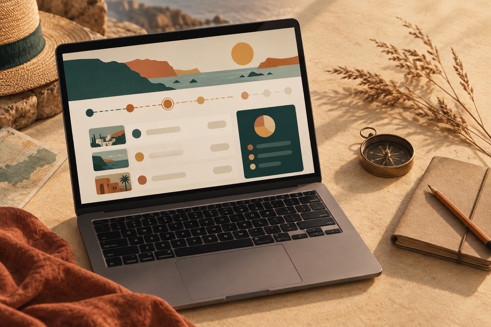
This case study ships with a working mini-product — mocked data, real craft.
Sundial Travel sells the opposite of a package holiday. Their small Sydney team plans slow journeys through Europe and Japan — weeks on rail passes, family-run guesthouses, dinners booked by phone because the restaurant has no website. By 2024 they had a loyal clientele, a five-week waiting list, and a website that looked like a discount airfare aggregator.
The site was quietly costing them. Ads for "cheap Europe itineraries" surfaced against their brand name. The booking flow treated a $9,000 rail journey like a hotel checkout: dates, guests, card details, pay. Roughly seven in ten people who started an enquiry never finished it, and those who did had often already been turned off by a price estimate that hid taxes and guides' fees until the final screen.
Sundial didn't want more leads. They wanted better-prepared ones — people who arrived at the first call already trusting the process and the price.
The challenge
Travel booking UX has converged on a single grammar: search box, date pickers, filter rail, grid of cards sorted by scarcity ("Only 1 left!"). That grammar suits commodity inventory. Sundial sells judgement — a person's accumulated knowledge of which Cinque Terre village takes the morning light, which ryokan will cook for a coeliac. When we interviewed twelve past and lapsed customers, the pattern was unmistakable: they didn't start with dates. They started with a feeling. "A field in Provence in late May." "Trains and bookshops."
The second problem was pricing honesty. Sundial's planners built itineraries in spreadsheets, so early-stage quotes on the site were auto-generated ranges with optimistic assumptions. The gap between the first number a visitor saw and the real quote eroded trust before a planner ever got involved. In our survey of lapsed enquirers, "the price moved" beat "too expensive" as the top reason for walking away.
The brief we wrote with founder Helen Marsh: make the site behave like the service. Deliberate, warm, honest about money from the first click.
Approach
We redesigned the funnel around three acts, and rebuilt the content platform underneath it.
Dream before dates. The homepage and every destination page now lead with editorial moodboards — photography, drawn maps, short essays — and a single prompt: "Tell us the trip you keep thinking about." Date pickers still exist, but they live further down, after the visitor has been invited to articulate intent. This mirrors what our product design practice calls aspiration-first flows: capture the qualitative desire while enthusiasm is high, structure it later.
Pricing you can check. We built a live estimate engine with Sundial's planners. Every itinerary module — rail passes, guesthouse tiers, guide days — carries real cost assumptions the team can update in the CMS. The site now shows a breakdown from the first screen: travel $X, accommodation $Y, our planning fee $Z, total including everything, stated as a range with the assumptions in plain language. Hiding the planning fee was never an option; it's Sundial's whole value. Showing it early reframed it as a feature.
A content engine for the long tail. Slow travellers research deeply. We modelled content in Sanity around journeys (multi-day routes), legs (one rail segment or stay), and notes (the small, opinionated field-guide entries planners write anyway). This let us generate hundreds of genuinely useful pages — "Paris to Lyon by slow train", "How luggage forwarding works in Japan" — each internally linked to itineraries rather than orphaned in a blog. It follows the editorial engine pattern we use across our growth retainers: the content is the product's evidence of expertise.
The build is a Remix front end over Postgres with a headless CMS, engineered to stay under a 129KB compressed initial JS budget because half of Sundial's audience researches on hotel wifi between legs. We treat performance as part of the hospitality, a view we go deeper on in our journal piece on budgeting page weight for marketing sites.
The outcome
The redesigned journey launched in March 2025, in time for the European summer enquiry season. All figures below are illustrative of the shape of change we saw, measured over the first twelve weeks against the same period the year prior:
- Enquiry completion rate: from 29% to 54%. Most of the lift came from moving dates after the dream prompt — people who articulate a trip in their own words abandon less.
- Quote-to-quote consistency: the share of first calls where the visitor's expected price sat within 10% of the real quote rose from about a third to over four-fifths. Planners reported noticeably shorter, warmer first calls.
- Organic traffic to journey content: up 240% year on year, with three rail-route guides in the top three results for their queries, without a dollar of paid spend.
- Average time to first deposit: down from 3.4 weeks to 2.1, since pricing no longer needed a trust-repair cycle.
"Brassfern were the first studio who told us to charge people earlier for less," Helen told us. ""Show the fee up front" sounded like commercial suicide. It turned out the people it scared away were never our customers, and the ones who stayed trusted us twice as fast."
What we'd tell other travel brands
Three transferable lessons. First, match the funnel to the product's emotional clock, not the industry's interaction patterns — commodity grammar communicates commodity value. Second, honest pricing is a conversion feature; the customers you lose to an early real number were churn with extra paperwork. Third, the long-tail content that converts is the knowledge your team already types into emails — your job is to give it a home with a content model, links into your product, and no blog graveyard.
If you're holding a high-consideration booking flow that behaves like a commodity checkout, we should talk. And if you'd like to see how we think about booking UX in a different register, our Wattle & Daub restaurant reservations work approaches the same problem at a two-minute timescale instead of a two-week one.

Summit & Still: booking UX for a yoga studio group with a calm nervous system
Five studios, one timetable, zero countdown timers. Rebuilding Summit & Still's booking around teacher loyalty, ethical intro offers and empathetic emails.
Marlowe Hotels: winning back the direct booking
A boutique coastal hotel group was paying OTAs a quiet tax on three-quarters of its bookings. We rebuilt the site and booking flow — and the share flipped.

Wattle & Daub: a dining room website that fills tables
How we rebuilt a Surry Hills restaurant's website around reservations that actually convert — cutting no-shows 38% and doubling midweek covers.