Arkwright Supply: B2B ordering that respects a tradie's lunch break
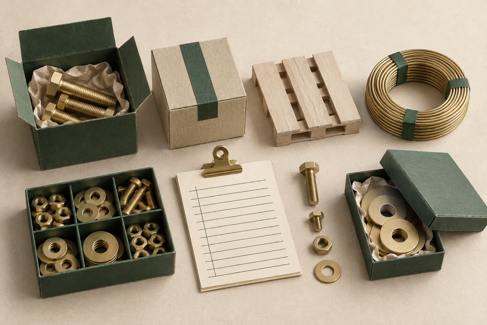
Arkwright Supply is a fictional-but-deeply-plausible industrial supplier: 40,000 SKUs of fasteners, fittings, power tools and site consumables, sold from nine depots to the people who physically build Australia. Their customers order from utes, from sites, and during a lunch break that lasts as long as the pie does. When we met them, "digital ordering" meant phoning the depot, and the website was a PDF catalogue — 412 pages, 38 megabytes, updated quarterly, wrong by Tuesday.
The general manager framed the project perfectly at kickoff: "My buyers have eleven minutes. If your website takes twelve, we're done." Here is how we got it under eleven. The outcomes are illustrative — but every design decision below is one we'd defend in a depot carpark.
The challenge
B2B commerce gets discussed as if it's consumer commerce with bigger carts. It isn't. The differences are structural, and they defined the entire build.
The buyer already knows what they want. A tradie reordering M12 galvanised hex bolts is not browsing; they are restocking. The site's job is not discovery — it's velocity. Time-to-reorder was our north star metric, measured and argued over weekly.
Nobody knows your SKU names but you. Arkwright's catalogue described products in supplier-speak: "Hex Head Bolt Class 8.8 ZP M12 x 50 (Bx 100)". Customers search for "12 mil gal bolts". The old site's search was a string match against supplier-speak, and its zero-results rate was 34%.
Pricing is personal. Trade accounts have negotiated pricing, credit terms and volume breaks. Showing list price to an account holder isn't just a miss — it's an insult that trains them to phone instead.
Orders are big, repetitive and collaborative. A typical order is forty lines, half of them reorders, assembled by a site supervisor and approved by a boss who's on another site. The old workflow printed the PDF, marked it up with a pen, and photographed it. We found three generations of this workflow in one depot visit.
The constraint that shaped everything: depot staff were sceptical, and rightly. Every previous "digital transformation" had made their phones ring more, not less. If the site created cleanup work — wrong orders, confused customers, returns — the depots would quietly route everyone back to the phone, and they'd be correct to.
The approach
Discovery in the depot, not the boardroom. We spent the first two weeks behind counters and in utes: watching the counter staff decode customer slang into SKUs, timing phone orders (average: 6 minutes 40 seconds, of which 4 minutes was stock checking), and collecting the marked-up PDFs buyers actually used as order forms. The design that emerged owes more to that fortnight than to any competitor audit. It's the same jobs-to-be-done posture we bring to all research — what people are trying to do, not what they say they want.
Search that speaks trade. We rebuilt the catalogue index (Elasticsearch) around aliases: every SKU carries its supplier description plus a growing synonym table — trade slang, common misspellings, competitor part numbers and, yes, "12 mil gal bolts". Synonyms are harvested from the zero-results log and reviewed weekly by a counter veteran who enjoys the job more than she expected. Autocomplete returns product cards — photo, trade price if logged in, stock at your depot — not bare strings. Zero-results fell from 34% to under 4%. The principles are the ones in search on storefronts, applied where the "storefront" is a phone balanced on a steering wheel.
Bulk ordering as a first-class citizen. Four ways to build a forty-line order, because buyers think in four ways: search-and-add for the known, quick order (paste SKUs or descriptions, one per line, we'll resolve them) for the organised, CSV upload for the office, and — the dark horse winner — reorder lists. Every account builds named lists ("Western Suburbs jobs", "Van stock") and any past order becomes a list in one tap. Bulk actions in the cart (set quantities, move to list, request quote on selected) follow the safe-power rules from our bulk actions field guide: selection is always visible, destructive actions are reversible, and nothing ever just happens to forty line items.
Account pricing that behaves like the counter does. Logged-in buyers see their price, their credit terms at checkout, and an honest volume-break table — "buy 200, save 8%" — because trade buyers do arithmetic whether you help or not. Checkout offers delivery, depot pickup with a two-hour readiness promise, and split fulfilment when stock is scattered across depots. The goal throughout was what we call checkout friction management: not zero friction, but spending it only where it protects the buyer.
Quotes without the phone tag. Some orders are genuinely complex — project packs, spec'd alternatives, volume beyond the website's nerve. So "request a quote" is a cart state, not a phone number: send the cart to a rep, get a priced quote back in the account, accept it and it becomes an order. Reps' dashboards show quote response time as a leaderboard, which the depots gamified within a fortnight and we absolutely did not plan but wholeheartedly endorse.
The outcome
A year post-launch, illustrative results:
- Phone-order volume down 48%. The phones still ring — for advice, which is what counter staff are for. Average call is now technical consultation, not dictation.
- Reorder time down 70%: the typical repeat order went from a 6m40s phone call to under two minutes from a saved list, comfortably inside the pie window.
- Online revenue mix: 0% → 31% of orders by count, 24% by value (the biggest project orders still run through reps — correctly, and they now start as web quotes half the time).
- Zero-results search rate: 34% → 3.8%, with the synonym table now a maintained company asset, curated weekly.
- Depot sentiment flipped. The quarterly ops survey that started at "the website creates cleanup work" ended at "the website handles the boring orders". In B2B, that's a five-star review.
If your catalogue lives in a PDF and your best customers live on the phone, this is squarely what our e-commerce practice builds. Related craft reading: search UX from query box to answers. And if you're ready to trade the 412-page PDF for something that fits in a lunch break, the brief form takes about as long as a pie.
What we'd tell any B2B supplier going digital
Your customers aren't shoppers; they're professionals restocking under time pressure. Measure time-to-reorder and defend it ruthlessly. Invest in search synonyms before any redesign — zero-results is where account loyalty quietly dies. And treat depot staff as the design's first users: they absorb every failure the site produces, and their verdict decides whether it lives.

Hearthbrew: the subscription club that retained like a magazine
A specialty coffee roaster's subscription club rebuilt around skip-when-you're-ahead honesty and packaging-as-content. How churn fell without a single retention trick.

GLADE: skincare e-commerce with nothing to hide
A skincare brand led with evidence instead of glow-washed photography. How ingredient transparency UX and honest PDPs changed what loyalty looks like.

Tidal Games: a storefront that outlasted launch day
An indie game label needed a store that could survive launch day and still feel hand-made. We built headless commerce and fair, queue-free drops.