Design logo systems, not logos
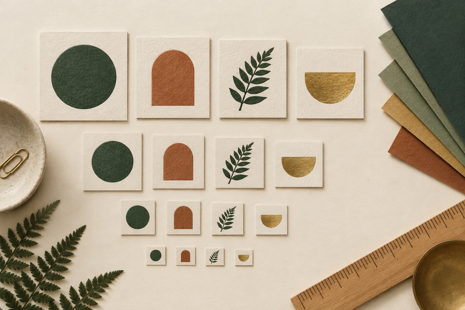
A logo in 2026 lives in worse places than any logo in history. It's a 16-pixel favicon on a tab the user swears she'll come back to. It's an app icon squashed into a squircle. It's a LinkedIn avatar, a watermark on a pitch deck, an etched mark on hardware, a footer stamp on an invoice PDF that renders in someone's 2013 email client. It is almost never the centred, whitespace-cushioned hero it was on the presentation wall where everyone applauded.
So we don't design logos. We design logo systems: a small family of related marks with tested behaviour at every size and context the brand will actually meet. The single static "primary logo with clear space rules" PDF is a deliverable from a decade when brands had three surfaces. Here's how the system version works — the same approach we run in our identity engagements.
The tier structure
Every identity we ship defines three or four explicit tiers, each a designed artefact, not a scaled-down accident:
Tier 1 — the signature. Full lockup: symbol plus wordmark, possibly a tagline line. Used where space and attention allow: website headers, covers, storefronts, the opening frame of a film. This is the only tier where the relationship between symbol and wordmark is a fixed composition.
Tier 2 — the mark. The wordmark alone (for wordmark-dominant brands) or the symbol alone (for symbol-dominant ones), each designed to stand independently. Not "the logo minus bits" — the spacing, optical size and terminals are redrawn for solo duty. Type that's tuned to sit next to a symbol looks wrong alone in ways most people feel but can't name; we fix it at the drawing stage, not in production complaints.
Tier 3 — the glyph. The smallest legible idea of the brand. App icon, favicon, avatar, social profile, loading spinner. This is usually a single letterform, a radically simplified symbol, or sometimes the thing nobody expects — a distinctive punctuation mark, a bar, a dot treatment. The glyph is designed first-pass at 32×32 and checked at 16; if it only works big, it doesn't work.
Tier 4 (optional) — the pattern mark. For brands with physical or motion surfaces, a drawing language derived from the mark — crops, repetitions, the symbol behaving as texture. This is how Hearthbrew's subscription packaging fills a mailer box without a single full logo on it: the mark at scale becomes wallpaper, and the box is recognisable from the kerb.
The rule that keeps tiers honest: each tier passes or fails on its own brief. "The favicon is just the logo made small" is the smell of a system that was never built.
The test contexts that kill logos
Before any mark is shown to a client, it runs our gauntlet — the contexts where identity systems actually die:
- The favicon test. Rendered at 16px on a white tab, a dark tab, and next to fifteen competitor tabs. Most marks become a damp smudge. The survivors have strong silhouettes or strong single hues.
- The app-icon test. Squircle-masked at 1024 and at 48. Symbols with fine detail or asymmetric tension read as accidents at small size.
- The invoice test. 300-wide, black-only, bottom-left of a finance PDF, reproduced on a mid-tier office printer. This test has ended more gradients than any design review.
- The one-colour test. Every tier must work in a single colour, both ink-on-paper and reversed. Not as a grudging "mono version" bolted on at the end — the one-colour version should be good enough to prefer.
- The embroidery/etch test. If there's any chance of physical application, we check stitch-count feasibility and single-pass laser etching. Thin strokes under ~0.4mm vanish; enclosed counters under a certain size close up and read as blobs.
- The motion-first frames test. For any brand that will appear in video, we check the mark as an end-frame: still, small, bottom-corner, over footage. Some beautiful marks are illegible in the only context film will ever show them.
Logos that pass the gauntlet are rarely the cleverest option on the wall. This is a feature. Cleverness is appreciated once; legibility is appreciated daily.
Motion behaviour is part of the system now
A brand that ships without defined motion behaviour ships unfinished. Not because every logo needs an animation — most shouldn't do much — but because the first time someone needs the logo to appear in a video, someone will improvise, and improvisation is how a thoughtful mark ends up swooshing.
We define, at minimum:
- The entrance. How the mark arrives: a draw-on, a settle, a plain cut. Duration and easing are specified — 400–600ms, and easing that matches the brand's physics, the same discipline we apply to interface motion. If product motion is tuned to feel precise, a bouncy logo entrance is a contradiction wearing assets.
- The behaviour. What, if anything, the mark does when alive: a breathing rate, a loading state (the glyph as spinner is nearly free and endlessly useful), a hover nudge on the web.
- The off switch. Every motion behaviour is defined with a static equivalent, non-negotiable — reduced-motion settings, print PDFs of decks, and screenshot culture all consume the still version. A logo that only exists in motion doesn't exist.
Co-branding and partnerships: write the rules before you need them
The week before launch is when someone emails asking for "the logo for the partner banner" — and if the system has no co-branding rules, the answer will be whatever the partner's intern cooked up. So every system we ship includes:
- The divider rule. How two marks share a surface: the divider line, its colour, and whose air is whose. Equal partnership gets equal optical size (not equal bounding boxes — an optical adjustment, since dense wordmarks read smaller than airy symbols at the same height).
- The endorsement pattern. "By ___" lockups for product brands under a parent, with a defined small-scale fallback because endorsement lockups die first at small sizes.
- The never-list. Real examples, rendered: the logo on a gradient, the logo in a box it hates, the logo with a drop shadow "for legibility". Never-lists with pictures get followed; prose rules get forwarded around until they're folklore.
The handover that actually happens
An identity system is only real if the people who inherit it can wield it. Our handover set, evolved over dozens of projects:
- Master files in the formats reality requires: AI/SVG masters, RGB and CMYK for every tier, PNGs in the exact sizes the common platforms demand, and a favicon set someone can use without opening design software.
- The usage guide as a website, not a PDF. PDFs fossilise; the guide online gets updated when tier 3 gets redrawn in year two. Internal links, copy-button colour values, downloadable assets that people can grab without opening design software.
- The font and licence file. Which typefaces ship with the identity, where licences live, what the fallback stack is. Brands get unwound by a missing licence faster than by any design flaw.
- A named internal owner. The single biggest predictor of an identity's condition at year three is whether one person inside the client owns it. We write that into the handover meeting, not because we can enforce it, but because asking the question is how it gets answered.
When the single logo still wins
Honesty corner: sometimes the system is overkill. A hyperlocal bakery, a conference, a zine — one well-drawn wordmark, one favicon, done. The tell is surface count: count the contexts the brand will meet in the next three years. Under half a dozen, draw one beautiful thing and spend the rest of the budget on typography. Over that, the system pays for itself in the first quarter, the first time nobody has to email an agency for "a small version".
Key takeaways
- Design tiers, not a logo: signature, mark, glyph, optionally a pattern mark — each briefed and judged independently.
- Run every tier through the real gauntlet: favicon, app icon, invoice PDF, one-colour, physical reproduction, film end-frame.
- Specify motion behaviour and its static equivalent. A logo with no off switch doesn't exist for reduced motion, print or screenshots.
- Write co-branding and never-list rules with rendered examples, before the first partner asks.
- Hand over a living system: all formats, a web-based guide, type licences, and a named owner on the client side.
- Small surface count? Skip the system and draw one great wordmark instead.
FAQ
How many logo variations is too many? Four tiers is our ceiling, and each addition must pass a "who asked for you" test. Variants multiply confusion faster than they add flexibility — if two tiers solve the same context, merge them. The system should feel like a small cast, not a crowd.
Should the favicon just be the first letter? Sometimes — if the letterform is distinctive and drawn for the job. A generic geometric sans initial at 16px is camouflage. If the letter isn't enough, simplify the symbol rather than defaulting to the alphabet.
Do we need brand guidelines for a two-person startup? You need a page, not a book: the tiers, the one-colour rule, the colours with values, the typefaces, and the never-list. Two people is exactly when bad habits are cheapest to prevent and hardest to retrofit.
How often should an identity be refreshed? Logos age like fonts, not like milk — slowly, then suddenly. Review the system every re-platform (new app icon standards, new social formats) and refresh when the gauntlet starts failing on surfaces that matter. A mark that needs annual redrawing was wrong; a mark that hasn't been looked at in eight years is a liability of a different kind.
Illustration systems that don't go stale
One-off illustration ages like milk. Here's how we build illustration languages as systems: primitives, composition rules, generators and maintenance models that survive.
An illustration system is rules, not a folder of PNGs
Illustration that stays consistent after the artist leaves: principles with forbiddens, per-artist commissioning briefs, rarity budgets, and storage that survives churn.
The logo is dead; long live the identity system
The standalone logo died when surfaces multiplied and motion became default. What replaced it isn't a smaller logo — it's an idea designed to survive every context.