Illustration systems that don't go stale
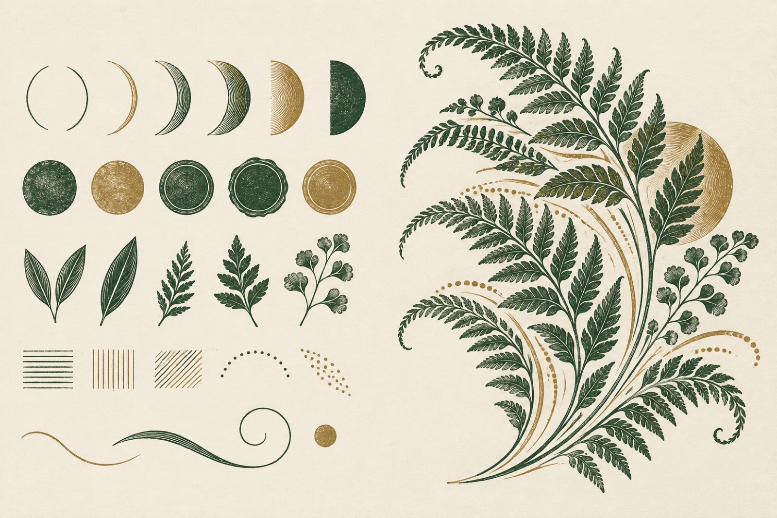
Every studio has seen the graveyard. A brand launches with twelve gorgeous bespoke illustrations — a hero scene, some spot art, a charming empty state — and for six months the site looks alive. Then a new feature ships and there's no illustration for it. A contractor paints one in a "close enough" style. Marketing needs a blog header by Friday, so someone buys stock. Eighteen months later the site wears four illustration styles like geological strata, each layer marking an era of whoever was available that week.
The failure isn't taste. It's architecture. One-off illustration is an expense; an illustration system is an asset. The difference is the same one that separates a logo from a logo system: a kit of parts, rules for combining them, and a way to produce new work that doesn't require the original artist. This is how we build them inside our brand engagements.
Start with primitives, not pictures
The mistake in most illustration briefs is commissioning images. "We need a hero about collaboration, a spot about security, and six icons." You get twelve pictures and zero language.
We brief for primitives instead: the smallest repeatable units of the visual language. For Tallow & Co., a providore with 1987 roots, the primitives weren't "draw some cheese." They were:
- Six base shapes — a hand-cut arc, a hatching stroke, a wax-seal circle, a crate rectangle, a leaf pair, a single continuous line.
- One grid behaviour — everything snaps to an 8px grid tilted 2°, which is what makes the work look hand-placed rather than machine-perfect.
- Two fills — flat ink, or ink with hatch shadow. Never gradients, never more than two colours plus the paper.
- One texture — a grain overlay at 6% opacity, applied last, always the same tile.
From those primitives you can compose a sourdough loaf, a delivery van, a storefront awning or an abstract pattern — and they all read as the same family because the DNA is shared even when the subject isn't. A good primitive set is like a good type scale: constraining in a way that makes everything else easier.
The test: we give a new illustrator only the primitive sheet and three finished compositions, then ask for a subject nobody has drawn yet. If the result slots into the family, the system works. If it looks like fan art, the primitives are mushy and we go back.
Rules of composition: the grammar nobody writes down
Primitives are vocabulary. You still need grammar — the rules about how much, how dense, how loud. This is the part brands skip and then wonder why two artists using the same shapes produce wildly different-feeling work.
The rules that actually prevent drift:
- Density ceilings. "A hero scene uses at most nine primitive instances; a spot illustration uses at most three." Density is the first thing that creeps when stakeholders say "can it feel richer?" A ceiling makes richness a decision, not an accident.
- A single focal verb. Every composition gets one thing that does something — a hand reaching, a line connecting two shapes, a lid lifting. Everything else is still. Two verbs in one frame is where illustration turns into clip art.
- Paper is a colour. The background is never "whatever's behind it." Specify it. Ours is almost always the brand's warm neutral, which is also why we art-direct imagery against the responsive canvas instead of treating illustration as transparent PNG confetti.
- Scale relationships. People are drawn at one of two sizes relative to objects: life-scale, where the world is normal, or giant-scale, where the world is a set they walk through. Never in between. Ambiguous scale reads as a mistake; deliberate scale reads as a style.
- What's forbidden. The "we will not" list is the highest-leverage page in any guidelines document: no drop shadows, no isometric tech cityscapes, no faceless-corporate-gradient people, no more than one speech bubble per asset. Every brand hates something; write it down before a deadline hates it for you.
Generators: illustration that ships at the speed of content
Even a good system stalls if every asset needs a human with a stylus. Where the subject matter is combinatorial — avatars, patterns, certificate art, social headers, feature cards — we build a generator: a small parametric tool that composes primitives into finished assets.
We've shipped these as Figma plugins, as little web apps, and once as a command-line script the content team ran in CI. The inputs are things a marketer can answer — subject, mood (from a fixed list), aspect ratio — and the output is an SVG that obeys every rule in the system because it can't do anything else. Density ceiling? Enforced by the composer. Forbidden moves? Not in the code.
The effect on throughput is absurd. One client's content team went from "three-week wait for blog art" to generating a header during the editorial meeting, and — more importantly — the hundredth generated asset looks as on-brand as the first, because the generator doesn't get tired, bored or influenced by whatever it saw on Dribbble that morning.
Generators pair naturally with the motion layer of the identity: the same primitives animate with the same easing tokens, so a looping header and a static spot feel like one language at two speeds.
Commissioning briefs that scale
You'll still commission humans for the work that deserves a hand: hero scenes, campaign art, the pieces with real narrative. The brief is where systems live or die. Ours has five parts and fits on two pages:
- The primitive sheet, current version, attached. Not described — attached, with the version number in the file name.
- The assignment in stories, not subjects. "A customer who has just realised they can sleep in because the roast arrives automatically" commissions better work than "a person drinking coffee happily." Stories give the artist the verb; subjects give them clip art.
- The context map. Exactly where this asset lives, at what sizes, next to what type. Composition for a 21:9 hero is a different drawing than the same idea at 1:1. Artists who know the canvas make better decisions; also, this is where you discover half the "we need an illustration" requests are actually "we need a layout fix."
- Two rounds, named. Round one is composition in rough — cheap to change. Round two is finish. A third round means the brief failed, and we say so in the document, which keeps everyone honest next time.
- The hand-back. Deliverables include the source file with layers named in our convention, so the system team can mine new primitives from finished art. Good commissioned work should make the kit richer, not just the page prettier.
Maintenance: who owns the garden
An illustration system without an owner has a lifespan of one reorg. The maintenance model we recommend:
A named editor. One person — usually a design lead — approves new primitives and new rules. Not a committee. Committees produce density creep and isometric cityscapes.
A quarterly cull. Every quarter, audit the asset library against the current rules. Assets that predate a rule change get fixed or deleted. Keeping legacy art "just in case" is how the geological strata form.
A changelog. The primitive sheet is versioned like software. "v3: hatching stroke now 1.5px, wax-seal circle retired, new ripple primitive added for the water campaign." Anyone holding v2 art knows it needs a refresh. We treat this exactly like a design tokens pipeline — because it is one, just with nicer pictures.
A budget line. Maintenance isn't free and pretending otherwise is how systems rot. Roughly 10–15% of the original build cost per year keeps a system healthy — new primitives, generator updates, the odd commissioned tentpole piece that re-sets the bar.
When illustration is the wrong spend
Honesty section, because we talk clients out of this as often as into it. Skip illustration when:
- The product is the visual. If you sell objects people want to look at — furniture, food, fashion — photography of the real thing beats abstraction almost every time. Illustration exists to make the invisible visible: concepts, services, software, feelings.
- Volume is low and stakes are high. Ten assets a year? Commission ten beautiful one-offs and skip the system overhead. Systems pay off at volume.
- The brand story isn't settled. Illustration style is a long bet. If strategy, naming or positioning are still moving, lock those first — building a visual language on a shifting strategy is how you buy the same system twice.
- Nobody will own it. No editor, no garden. Buy photography instead; it ages more gracefully when neglected.
Key takeaways
- Commission primitives and rules, not pictures. Assets expire; languages compound.
- The "we will not" list is the highest-leverage page in the guidelines.
- A generator that composes primitives turns illustration from a bottleneck into a button — and it never drifts off-brief.
- Judge a system by the stranger test: can a new artist produce on-brand work from the sheet alone?
- Budget 10–15% of build cost per year for maintenance, with a named owner, or don't build a system at all.
FAQ
How much does an illustration system cost compared to one-off art? The upfront cost is typically 2–3× a comparable set of bespoke illustrations, because you're buying the language, not just the assets. It usually breaks even inside a year for teams shipping weekly content — after that, each new asset costs minutes (generator) or a fraction of a commission (new art from existing primitives).
Can a system survive changing illustrators? That's the entire point. If the work collapses when the founding artist leaves, you bought a style, not a system. The primitive sheet, composition rules and generator are deliberately artist-portable — we test handover to a new illustrator before we call an engagement done.
How do you stop generated assets feeling samey? Samey is a failure of the primitive kit, not the generator. We aim for combinations in the thousands before calling a kit done, and we retire over-used compositions the way editors retire clichés. A quarterly "pattern report" — which primitives are doing all the work — tells us what to refresh.
Should illustration be on every page? No. Restraint is a system property too. We typically spec illustration for moments of explanation, celebration or emptiness — and deliberately keep it off checkout, settings and anywhere the user is mid-task. Decoration where people are trying to get something done is just latency with a style guide.
Does AI-generated art change any of this? It makes the primitives more valuable, not less. We treat generative tools the same way we treat a commissioned artist: they must work from the primitive sheet and pass the same audit. A model fine-tuned on your kit can draft at remarkable speed; the system is what keeps a thousand fast drafts on-brand — the same principle as our AI voice guardrails, applied to the visual layer.
An illustration system is rules, not a folder of PNGs
Illustration that stays consistent after the artist leaves: principles with forbiddens, per-artist commissioning briefs, rarity budgets, and storage that survives churn.
Design logo systems, not logos
A logo is judged at 16 pixels and on an invoice footer, not the presentation wall. How we build tiered identity systems — marks, motion, rules — that survive.
Mascot systems: when the character earns its keep
Most mascots are clip-art wallpaper. Here's how to tell if a character will earn its keep — and the construction, expression, motion and usage rules that keep it sharp.