Mascot systems: when the character earns its keep
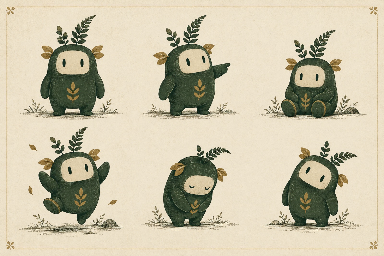
Every brand graveyard has a mascot section. A wide-eyed character, drawn with love for the launch campaign, grinning from the homepage hero — and, eighteen months later, grinning from nowhere else. The product team never asked for it. The support team is scared of it. It appears once a year on a sticker sheet for a conference nobody enjoyed, a ghost earning no rent.
And yet. Walk into any product people genuinely love and you'll often find a character doing real work: softening an error, teaching a gesture, turning an empty state from a dead end into a wink. The difference between those two fates is never the drawing. It's whether anyone asked, before sketching a single whisker, what job is this character being hired to do?
This is the framework we use when a client asks for a mascot — and, just as often, when we talk them out of one. It's part of how we scope brand identity engagements, and it has saved more mascots than it has created.
The employment test: two questions before any sketching
A mascot is a hire. Like any hire, it needs a job description, a manager and a budget. So before character design begins, we ask two questions.
1. Does the brand have recurring emotional moments nobody is dressing?
Mascots earn their keep at moments of feeling: the empty inbox, the failed payment, the first-run welcome, the 2 a.m. "something went wrong." If the product is a calm spreadsheet with no emotional weather, a mascot is a clown at a chess match. If the product regularly hands users disappointment, confusion or small victories, there is work available. Count the moments. Fewer than five recurring moments across the whole experience? Don't hire.
2. Is there anyone on staff who will feed it?
A mascot is not an asset; it's an ongoing character performance. It needs new poses, seasonal variants, expressions for features that don't exist yet. If the honest answer is "marketing will request art when needed, via ticket," the mascot will starve. We ask for a named owner — usually the same person who tends the illustration system — before we proceed. No owner, no mascot. This rule has killed more mascots than bad drawing ever has.
Pass both tests and you have a genuine brief. Fail either and we say so, in the document, and suggest what to do instead — usually a stronger illustration language or a motion identity, which deliver warmth without the upkeep of a character.
Where mascots earn (and where they never should)
Once hired, the character gets a territory map. This is the page of the guidelines most teams skip, and it's the page that determines whether the mascot ages into a beloved fixture or a lawsuit-shaped embarrassment.
Yes territory: empty states, success confirmations, onboarding, loading waits over three seconds, error pages, educational moments, community swag, the occasional campaign cameo. These are moments with slack in them — the user is waiting, or done, or stuck — and a character filling that slack feels like hospitality.
No territory: invoices, receipts, legal and security notices, permission requests, pricing pages, account deletion flows, and anywhere the user is mid-task at speed. A mascot on an invoice reads as flippancy about money. A mascot on a delete-my-account screen reads as emotional manipulation. Our shorthand at the studio: error pages yes, invoices no — the character shows up when the user needs company, never when they need answers.
The rule underneath both lists: the mascot may comment on the experience, never interrupt it. The moment a character slows a task by a single beat, it's no longer a mascot. It's an ad.
Construction: rig the character like an athlete, not a statue
Most mascot briefs produce one drawing: the character at three-quarter view, waving, best foot forward. Then reality arrives — the character must now shrug, hold a phone, fit in 24 pixels and look disappointed without looking like it's blaming the user. The single-hero-pose mascot collapses within a quarter.
We build mascots as rigs, not portraits:
- One anchor shape. The character's silhouette must survive as a single filled blob. We test at 24px and at arm's length on a poster. If the silhouette could be anyone — a bean, a blob, an ambiguous animal — the construction fails. One memorable outline beats five clever details.
- Three construction pieces, max. A body logic, a face logic, a limb logic. Complexity beyond that multiplies every future drawing request and guarantees drift between illustrators. The best-performing mascots we've shipped are built from fewer shapes than an average icon set.
- Pose economy. We deliver six canonical poses — neutral, pointing, working, waiting, celebrating, apologetic — and the rules for deriving more. "Working" and "waiting" alone cover sixty percent of real product needs. A mascot with forty poses has no canonical self; one with two has no range.
- The face is a separate system. Eyes and mouth get their own spec sheet: positions, proportions, and which mouth pairs with which eyes. This is what stops the slow slide into uncanny territory where version nine of the character looks like it's seen things.
Everything inherits from the parent identity — the character is drawn in the brand's stroke weight, its palette, its grain — so it reads as family rather than a hired mascot bolted on afterwards.
The expression library: six faces cover a career
New teams always over-commission expressions. The library we ship has six, and each is tied to a named product moment:
| Expression | Product moment | The rule |
|---|---|---|
| Neutral | Default presence, avatars | The resting face must be kind at 24px |
| Encouraging | Empty states, streaks, onboarding | Warmth without hype; no jazz hands |
| Waiting | Loading over 3s | Occupied, not anxious — never staring at the user |
| Celebrating | Success, milestones | One beat of joy; the moment passes and the character steps back |
| Apologetic | Errors, failures | Takes the blame itself; never frames the user as the problem |
| Curious | Tips, education, "did you know" | Invites, doesn't lecture |
Three rules keep the library honest. First, apologetic never appears with celebratory on the same screen — you'd be amazed how often a success toast and an error banner coexist. Second, expressions are states, not stickers: each one defines posture and eyes together, because a disappointed mouth on a waving body is a hostage video. Third, the hardest expression to draw is sincerity at small sizes, so we design the 24px version first and scale up, never the reverse.
Motion: the character moves like the brand, not like a cartoon
A mascot that moves is twice as alive and three times as dangerous. The failure mode is theatrical: bouncing, blinking, attention-seeking loops that turn the product into a children's show and the CPU into a space heater.
Our motion rules for characters are the same ones we apply to the whole identity's motion layer, with two extras:
- Ambient motion is nearly still. A breathe, a blink every eight seconds or so, a settle. If you can notice the loop, it's too loud.
- Reward motion is one gesture. A hop, a turn, a hat tip — one thing, under half a second, that doesn't repeat. Celebration that loops is celebration that mocks.
- The character must hold still at
prefers-reduced-motion. A static pose, fully composed, not a frozen mid-bounce frame. This is tested like any other state, because stillness is a state.
Ownership, or: who feeds the mascot
In the guidelines, the mascot gets a chapter of its own in the living brand documentation, versioned like software: new expressions are releases, pose fixes are patches, and nothing ships to the library without the owner's review. We also write down who is allowed to commission new art (the owner), where source files live (not on someone's laptop), and what happens when the library is asked for something it doesn't have (a one-week turnaround rule, so nobody improvises a pose in PowerPoint — the true killer of mascots).
Retiring a mascot with dignity
Characters end. Brands outgrow them, products pivot, audiences age. The mistake is the silent disappearance — one day the character is just gone, and the community notices, and the thread about it is sadder than any offboarding email.
When retirement is right, we plan it like a departure, not a deletion: a last campaign or cameo that closes the loop, a thank-you in the changelog (yes, really — it works), an archive page in the guidelines so the character's history is preserved rather than scrubbed, and a decision about inheritance. Often the mascot's best feature — a colour behaviour, a shape, an expression logic — deserves to be folded back into the parent identity. The 404 page is a good retirement home: a beloved former mascot makes a perfect guide for lost visitors, a lighter role for a lighter duty.
Done well, a retirement deepens affection for the brand. People remember companies that treat their own artefacts with care.
Key takeaways
- A mascot is a hire: it needs a job description (recurring emotional moments), a named owner, and a maintenance budget. Missing any of the three, don't draw.
- Map the territory before the art: error pages yes, invoices no. The mascot comments on the experience; it never interrupts a task.
- Build a rig, not a portrait — one anchor shape, three construction logics, six canonical poses, a separately-specified face.
- Six expressions cover a career. Design them at 24px first; apologetic and celebratory never share a screen.
- Mascot motion follows brand motion law: near-still ambient, one-gesture rewards, and a composed static pose under reduced motion.
- Plan the ending. A character retired with a farewell and an archive is a brand asset forever; one that vanishes is a small betrayal.
FAQ
How much should a mascot system cost relative to a brand identity? As a working number, a properly rigged mascot — construction, expressions, motion behaviours, guidelines — runs 15–25% of the identity budget. If that number makes the room flinch, that's useful information: it usually means the brand doesn't have the operational appetite a character requires, and the money is better spent on a deeper illustration system.
Should our mascot have a name? Only if the community will use it. Named mascots work when users talk to or about the product — developer tools, community products, consumer apps. In B2B contexts the name usually becomes an internal joke within a quarter, which is fine, but be honest about which audience it's for.
Can we use our mascot in marketing but not product? You can, but it's the weakest configuration. A mascot that only appears in ads is a spokesperson; a mascot that lives in the product is a host. The strongest mascots do both, with the product expressions — calmer, smaller, less theatrical — treated as the canonical personality that marketing amplifies rather than replaces.
What about AI-generated mascot variants? The same rule as all generative brand assets: generation is fine for exploration, forbidden for production. A mascot's integrity lives in construction consistency, and current generative tools cannot hold a character's geometry steady across poses. Ship from the rig, not from the prompt.
Illustration systems that don't go stale
One-off illustration ages like milk. Here's how we build illustration languages as systems: primitives, composition rules, generators and maintenance models that survive.
An illustration system is rules, not a folder of PNGs
Illustration that stays consistent after the artist leaves: principles with forbiddens, per-artist commissioning briefs, rarity budgets, and storage that survives churn.
Sonic branding for studios without a jingle budget
Lightweight sonic identity without the six-figure jingle: the three-moment rule, UI sound principles, accessibility defaults, and one commissioned motif.