Art-directing images for the responsive web
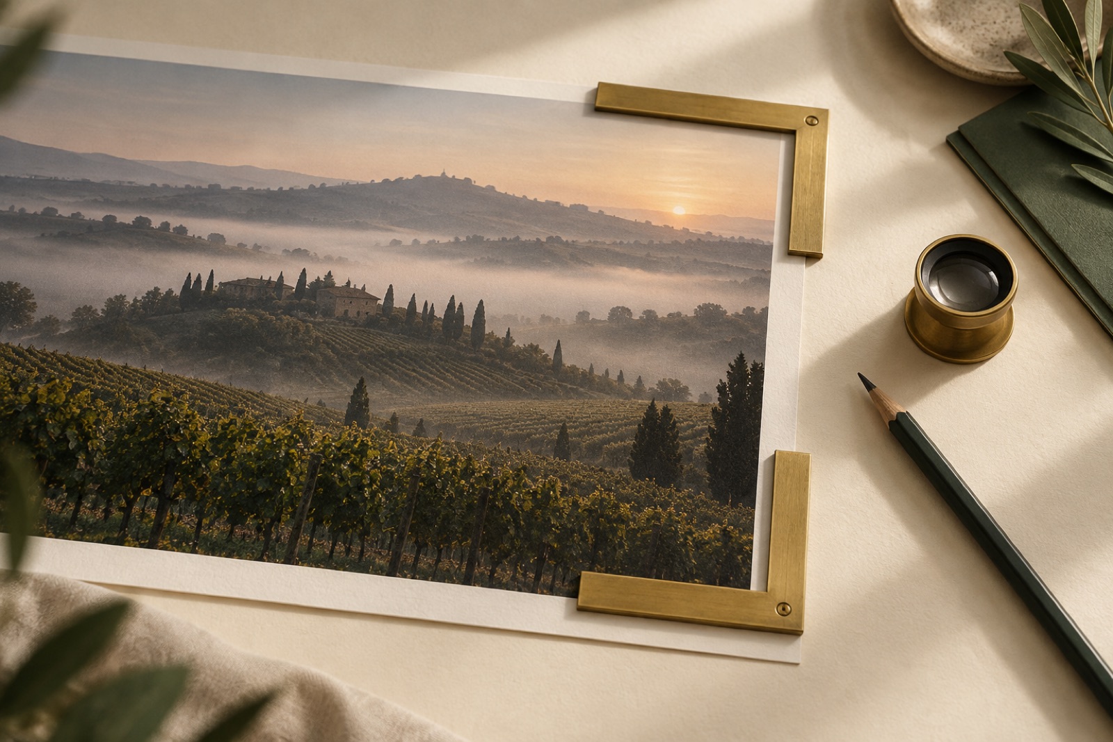
The most common lie on the responsive web is object-fit: cover. It promises that one image can serve every viewport, and it keeps that promise by quietly throwing away a third of the photograph. A wide, breathing editorial shot becomes a cramped sliver on a phone. The subject ends up bisected by the fold. Nobody chose that crop — it was chosen by arithmetic, centred and indifferent.
Art direction is the refusal to let arithmetic compose your pages. The tools have existed for a decade: the <picture> element, srcset, sizes, CSS aspect ratios, focal-point metadata in any headless CMS worth its licence fee. What's scarce is not technology but the discipline of treating the crop as a design decision. This is that discipline, as we practice it — including the uncomfortable conversation about generated imagery, which we have with more clients every quarter.
Crop-as-composition: the portrait crop is not a small landscape crop
Look at how most responsive images actually fail. A hero photographed for desktop: subject right of centre, negative space left for the headline. On mobile, object-fit: cover keeps the centre of the frame — the negative space — and the subject slides out of view. The fix is not a smarter algorithm; it's a different photograph, or at least a different crop, composed from scratch for the portrait frame.
Our rule: every important image has at least two compositions. Not two sizes — two compositions, art-directed independently, each with its own subject placement, breathing room and text safe-zones. On the Fernleigh Wines storefront, the desktop hero is a wide vineyard tableau, bottle tiny in the foreground; the phone hero is the bottle and a hand, close. Same story, different sentence.
Practically, this is the <picture> element doing exactly what it was invented for:
<picture>
  <source media="(max-width: 48rem)" srcset="hero-portrait.avif" />
  <source srcset="hero-wide.avif" type="image/avif" />
  <img src="hero-wide.jpg" alt="…" width="1600" height="900"
       fetchpriority="high" decoding="async" />
</picture>
The width/height attributes are not decoration — they reserve layout space and kill CLS. For anything that will be the LCP element (heroes, almost always), fetchpriority="high" is the single highest-leverage attribute on the page. And never, ever loading="lazy" an above-the-fold image; lazily loading your own LCP is a surprisingly common self-own.
Focal points: teaching the CMS what not to crop
Two compositions won't cover every case. Blogs, product grids and archives generate crops automatically, and for those you need the image to carry its own intent. Every CMS integration we ship includes a focal-point field: the editor clicks the thing that must survive any crop, and the front end uses it to position the image (object-position) instead of centring blindly.
The editor experience matters more than the implementation. If setting the focal point is optional, editors won't do it — not from laziness, but because nothing in the preview shows them the consequence. Show the thumbnail grid in the CMS, rendering the actual square and portrait crops, and the field fills itself. Consequence visible in the tool beats instruction in the documentation every time. This came out of our editorial work on the Holloway Records catalogue, where two hundred album-adjacent press shots needed to survive three crop ratios without decapitating anyone.
Aspect ratio is a layout token
The subtlest form of image chaos is the ragged grid: cards whose images are 4:3, 16:9 and "whatever the client uploaded", stacked in a layout that assumed one of those. The fix is to promote aspect ratio into the design system as a first-class token. Our systems define a small closed set — typically 4:5 for editorial cards, 16:10 for heroes and featured work, 1:1 for thumbnails — and the layout refers to tokens, not images. aspect-ratio: var(--ratio-card) on the container, image fills it, done.
Two consequences follow. Editors get upload guidance written in crops, not pixels: "this slot shows 4:5; your image will be cropped to that shape." And the page stops jumping. Reserved aspect-ratio boxes mean zero layout shift from imagery, which is the difference between a page that feels machined and one that feels nervous. (The full performance playbook — budgets, lazy loading, format negotiation — lives with our websites practice; the point here is that art direction and Core Web Vitals are the same conversation.)
The AI question, honestly
So: generated imagery. We use it — this site is full of it — and we also talk clients out of it regularly. The honest framework we apply:
Where generated imagery serves the brand: abstract editorial art, textural backdrops, conceptual illustrations for topics photography can't touch (data flows, infrastructure, futures), and rapid prototyping of directions before a real shoot is commissioned. It is superb at texture and atmosphere, and it makes high-volume content programmes economically possible. We'd rather see a consistently art-directed generated style across ninety journal articles than ninety mismatched stock photos pretending to be a system.
Where it quietly erodes the brand: anywhere trust is the product. People — always. A generated face is a fictional employee wearing your brand's clothes; the day a customer learns that, every honest photo on the site becomes suspect. Product — shoppers read generated product images as an admission the thing doesn't exist. Place — a restaurant that generates its dining room is telling you the dining room cannot be photographed. When we built Wattle & Daub's site, the photography brief was explicit: real room, real pass, real Sunday light. Bookings are a trust transaction; the images are the deposit.
The middle ground matters too: consistency is a design system problem. If you use generated imagery, treat it as you would a photographer's brief — one documented style (palette, lens feel, grain, negative space), one tool configuration, a review gate. Uncurated generation has a signature: the plasticky sheen, the nonsensical detail at the frame's edge. Audiences have learned to read it, and what it says is "nobody looked at this before you did."
A working checklist for image art direction
When we hand a system to a client team, this is the card that travels with it:
- Every key image has purpose-built desktop and portrait compositions, switched with
<picture>. - Every auto-cropped image carries a focal point, and the CMS previews the real crops.
- Aspect ratios are layout tokens; containers reserve space; nothing shifts after load.
- The LCP image ships with
fetchpriority="high", explicit dimensions, no lazy loading, and a modern format with a real fallback. - Below the fold, images lazy-load with
decoding="async"; srcset is tuned to actual rendered sizes, not a hopeful ladder of device widths. - Every image has declared intent — informative, evocative or decorative — which decides both its alt text and its crop priority.
- Generated imagery follows a written style brief and never impersonates people, product or place.
None of this is exotic. All of it is the difference between images that were placed and images that happened.
Key takeaways
- Two compositions per key image, minimum: the portrait crop is a redesign, not a resize.
- Focal-point metadata plus a CMS preview of real crops keeps auto-generated thumbnails honest at scale.
- Promote aspect ratio to a layout token and layout shift disappears.
- The hero image is a performance feature:
fetchpriority, dimensions, modern formats, never lazy. - Generated imagery wins for texture and abstraction; it should never stand in for people, products or places your customers need to trust.
Frequently asked questions
How many image breakpoints do we actually need? Fewer than you think. Two art-directed compositions (wide and portrait) plus three to four generated sizes per composition covers real-world traffic well. The ladder of twelve widths in many srcset implementations mostly serves to slow builds; size the generated set from your analytics' actual viewport distribution instead.
Is AVIF or WebP worth the pipeline complexity in 2026? Yes — serve AVIF with a WebP or JPEG fallback via <picture> and stop thinking about it. The byte savings are large enough (commonly 30–50% over JPEG at equal quality) to move LCP on mobile connections, which is where LCP matters. Every modern build pipeline can emit both in the same pass.
How do we stop editors uploading gigantic originals? You don't stop them — you absorb it. Accept the upload, generate the size/format ladder server-side or at build, and never ship the original to the front end. The governance failure is exposing originals to the page; expect humans to export at maximum quality, because they always will.
Can generated imagery be accessible? As accessible as any imagery — the question is alt text and intent, not provenance. Generated images are frequently harder to describe because they contain incidental, meaningless detail; prune the composition so there's something to say, and declare decorative images decorative. The accessibility failure mode is the same as with stock: using imagery with no intent and then writing alt text that pretends otherwise.
A photography style without a photoshoot
No budget for a shoot? Crops, duotones, grain and a treatment matrix make any source image look on-brand. How we art-direct cheap photography.
Aspect-ratio systems for editorial imagery
Stop cropping at random. A small, deliberate set of aspect ratios — what each says editorially, how object-fit discipline works, and how ratios survive art direction.
Scrollytelling with restraint: narrative pages that respect the scrollbar
The production playbook for scrollytelling that earns its keep: a one-pin budget, chapter navigation, a designed reduced-motion variant, and a print-test honesty check.