Holloway Records: an independent label site that sells records, not ads
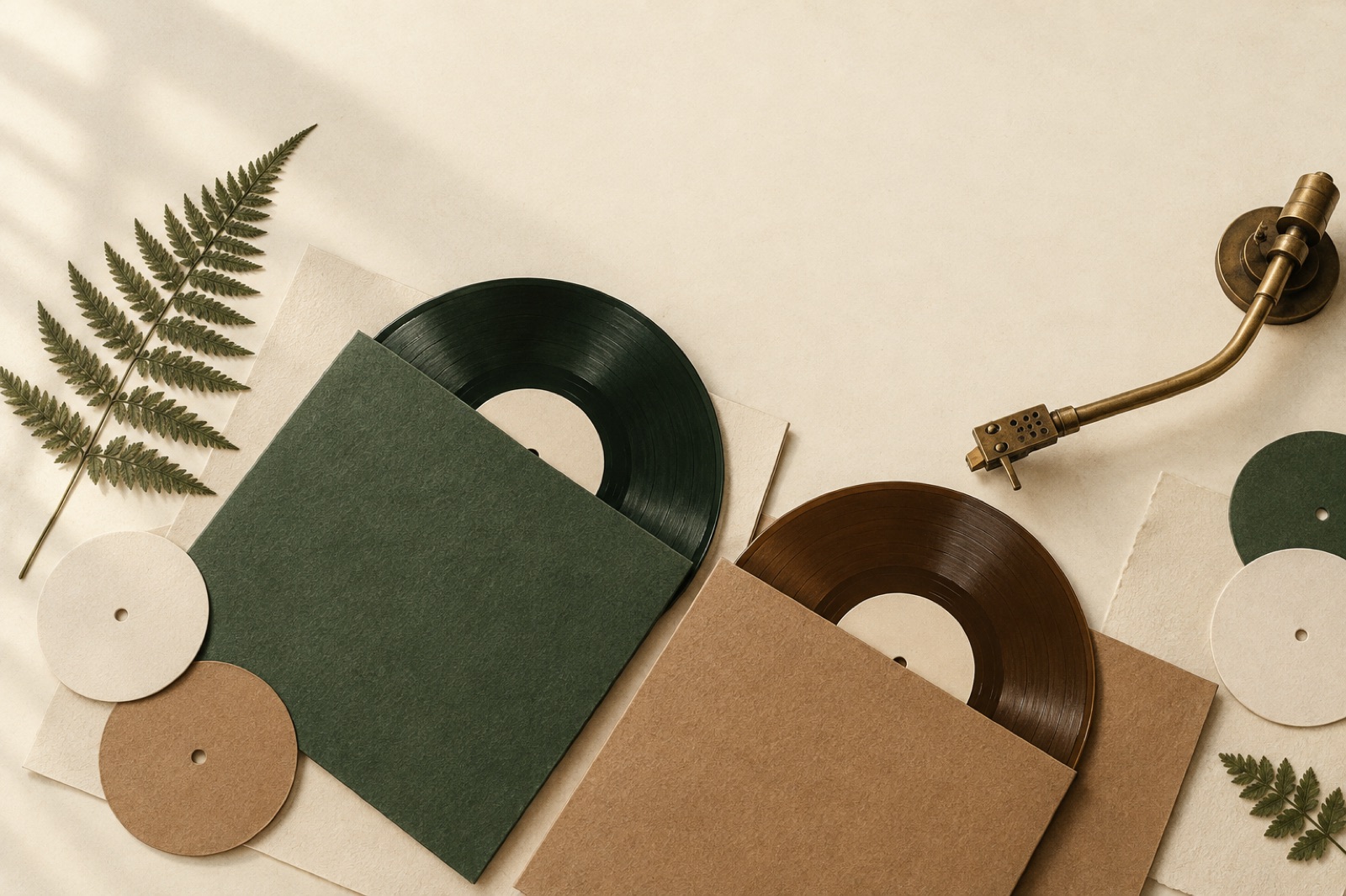
This case study ships with two working mini-products — mocked data, real craft.
Holloway Records is a fictional Sydney independent label with eleven artists, a catalogue of sixty-odd releases, and the standard financial arrangement of indie music: streaming pays for coffee, vinyl pays the rent. When they came to Brassfern, their site was a link-in-bio graveyard — a grid of streaming-service buttons that dutifully sent every visitor's attention (and margin) to platforms Holloway didn't own.
Label founder Cass Ando put the brief plainly: "I want a site that behaves like the listening room at the back of the shop, not like a flyer board." What follows is how we built exactly that. The figures are illustrative, the craft is not.
The challenge
Independent labels face a structural contradiction online. Discovery happens on streaming platforms and social media, but the economics only survive on direct sales — vinyl, merch, memberships. The website's job is to catch attention mid-scroll from Instagram and convert it into a relationship the platform can't tax. Most label sites fail at both ends: too thin to hold attention, too shy to ask for the sale.
Holloway's specific problems were threefold. First, streaming buttons leaked nearly every visitor within nine seconds; outbound links were the entire homepage. Second, merch and vinyl ran through a marketplace storefront that knew nothing about the music — you could buy the LP without hearing a note. Third, the artists themselves were invisible: no story, no context, no reason to believe this label's record over any other. Cass's instinct — "a fan of one Holloway artist should become a fan of the label" — had nowhere to live.
Constraints, as always: a two-person team running everything, releases every three to five weeks, and a hard requirement that updating the site never take longer than boxing the records it sells.
The approach
Music-first information architecture. We inverted the standard label homepage. Instead of a news feed, the site opens on whatever is playing — a persistent audio layer with the current featured release one tap away, full tracks for members, generous previews for everyone. Artists, releases and a small editorial section ("Liner Notes") form the whole IA. The shop is present everywhere and pushy nowhere: every track that plays carries a quiet, persistent "this exists on vinyl" line. Selling as annotation, not interruption.
An audio player that never betrays the listener. The technical heart of the project is a Web Audio API player that survives navigation (an SPA-style island on an otherwise static site), remembers position across pages and sessions, and handles the thing every music site gets wrong: tab behaviour. Audio ducks politely when the OS demands it, resumes without ceremony, and never autoplay-blares on a second visit. We tested on the actual hardware of the label's actual audience — old iPhones, cracked Androids, an iPad mini from 2019. If the player stutters, nothing else matters; we budgeted performance there first, the same priority order we bring to our commerce work.
Artist pages as editorial, not templates. Each of the eleven artists got a designed page — not eleven layouts, one flexible system with art-directed moments: full-bleed photography, pull quotes from interviews we commissioned, a "path through the catalogue" for new listeners ("start here, then here, then this live recording"). The label's voice does the connecting: every release page ends with Cass's own two-sentence note on why Holloway signed it. That idiosyncratic, human layer is what a platform can never clone — and it's why the site builds loyalty to the label, not just to individual acts. It's a philosophy we return to often, from restaurants like Wattle & Daub to climate data: own your story or rent someone else's distribution.
Vinyl drops with honest scarcity. Limited pressings (typically 300 copies) get a drop mechanic: a countdown page with the story of the pressing, colour-variant photography, and a waitlist that converts at an absurd rate. Critically, we refused every dark pattern the brief could have invited — no fake "only 2 left" counters, no artificial cart timers. Scarcity at Holloway is real; the design just stops hiding it. A sold-out page swaps to a "tipped for repress" waitlist, which doubles as demand signal for the next pressing decision.
Membership as the business model. "The Dead Wax Society" — named by Cass — is a AU$9/month membership: full streaming of the catalogue on-site, first access to drops, a quarterly 7-inch club, and members-only liner note essays. We built the signup directly into the player: hit the preview limit on a track you love and the pitch appears in context, mid-listen, where the desire actually lives. Member onboarding then borrows the activation logic from our Brightmarsh work: value in the first sitting, no confetti.
The outcome
Twelve months post-launch:
- Average session length: 48 seconds → 6 minutes 12 seconds, with 71% of sessions now including playback. The site went from flyer board to listening room, as briefed.
- Direct vinyl and merch revenue up 3.1× year-on-year, with drops now selling out in a median of 19 hours. The waitlist alone covers the first pressing decision's risk on most releases.
- Membership passed 1,400 subscribers in year one — recurring revenue that, in Cass's words, "pays the rent so the records can be reckless." Churn runs under 3% monthly, which we attribute to the quarterly physical artifact: subscriptions anchored to objects outlast subscriptions anchored to apps.
- Outbound clicks to streaming platforms fell 62% — not by hiding the links (they're still on every release page, for the fans who live there) but by giving visitors something better to do first. Discovery still happens off-site; the relationship now happens on-site.
- Update burden: under 20 minutes per release. Sanity models releases, artists and drops as structured content; a new release page is data entry plus one batch of photography, hitting the same editorial standard every time.
The outcome nobody forecast: two artists approached Holloway because of the site, citing the artist pages as evidence of how the label treats its roster. A website as an A&R tool. We'll happily take credit for that in hindsight.
Stack and team
Astro for the static shell with a persistent React island for the player; Web Audio API with HLS for adaptive audio; Shopify Hydrogen for checkout and inventory, extended with the waitlist service; Sanity for editorial content; Stripe for membership billing. The entire front page ships under 120KB of JavaScript except the player island, which lazy-loads on first interaction. Team: one design lead, one brand designer (the label identity refresh ran in parallel), one engineer, sixteen weeks including the parallel brand work — structured as our fixed-scope sprints describe.
What we'd tell another label
Your catalogue is the homepage; your story is the moat. Make playback unkillable and unclichéd — fans forgive ugly, they do not forgive interrupted. And sell with honesty: the indie audience has forensic dark-pattern detection and a long memory.
More of this thinking lives on our journal and across our work. If your records deserve better than a flyer board, brief us.
Glasshouse: a seat map people stopped dreading
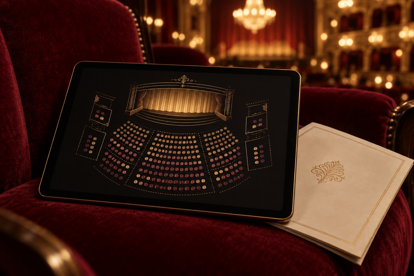
A 384-seat theatre's box office was where sales went to die. We rebuilt it around an honest seat map, truthful timers and keyboard-first booking.

Verdigris Archive: 80,000 botanical plates, searchable in a blink
A botanical museum put 80,000 plates online with fast faceted search, a deep-zoom viewer and public-domain downloads. Search success rose 63%.
The Corrowong Trust: an archive people actually browse
How we rebuilt a regional museum group's 180,000-item digital archive around wandering instead of database forms — and made it funding-proof.