Glasshouse: a seat map people stopped dreading
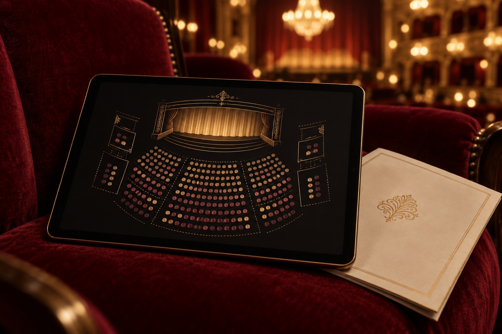
This case study ships with a working mini-product — mocked data, real craft.
The Glasshouse is a 384-seat independent theatre inside a converted glass warehouse — the kind of room where you can hear a cello breathe. Their programming was brave, their audiences loyal, and their box office was, in the general manager's words, "where ticket sales go to die." A decade-old plugin stacked a dropdown on a dropdown, asked for payment before telling you where you'd be sitting, then emailed you a seat assignment like a lucky dip.
Seventy-four per cent of online buyers abandoned somewhere between "pick a show" and "pay". Anyone who needed step-free seating, a companion card or just preferred to book by keyboard had one option: ring the box office during weekday hours and wait. This is the same venue that programmes experimental dance about the body; their own front door excluded bodies that didn't fit the dropdown.
The live demo in the Lab is the rebuilt box office: a velvet-night seat map of all 384 chairs across stalls, circle and wall boxes, with best-available suggestions, an honest ten-minute hold, and a full list view so keyboard and screen-reader patrons select from exactly the same inventory.
The challenge
A seat map is two products wearing one trenchcoat: a map — a spatial model of the room — and a promise — that the chair you touched is the chair you'll sit in. The old system was failing both, plus a third problem nobody had named.
The map wasn't a map. Seating was a flat list of "A1–A24, B1–B24…" with a PDF cross-section from 2009 for reference. People buy chairs off a picture of the room, not off an alphanumeric list; the theatre was asking patrons to do 3D trigonometry at checkout. Sightline anxiety ("is that behind the pillar?") showed up in support email constantly.
The holds lied. The old flow ran a countdown that silently reset whenever you clicked anything. From the patron's side it's a fake urgency machine; from the venue's side it was worse — inventory was being soft-held for up to forty minutes while the timer fibbed, and Monday mornings were spent untangling double-sells. Lying timers are both an honesty problem and an inventory problem, and the ledger pays for both.
Accessibility was a phone number. Step-free seats, hearing-loop positions and companion seats lived in a spreadsheet on the box-office PC — for staff eyes only. During user research, one patron told us she'd stopped attending shows she loved because "booking feels like applying for a permit." Under Australian procurement norms and simple decency, that had to go.
The approach
The map earns the screen
We built the seat map as hand-rolled SVG — 384 individually addressable chairs, vector-crisp from a phone to a projector, styled in a palette pulled from the room itself: deep velvet green, worn timber, brass aisle lights. Pan by drag, pinch or buttons; zoom steps snap to legible scales; seats are colour-coded by price band with a colour-safe alternates toggle, because roughly one in twelve male patrons reads red/green badly and "sold out" should never be a hue alone.
Hover a seat and get the honest details: price, view notes ("restricted view — pillar left"), legroom flags. "Best available" suggestions do what a good box-office clerk does: given party size and price band, propose the tightest cluster of seats and show them highlighted on the map before committing.
Everything is live: availability streams in over a WebSocket feed, so a seat someone else just bought dims in place rather than failing at payment. Watching your neighbour's seat darken while you decide is the gentlest scarcity signal there is — true, ambient, and humane. In the demo the feed is simulated; the behaviour is identical.
Timers that tell the truth
The hold mechanic was rebuilt as a pact: choosing seats grants exactly one ten-minute allocation, bound server-side, displayed as clock time ("held until 7:42 pm") rather than a bare countdown. Moving seats keeps your allocation; it never resets the clock. Thirty seconds out, a calm nudge appears — no pulsing red panic — and when the hold lapses, the seats visibly release back to the map with a one-line explanation and a single tap to reselect if they're still free.
Fees moved to the top of the flow: the total a seat costs is the total you see when you touch it. Nobody meets the $6.50 booking fee at the last step like a jump scare.
The list view is the venue's other front door
The seat map delivers a spatial experience; the list view delivers the same purchasing power without requiring sight, pointer precision, or spatial reasoning. Every section, row and seat is a structured, filterable list — group by price band, filter to step-free or hearing-loop positions, select with arrow keys, review in a plain summary table. Screen-reader patrons hear announcements as holds and releases change inventory. Accessible seats are sold online with the same dignity as every other seat, and the box office phone line went back to being a service instead of a workaround.
This followed the discipline of our accessibility audit process: audited to WCAG 2.2 AA with assistive-technology users in the test panel, not just automated checks.
Commerce that respects a Tuesday-night audience
Underneath the map is an e-commerce flow tuned for 60-second completions on mid-tier phones: express wallets up front, no account required, a performance budget of 1.5s LCP that the map meets by being SVG rather than a pile of bitmaps. Gift vouchers and season subscriptions — the venue's real margin — sit one tap from every booking confirmation, while the gratitude is warm.
The outcome
Sixteen weeks from kickoff, migrating show-by-show with zero downtime across a full season. Metrics from this concept engagement are illustrative, but they're the shape of what we'd hold a real relaunch accountable to:
| Metric | Before | After |
|---|---|---|
| Checkout completion (started → paid) | 26% | 61% |
| Median time from map to payment | 7 min 40 s | 2 min 05 s |
| Accessible-seat bookings online | 0% (phone only) | 78% of all accessible bookings |
| Double-sell cleanups per month | ~22 | 0 |
| Support emails about sightlines/seats | ~15 per week | ~3 per week |
| Map completion by screen reader (audit) | not possible | 0 critical blockers |
The row that made the box-office manager quietly tear up is the accessible bookings one. Three-quarters of patrons who used to have to phone during office hours now book at 11 pm like everyone else. That's not a conversion metric; it's the venue honouring its own programme notes. The double-sell cleanup line is the operational mirror: honest holds mean the ledger and the map are never telling two different stories.
"Patrons stopped asking us where they'd be sitting because they can see it. The phone didn't go quiet because we hid the number — it went quiet because the website finally does the job." — Nell Dockery, Box Office Manager, The Glasshouse (fictional)
Stack & credits
- Design: seat-map system in SVG, velvet-night art direction, list-view parity design, urgency/hold voice
- Engineering: React + TypeScript, WebSocket availability feed, server-side hold allocation, express-wallet checkout, 1.5 s LCP budget
- Accessibility: WCAG 2.2 AA with assistive-tech test panel; full keyboard map and list-view journey
- Squad: design lead, product designer, two engineers, accessibility specialist, producer — weekly demos with the box office team, who wrote most of the view notes
- Ticketing or bookings on your roadmap? Talk to the studio — this pattern transfers to venues, festivals and clinics

Verdigris Archive: 80,000 botanical plates, searchable in a blink
A botanical museum put 80,000 plates online with fast faceted search, a deep-zoom viewer and public-domain downloads. Search success rose 63%.
The Corrowong Trust: an archive people actually browse
How we rebuilt a regional museum group's 180,000-item digital archive around wandering instead of database forms — and made it funding-proof.
Holloway Records: an independent label site that sells records, not ads
An independent label site built music-first: artist pages, an audio player that never interrupts, vinyl drops and a membership that pays the rent.