A photography style without a photoshoot
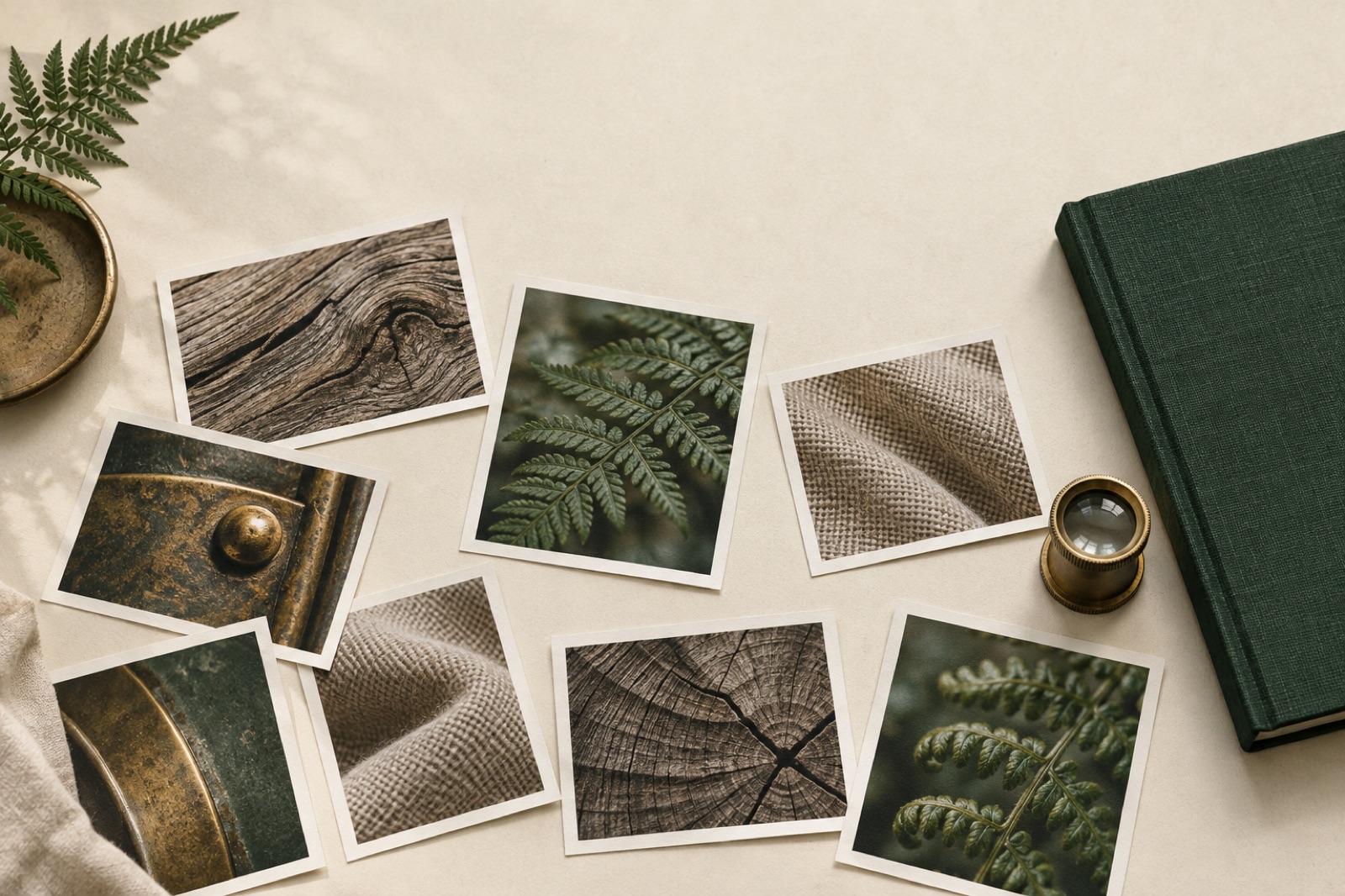
A photo shoot for a small brand costs what a small brand doesn't have. Five figures in Sydney once you count the photographer, the stylist, the location, the food that gets styled and thrown away. So most young brands do the sensible thing — they use stock — and the predictable thing happens: their website looks like every other website that used the same search terms. "Diverse team collaborating around laptop." You know the image. You've closed the tab on it.
You don't need a photoshoot to have a photography style. You need a treatment system: a small set of decisions about crop, colour, texture and subject that makes any source image — stock, founder's phone, supplier shots, licensed editorial — read as unmistakably yours. We've built these systems at Brassfern for brands that had nothing to shoot and everything to prove. Here's the method.
Start with what you'll never show
Every strong photographic style is defined by its exclusions. Before you pick what images look like, list what they will never be. This list is the fastest thing to write and the hardest to hold, so write it in the brand book in blunt language. Some real examples from our projects, anonymised to the principle:
- No eye contact with camera. Instantly kills 90% of stock photography, which is the point. Images become observed rather than staged.
- No white backgrounds. Forces warmth, texture, context — and rules out every packshot-style library image.
- No hands doing nothing. If hands appear, they're working: holding, pouring, cutting, turning. This single rule made Tallow & Co. — a butcher-turned-providore with zero photography budget — look like it had a documentary crew embedded in the shop. All of it was the owner's phone and one $80 macro clip-on lens, graded to spec.
Exclusions do the heavy lifting because they're checkable. "Warm and authentic" is a vibe; "no eye contact, no white backgrounds, no staged hands" is a diffs-that-fail test anyone can run while browsing a stock library.
The four levers
A treatment system has four levers. You don't need all four — you need the same ones, applied consistently.
1. Crop. Cropping is the cheapest art direction there is. Decide on a compositional grammar and apply it ruthlessly: extreme close-ups only; or always off-centre with generous negative space; or details at 100%, scenes at a distance, never the middle distance in between. One of our favourite systems forbade the "medium shot" entirely — images were either textures (a crust, a weave, condensation) or wide environmental frames. The missing middle is what made it feel authored. Also decide aspect ratios per slot (hero, card, avatar) and stick to them; nothing says "template" like a grid of whatever-ratio-the-source-was.
2. Colour grade. This is where "any source image" becomes true. Pick a palette relationship and enforce it:
- Duotone or tritone. Map shadows and highlights to brand colours — ink and cream, fern and paper. Duotone is unfashionable exactly where it's overused (fintech gradients) and quietly powerful elsewhere, because it makes a 2009 supplier photo and a 2026 iPhone shot siblings. We cover the engineering of serving these efficiently in art-directing images for the responsive web.
- Tonal shift. Keep full colour but bend it: warm the shadows, desaturate everything 20%, lift the blacks so nothing is ever true black. This is a subtler look that survives product photography, where colour accuracy matters.
- Temperature rule. Simplest of all: everything graded warm, or everything cool, always. Consistency of temperature alone can unify a chaotic image library.
Whatever you pick, encode it. A Lightroom preset, a LUT, or a documented CSS transform (filter: saturate(0.82) sepia(0.15) brightness(1.04) is a legitimate brand asset) — something a new hire can apply blind and land within tolerance.
3. Texture. Grain, halftone, paper, blur — a physical artefact that says these images live in the same world. We add 2–4% monochrome grain to nearly every Brassfern image treatment; it's the difference between "photos on a website" and "printed matter." Keep it subtle, keep it monochrome (coloured noise reads as compression artefact), and bake it rather than filtering it when you can — the image pipeline can apply grain at transform time so the texture crisps correctly at every size.
4. Subject. The last lever is what the photographs are of. Define three or four subject classes and their proportions: e.g. 40% material details, 30% people working, 20% place, 10% product. Pre-committing the mix stops the library drifting toward "whatever was easiest to find this week," which is how every undirected image library ends up as eight variations of the exterior of a building.
The treatment matrix
Pull the levers into a one-page matrix — this is the deliverable that makes the system survive you. Columns: slot (hero, card, editorial, thumbnail). Rows: crop grammar, grade, texture, subject, minimum resolution, forbidden moves. Anyone on the team — developer pulling a blog image, marketer making a social card — should be able to produce an on-brand image in five minutes from any source. For Fernleigh Wines the matrix fit on an A4 sheet pinned inside the cellar door office: late-afternoon light or none, labels never sharp-focus, grain at 3%, greens pushed toward fern in the grade. A winery with no photography budget now has a look you could pick out of a line-up.
Two operational rules make the matrix real. First, a reject pile: a shared folder of images that failed the system, with a one-line reason. People learn the style faster from failures than from the spec. Second, one owner: somebody whose job includes saying no. Treatment systems decay by a thousand helpful exceptions.
Sourcing without stock clichés
With a treatment system in hand, sourcing gets easier, because you're grading out most libraries at a glance. Where we actually find images:
- The founder's phone, directed. Give them the matrix and a shot list. Fifteen specific requests ("the door handle at 8am light," "the bench from knee height") beat "take some photos around the place" by an embarrassing margin. Modern phone sensors are past the threshold where treatment can sell them.
- Supplier and process photography. Manufacturers, growers and printers all take documentation photos of their work. They're technically mediocre and visually honest — exactly what a treatment system is designed to elevate. Ask.
- Editorial licensing. One licensed editorial image of real quality, cropped within the system, outperforms twenty stock thumbnails for hero slots.
- Generated textures, honestly used. For abstract needs — backgrounds, transitions, empty slots — generated grain, paper and material textures fill the gaps without pretending to be photography. Our rule is that generated imagery never depicts people or specific products; it's material, not evidence. (It's how every hero image on this journal works.)
The one source to treat with suspicion is mid-tier stock of people. It has a smell — the lighting, the beiges — that no grade fully removes, and your audience has scrolled past ten thousand of its siblings.
When the system says "get a photographer"
Honesty point: treatment systems are a bridge, not a destination. There are three moments to spend real money: when the product is the visual (fashion, food at the high end, architecture), when people are the story and they must be real (team pages, founder-led brands), and when the library has been treated within an inch of its life and the seams show. The good news is that two years of a working treatment system tells you exactly what to brief the photographer with — the exclusions, the crop grammar and the grade become the shot list. The shoot extends the brand instead of starting it over.
This is how we think about brand identity work generally: systems that produce coherence from whatever ingredients a business actually has. Photography is just the ingredient people assume is out of reach.
Key takeaways
- A photography style is a treatment system: exclusions, crop grammar, colour grade, texture, and a subject mix — not a shoot.
- Exclusions ("no eye contact," "no white backgrounds") are the most enforceable and valuable part.
- Encode the grade as a preset, LUT or documented CSS transform so anyone can apply it.
- The treatment matrix — one page, slots × rules — is the deliverable that keeps the style alive.
- Source from directed phone shots, supplier documentation and editorial licences; be suspicious of mid-tier people stock.
- Spend on real photography when the product is inherently visual or the people must be real — and brief the shoot with the system you've built.
Frequently asked questions
Won't duotone make every image look the same?
That's the feature, properly constrained. Duotone at full strength on every slot does flatten a site; we typically reserve it for editorial and card slots and use the tonal-shift grade for heroes and product. Sameness across sources is the goal; sameness across slots is the failure.
How do we keep treated images fast enough for good Core Web Vitals?
Bake the treatment into the image at build or CDN-transform time rather than applying CSS filters in the browser — filters block the main thread and can't be cached as pixels. Serve AVIF/WebP, size to slot, and lazy-load below the fold.
Can a treatment system work with AI-generated imagery?
For material textures and abstract slots, yes — and the treatment matrix applies unchanged. For people and products, we don't, both for honesty reasons and because generated people have the same uncanny consistency problem as stock, just newer.
How long does a treatment system take to build?
Two to three weeks alongside brand work: a week of experiments and exclusion-listing, a week of matrix and presets, a week applying it to real content to find the holes. It's one of the highest leverage-per-dollar items in an identity engagement.
What breaks treatment systems?
Untreated exceptions: the press image that must run as-is, the social team's raw phone video, the one stakeholder who "just likes it brighter." Solve it socially (the reject pile, the owner, the shared vocabulary), not technically — you cannot lint taste, but you can make it cheap to be consistent.
Art-directing images for the responsive web
Cropping is composition. Focal-point markup, per-breakpoint aspect ratios, srcset discipline and an honest reckoning with when AI imagery serves a brand.
Editorial grids on the web: rhythm, breakout, and restraint
The sequel to our editorial grid philosophy: the CSS mechanics of full-bleed breakouts, captions and pull quotes as real components, and a governance model for restraint.
Trust marks without the clipart
Certification badges and partner logos are the least trusted pixels on B2B sites. Typographic credentials, provenance links, and when badges erode trust.