Signal & Noise: a podcast network site built around listening
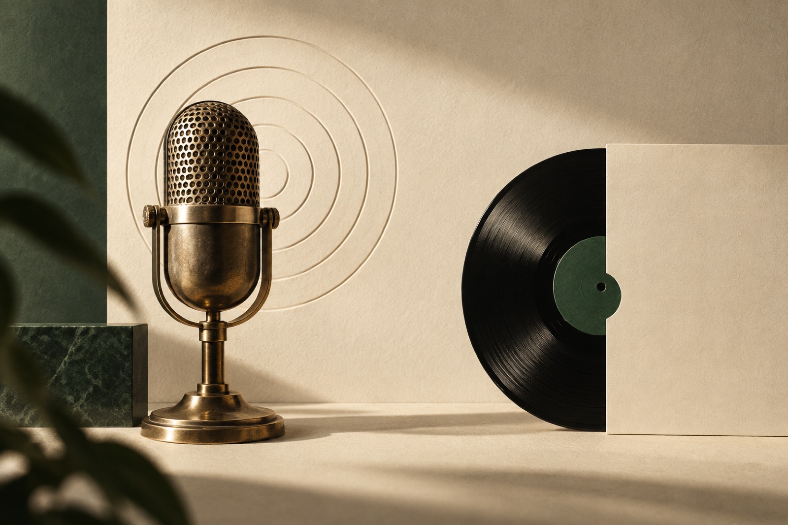
This case study ships with a working mini-product — mocked data, real craft.
Signal & Noise makes nine podcasts from a converted warehouse in Collingwood — interview shows, a beloved fortnightly about urban birds, a narrative series that podcast people describe as "prestige". Nearly two million listens a month across the apps, and a website that was, in the words of network director Elio Vasquez, "a graveyard with a subscribe button". Every listen happened inside Spotify or Apple; every listener relationship did, too. The network didn't know its own audience, couldn't sell a membership worth having, and watched its best ad inventory get brokered by platforms that took a cut of conversations they never hosted.
The challenge
The brief had a paradox baked in: build a destination for listening without asking anyone to change where they listen. Elio was clear-eyed about it. "We're not going to beat the apps at being apps. But we should own something." Owning something meant three concrete goals: a direct relationship with listeners (email, membership), search traffic that currently went to whoever scraped the episode titles fastest, and a site good enough that talent would want their show pages to live there.
Technically it was a pile of interesting constraints. Nine shows with wildly different visual identities under one roof. Audio that had to keep playing while you wander the site. RSS feeds as the content spine — which meant building on data shaped by Apple Podcasts' spec from 2005. And a membership tier whose pitch was "support independent audio", aimed at people who have never paid for a podcast in their lives.
The approach
The player is the product
We treated the persistent audio player as the site's spine, not a widget. It docks at the bottom of every page, survives navigation without a gap or a reload (client-side routing around the whole site, so the listening context never unmounts), and remembers your position across episodes and sessions. Speed control, chapter markers and a sleep timer — the table stakes the apps set — but also small kindnesses the apps don't bother with: a transcript that follows the playhead like karaoke, tap-to-seek from any line, and the queue that persists between visits. This is product design as hospitality: the site behaves like the best houseguest of your listening habit.
Transcripts as an editorial asset
Every episode got a full, corrected transcript, published as a real page with real typography — speaker names, section headings, pull quotes — not a collapsed accordion of caption vomit. The SEO logic is simple and under-exploited: a one-hour interview is fifteen thousand words of expertise that search engines otherwise cannot see. Each transcript page carries structured data, links generously to related episodes, and ranks for the specific questions guests answered. Within six months, transcripts were the largest source of organic traffic the network had ever had — our growth team's favourite kind of win, because it compounds while you sleep.
The transcripts also made the shows accessible to deaf and hard-of-hearing audiences for the first time, which mattered to the network on principle and mattered commercially more than anyone predicted.
Nine identities, one house
The design problem was diplomatic. Each show has its own art, palette and temperament; the network needed coherence. Our answer was a strict underlying grid and type system — the house — with a per-show colour and art direction layer expressed as tokens, so the bird show can be mossy and the true-crime-adjacent one can be severe without any of them breaking the furniture. Show pages are editorial documents, not database entries: long descriptions, host bios with actual personality, recommended starting episodes. The membership tier, The Frequency, launched with member-only feeds and a frankly gorgeous quarterly audiozine, and was sold entirely through the site's voice: warm, specific, zero guilt-tripping.
Measurement that respects the medium
The old site's analytics consisted of a platform dashboard and a feeling. We instrumented the player with privacy-respecting listening events — starts, completion points, drop-off cliffs, transcript follows — and built the network a small internal dashboard that answers editorially useful questions: where do people bail in a 70-minute interview, which show borrows the other's audience, which transcripts earn return visits. The insights changed programming within a quarter (cold opens got shorter; the bird show got an episode index). It also gave sponsors honest numbers, which in the podcast market is close to a superpower. None of it required a cookie banner worth apologising for: aggregate, first-party, and gone in ninety days.
The outcome
The rebuild shipped in twelve weeks, feeds intact, not a single subscriber churned by the migration — which, if you've ever rebuilt around RSS, you know is the whole ballgame. The metrics below are illustrative figures from this fictional concept project:
| Metric | Before | After |
|---|---|---|
| Organic sessions / month | ~8,000 | ~61,000 (illustrative, 6 months) |
| Listens started on site / month | ~900 | ~24,000 |
| Newsletter subscribers | 4,100 | 19,800 (illustrative) |
| Paying members (The Frequency) | 0 | 3,400 in six months |
| Median transcript page read time | n/a | 6m 20s |
Elio's summary at the six-month review: "We stopped renting our audience." The network now launches new shows with a built-in mailing list, and sponsors pay a premium for the site placements because the network can finally prove who's on the other side of them.
"The apps are where people find us. The site is where they find out who we are. Brassfern built the first web thing we've ever owned that feels like one of our shows." — Elio Vasquez, Network Director, Signal & Noise (fictional)
Stack & credits
- Design: network identity layer, nine show art directions, editorial templates, player UX
- Engineering: Astro + React islands, persistent player with playhead-synced transcripts, RSS-to-CMS pipeline, Stripe memberships
- Growth: transcript SEO system, structured data, newsletter and membership funnels
- Squad: principal engineer, product designer, growth strategist, motion designer, producer — how our squads work
- More: our media industry page · Building something people listen to? Start a project
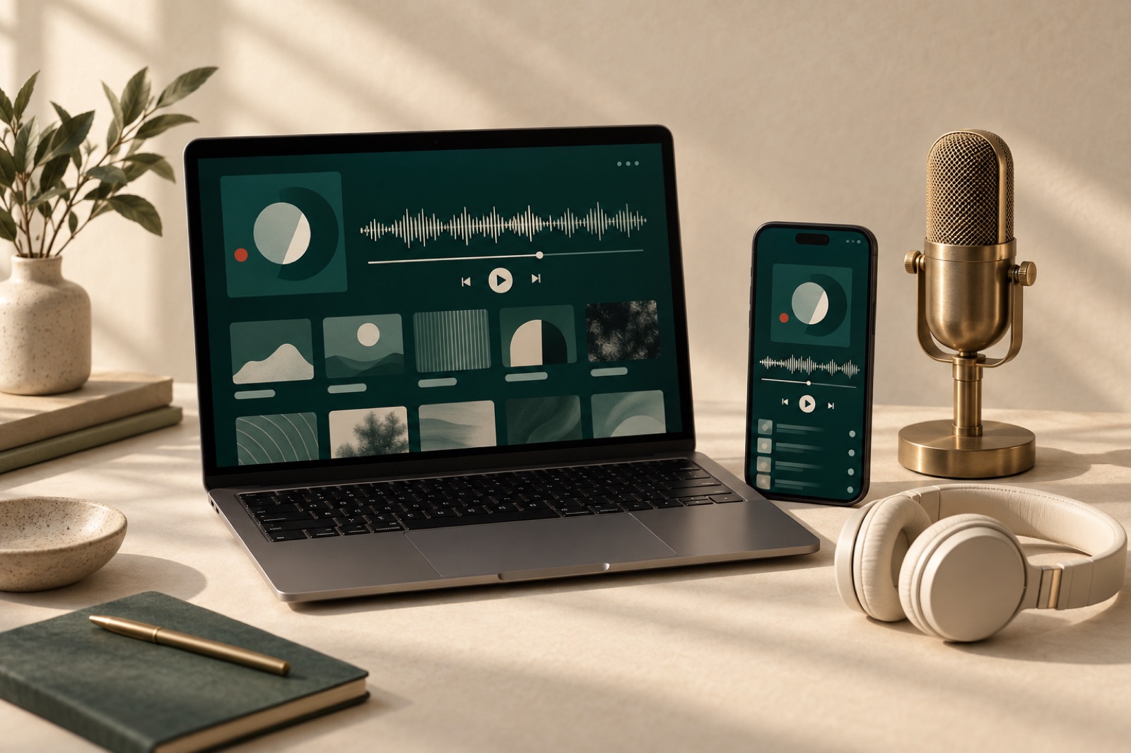

Verdigris Archive: 80,000 botanical plates, searchable in a blink
A botanical museum put 80,000 plates online with fast faceted search, a deep-zoom viewer and public-domain downloads. Search success rose 63%.
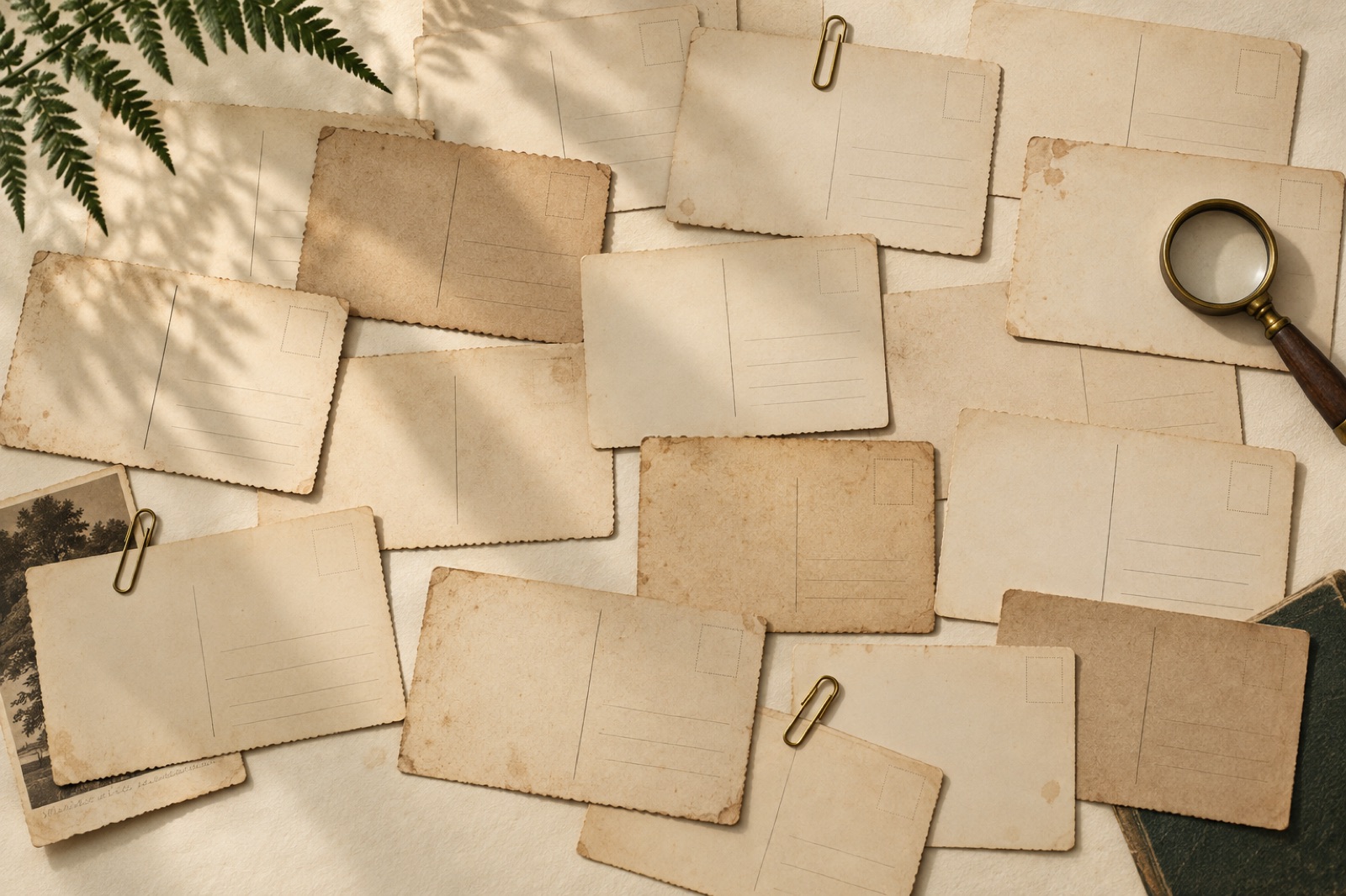
The Corrowong Trust: an archive people actually browse
How we rebuilt a regional museum group's 180,000-item digital archive around wandering instead of database forms — and made it funding-proof.
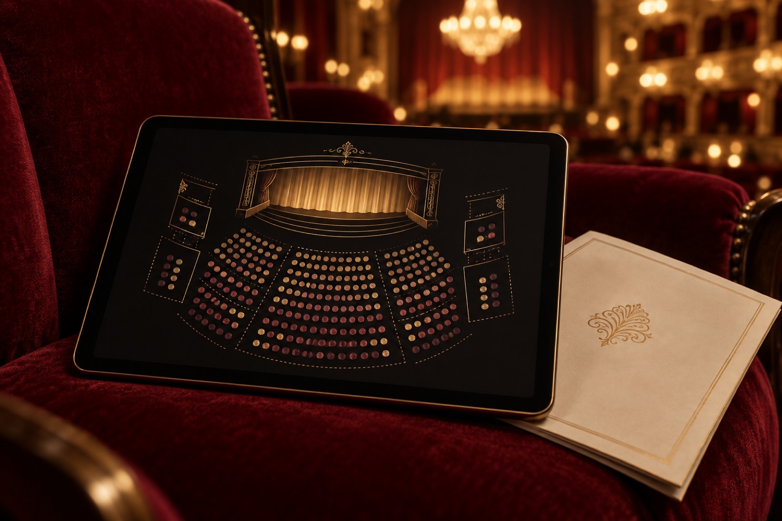
Glasshouse: a seat map people stopped dreading
A 384-seat theatre's box office was where sales went to die. We rebuilt it around an honest seat map, truthful timers and keyboard-first booking.