Modernising a heritage brand without erasing its soul
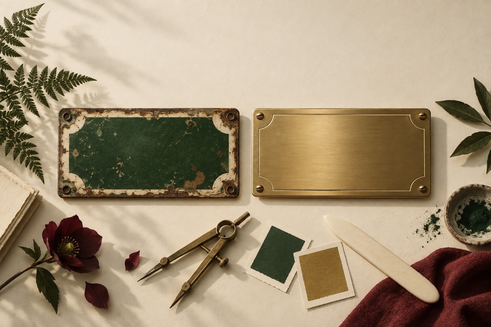
Every few years a beloved old brand unveils a rebrand, and the internet responds with a single, devastating verdict: "it looks like everyone else now." The serif comes off. The colour gets muted. The mascot gets flattened into a geometric abstraction that could belong to a payments company. The brand becomes modern in the way an airport lounge is modern — clean, expensive and impossible to remember.
Heritage modernisation is the highest-stakes work in branding, because the asset at risk is the one thing money can't buy back: decades of accumulated recognition and affection. Here's how we approach it — including a respect audit, a keep-burn-build framework, and the discipline of earned symbols.
First: understand why it needs to change (and it usually does)
The nostalgia trap cuts both ways. Heritage brands aren't museum pieces; the ones that survive are the ones that kept their character while changing everything else. The pressure to modernise is usually real:
- The identity predates digital and simply doesn't render — thin serifs at 16px, a crest that turns to porridge in an app icon, colours with no accessible pairings.
- The audience has widened beyond the original community, and the brand reads as insular or dated to newcomers.
- The business changed: a butcher that now does most of its trade online, a community bank competing with apps, a wine label that sells direct now.
- The system has decayed — thirty years of one-off additions until nothing matches anything.
Notice that none of these reasons is "it's old." Age is not the disease. The disease is friction between the brand and the way people now meet it. If you start the project by listing what's old, you'll end by deleting what's loved.
The respect audit: inventory before surgery
Before any sketching, we run what we call a respect audit — a structured inventory of the brand's equity. It has four parts:
- Artefact archaeology. Collect the brand's history: old labels, shopfronts, packaging, letterheads, ads, uniforms. Photograph everything. The goal isn't nostalgia — it's identifying the originals, the elements that have survived every previous refresh because they work. There's almost always one: a letterform, a colour, an ornament, a phrase.
- Recognition testing. Show customers fragments — the colour alone, the wordmark cropped, the mascot's silhouette, a strip of the old packaging — and ask what brand it is. The fragments that score highly are the equity. The fragments that score zero are decoration. This is fast, cheap and brutally clarifying.
- Language harvest. Listen to how customers talk about the brand. If everyone calls the bank "Copperline" with a fond half-joke, or describes the shop's red as "the cured-meat red," that language is data. When we modernised Copperline Mutual, the warmth in how members spoke about the place became the brief for the brand voice — "sounds human" came from the members, not a workshop.
- The founder's intent, if findable. Why was it designed that way originally? Sometimes the ornate thing was a deliberate stance — craftsmanship, permanence, defiance of the cheap competition. Understanding the intent tells you which battles the original designer was fighting, and whether you're still fighting them.
Keep, burn, build: the framework
With the audit done, every element of the existing identity goes into one of three buckets, decided with the client and argued over openly:
Keep — the earned symbols. Elements with proven recognition or genuine affection. These are not redesigned; they are restored: digitised properly, redrawn at production quality, given the technical foundations they never had (a redrawn crest with a responsive small-size variant; the historic red recalibrated to pass contrast on screens). Restoration is real design work and should be credited as such.
Burn — the accrued damage. The clipart era. The gradient someone added in 2009. The seven fonts. The colour that exists only because the sign-writer had it in stock. Heritage clients often defend these out of habit; the recognition testing usually dissolves the defence, because nobody actually remembers them.
Build — what never existed. Usually: a digital-first type system, accessible colour pairs, motion behaviour, a social/avatar adaptation, iconography, a voice that writes like the people sound. The new material must be designed to retire alongside the kept material — stylistically compatible, explicitly subordinate. The historic wordmark leads; the new sans supports.
The framework's real value is political, not artistic: it converts an anxiety spiral ("are we losing everything?") into an itemised negotiation. Every stakeholder can see their treasured element was considered and placed deliberately. The hardest conversations happen here, in the audit, where they're cheap — not at the reveal, where they're expensive.
The whitewash failure mode, and its causes
The erased-soul rebrand almost never comes from malice. It comes from a stack of defensible micro-decisions: the serif fails at favicon size (true), so replace it (false). The palette has contrast problems (true), so go neutral (false). The mascot is hard to animate (true), so delete it (false).
The discipline that prevents the whitewash: for every "doesn't work" finding, the question is "how do we make the original work?" before "what replaces it?" Redraw before replace. Calibrate before discard. Nine times out of ten the original element has a solvable technical problem and an irreplaceable emotional one.
The tell that a heritage rebrand has gone wrong: the new identity would be equally appropriate for any company in any industry. Run the swap test — put a fintech's name on it, then a skincare brand's. If nothing breaks, you built airport-lounge modern. The modernised identity should still be unimaginable on anyone else.
What heritage buys you, if you don't burn it
Earned symbols do measurable work. Recognition halves your marketing's first job. Nostalgia, handled honestly, is one of the few things that can make a transactional category feel relational — it's part of why Hearthbrew's subscription retained like a magazine: the brand behaved like an institution people belonged to, not a funnel they passed through. And in an era when every startup can buy a competent identity in a quarter, continuity is the one asset with a genuine barrier to entry. A competitor can copy your new look in six months. They cannot copy your fortieth anniversary.
Key takeaways
- Modernise because of friction (digital rendering, audience change, business change), never because of age.
- Run a respect audit first: artefact archaeology, recognition testing, language harvest, founder's intent.
- Sort every element into keep (restore, don't redesign), burn (accrued damage) or build (what never existed).
- For every "doesn't work" finding, try to make the original work before reaching for a replacement.
- Run the swap test: if the new identity fits any company, you've whitewashed it.
- Continuity is an uncopyable asset — treat age as the moat it is.
FAQ
How is a modernisation different from a rebrand? A rebrand changes what the brand is; a modernisation changes how well it works. Modernisation keeps the positioning and the earned symbols, and rebuilds the system around them. If your strategy genuinely changed, you need the full rebrand — see rebrands that worked, and the ones that were just new paint.
How much does recognition testing cost? Almost nothing. Twenty to thirty customer interviews or a simple survey with cropped image fragments gives you a usable equity map in a fortnight. It's the cheapest insurance in the entire project.
What if the founder's family or long-tenured staff resist? Bring them into the respect audit, not the reveal. People defend what's threatened; they celebrate what's honoured. When they see the archive photographed and the historic elements restored at high quality, resistance usually converts to pride.
Should the old brand be archived publicly? Often, yes — a heritage page showing the identity's evolution is both good storytelling and good SEO, and it signals confidence: we're not hiding where we came from. Museums and archives do this beautifully; our work on Postcards from the Museums showed how much affection old brand artefacts carry.
How do we modernise colour that fails accessibility? Keep the hue, change the job. The historic red can stay as the brand's signature at large sizes and brand moments, while a darker calibrated sibling of the same hue handles text and small UI. Same family, two workers, one soul — our palette strategy piece covers the mechanics.
Picking a brand palette is strategy wearing paint
A brand palette is a strategic decision before it is an aesthetic one. How we map competitors, treat accessibility as a creative constraint, and pick ownable colour.
Rebrand rollout: the domino order matters
A rebrand is a logistics operation wearing a brand costume. The domino order — domain, redirects, app stores, email, legal — that decides whether launch week sings.
Rebrand announcement day: theatre, then receipts
Launch day for a rebrand is a narrative event and an operational stress test. How to script the reveal, survive the hot takes, and when the case study actually lands.