Brand photography without the five-figure shoot
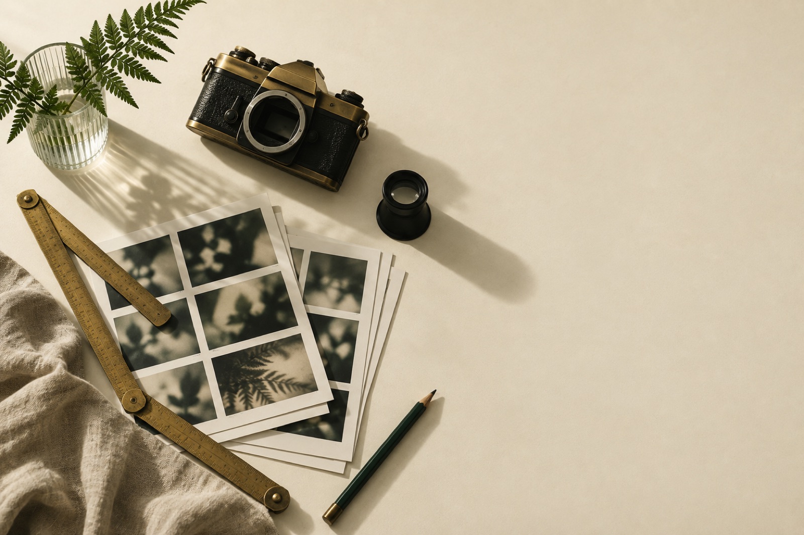
A client's photography is usually the most expensive thing in the brand and the first thing to look cheap. One hero image from a stock library, smile-group-hands-meeting; one attempt at a shoot with whoever owns a camera; a homepage that looks like every other homepage in the category, but slightly warmer. The problem is almost never the budget. It's the absence of art direction — nobody decided what the photographs are for, so they cost money and say nothing.
We run photography the way we run the rest of our brand work: as a system with rules, not an afternoon with a camera. A small shoot with sharp art direction beats a big shoot with none, every time. Here's the playbook we give clients whose photography budget rhymes with "modest".
First, the decision: shoot, stock, or synthesise
Before any camera appears, split your image needs into three honest buckets:
- Only-we-can-shoot-it. Your product, your space, your people, your process. The butcher's hands at Tallow & Co., the fermenters at a brewery, a clinic's actual waiting room. These images carry proof. Nobody else can make them, which is exactly why they're worth the shoot.
- Stock, but disciplined. Abstract texture, generic environments, concept imagery. Usable if — and only if — you apply the same lighting and colour rules as your commissioned work. Stock fails when it breaks the system, not when it's stock.
- Don't photograph it at all. Some things say more as illustration, diagram, or type. Our piece on building a photography style without a photoshoot covers the no-camera end of the spectrum.
The mistake is treating these buckets as a hierarchy where real shoots are aspirational and stock is failure. They're instruments. A skincare brand that shoots its own ingredients but pairs them with mismatched lifestyle stock looks worse than one with a tight commissioned set of six product stills and nothing else.
The shot list is a screenplay, not an inventory
The amateur shot list is a noun dump: "product on white, team photo, office, lifestyle, x3". The professional shot list is a list of sentences the website needs to say, each paired with the frame that says it.
Write the site's sentences first. Literally: copy the draft headlines and captions into a spreadsheet. "We roast in small batches" needs hands, beans mid-roast, a scale — three frames, specific. "Our support team actually answers" needs a real person at a real desk with honest lighting, not a headset model. If a sentence has no corresponding image, you either shoot it or delete it. If an image idea has no sentence, it doesn't get shot. This one discipline is what separates a library from a folder.
Then size the list brutally. Sixty frames in a day sounds efficient and produces sixty mediocre relaxations of the same idea. Twelve frames, each with its own lighting setup, composition sketch and thirty minutes of actual craft, produces a library. Constraint is the budget's best friend: a small, undeniable set opens the site; the gaps get filled by the illustration and type system anyway.
Art direction is a lighting language, not a filter
Most photo briefs die at "warm, authentic, premium". That's a mood, not an instruction. You can't expose for "authentic". What a photographer can execute is a lighting language — the few decisions that make every frame unmistakably yours:
- Light source and direction. One source, window-height, camera-left. Or hard overhead midday sun with crisp shadows. Pick one and forbid the rest. Consistency of direction is what makes a library read as one voice even across different subjects and years.
- Time of day, colour temperature, shadow behaviour. "Golden hour everything" is the warm-authentic-premium trap again. Decide whether your shadows are long and soft or short and graphic, and whether whites run cream or neutral.
- Distance discipline. A defined ratio of wide context frames to hands-and-detail frames (we usually brief 1:2) stops the photographer defaulting to waist-up medium shots, the oatmeal of framing.
- Background logic. What's behind things matters more than the things. Choose working surfaces — worn timber, raw paper, brushed metal — over the infinity curve, which gives everything the same floating-in-void catalogue look.
- Prop rules. A short list of materials allowed in frame (brass, glass, linen, living green) plus a no-list (no screens showing fake dashboards, no coffee cups nobody will drink). Props are the accent colour of photography; five materials, forever.
Put this on one page with reference frames and it travels: to a different photographer in another city, to the freelancer you hire in two years, to the founder's iPhone at the trade fair. That page is the art direction. Everything else is equipment.
Casting: the hands problem
People are where budgets and authenticity collide. The cast of your category — the agency team all laughing at a laptop — is available from every stock site and it poisons trust on contact. But real staff freeze under studio lights, and professional models make your founder's workshop look like a bank ad.
The working answer: hands, torsos, and backs-of-heads before faces. Hands doing the actual work — grinding, stitching, plating, packing — are honest, timeless, and don't require anyone to act. The person in the frame should be the person who does the thing, lit as if nobody's watching. When faces are unavoidable, one genuinely relaxed environmental portrait of a real person beats six stiff ones: schedule the portrait for the end of the day, shoot during a conversation about something off-topic, and never use the word "pose".
If your brand shows customers rather than makers, cast one or two real customer archetypes for a half-day instead of trying to represent everyone. Representation in brand photography is a casting brief, not a census: identify the audiences you must include, then cast them with dignity and specificity — this person owns the frame — rather than assembling a rainbow of half-second cameos. (For the ingredient-honesty photography we art-directed for GLADE, nearly the whole library is hands and product. Zero faces, zero stock, and the frames still look fresh three years on.)
Build the library to age slowly
A photo library doesn't age because the fashion changes. It ages because the details change: the old packaging in the background, last year's phone on the desk, the seasonal specific that pins an image to a two-month window. Future-proofing is mostly subtraction:
- Keep timeless objects in focus; contemporary objects contextual and replaceable. A laptop is a prop with a shelf life. A knife, a ledger, a brass tap is forever.
- Shoot plates, not just finals. A clean background plate of every setup costs two extra frames now and saves a reshoot when the packaging changes.
- Version the packaging shots separately from the ambience shots, so a label refresh invalidates a tenth of the library, not all of it.
- Store the RAWs with the recipe. Camera files, LUTs, and the one-page lighting language archived together. The difference between a library and a memory is whether a stranger can match it in two years.
- Review quarterly, ruthlessly. Retire the frame that's no longer true. A library of sixty honest images beats two hundred where a third walk around with their fingers crossed behind their backs.
Do the maths honestly and the five-figure shoot is rarely what you needed. You needed twelve sentences, a lighting page, one craft-focused day, and the discipline to say no to the sixty-frame fantasy. That's the shoot with the heartbeat.
Key takeaways
- Split image needs into three honest buckets — must-shoot, disciplined stock, don't-photograph — and design for the gaps with illustration and type.
- Write the shot list from the site's sentences, not from nouns. Twelve crafted frames beat sixty relaxed ones.
- Art direction is a one-page lighting language: source, shadows, distance discipline, background logic, prop rules. "Warm and authentic" is not a brief.
- Hands before faces. Cast real people late in the day, mid-conversation, without the word "pose".
- Libraries age through details: shoot plates, future-proof packaging shots, archive the recipe with the RAWs, and retire untrue frames quarterly.
FAQ
How much should a small brand actually budget for photography? For a one-day shoot with a competent local photographer, shared usage rights and this level of art direction, most of our clients land in the low-to-mid four figures — often less than the annual cost of the stock subscriptions it replaces. The art direction page is the multiplier: it lets a modest photographer produce a library that reads like a big production.
Can't we just use AI-generated imagery? Sometimes, loudly labelled, for clearly conceptual work. But AI images fail precisely where commissioned photography wins: proof. Your actual product, your actual space, your actual hands are the entire value of the shoot, and fabricating those is a quiet lie your best customers will eventually notice. Use synthesis for concept imagery the way you'd use stock, never as counterfeit evidence. Our brand strategy one-pager covers why proof points are the whole game.
How do we brief a photographer we've never worked with? Send the sentence spreadsheet, the one-page lighting language, and twelve reference frames annotated with why each one works. Then get on a call and shoot one test frame before the day. Photographers who ask to see the website are keepers. Ones who only ask about the shot count are telling you something.
What if the founder insists on being in every photo? Book the portraits for the last hour of the day, keep them environmental, and remind them the library outlives the org chart. Founder-led brands have their own rules — the founder can be the brand, but the images should still do jobs, not just document a face.
An illustration system is rules, not a folder of PNGs
Illustration that stays consistent after the artist leaves: principles with forbiddens, per-artist commissioning briefs, rarity budgets, and storage that survives churn.
Type as brand: when the typeface is the logo
Retail fonts, custom type, and the maths in between. How we decide when letterforms should carry a brand — and how to make typography do a logo's job.
Design logo systems, not logos
A logo is judged at 16 pixels and on an invoice footer, not the presentation wall. How we build tiered identity systems — marks, motion, rules — that survive.